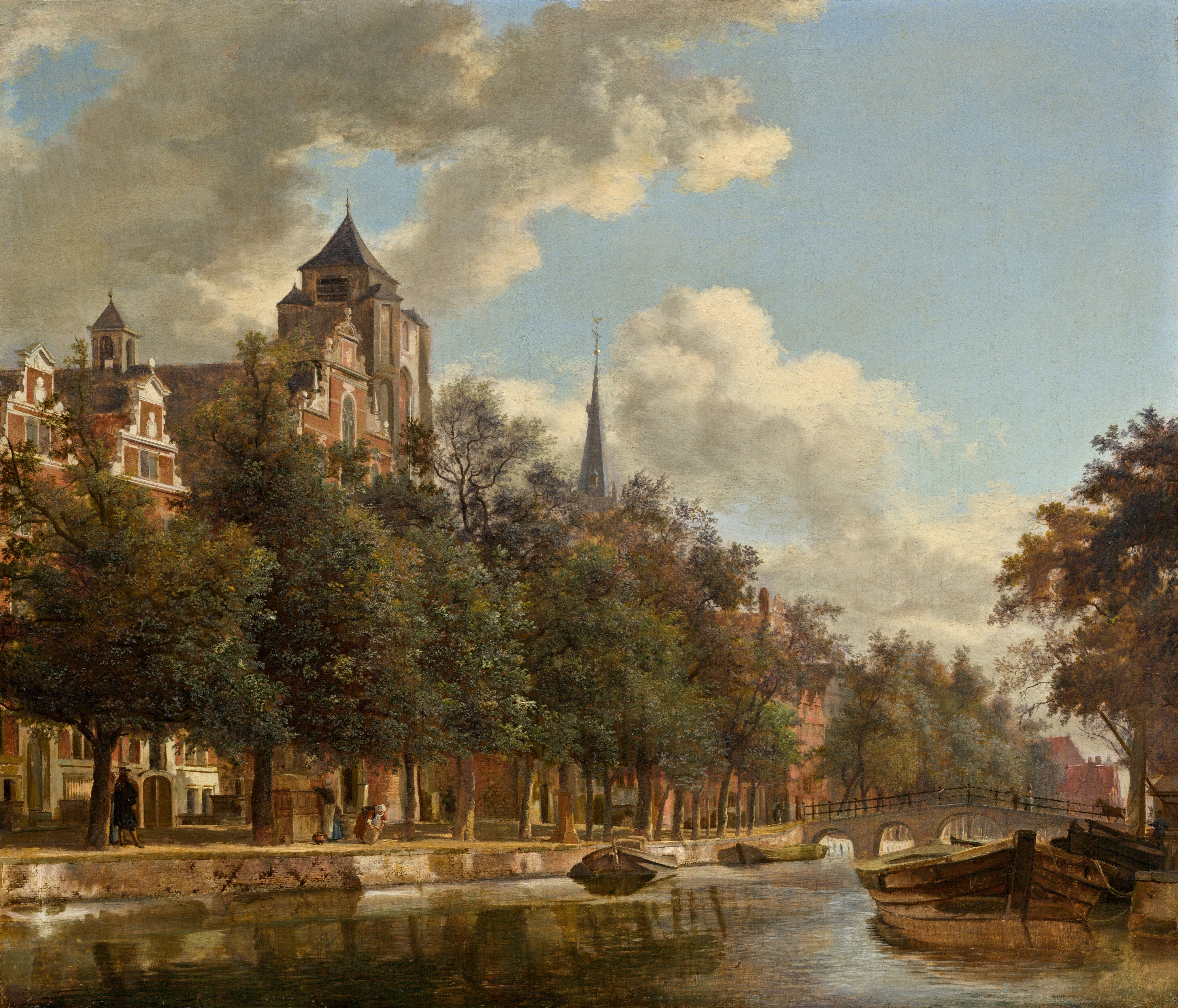
Jan van der Heyden had a remarkable ability to capture the flavor and feeling of Amsterdam and its many canals, even in fancifully conceived images such as this one. He understood the sense of the city one gains by wandering along them: the glimpses of imposing buildings behind trees lining the Herengracht and Keizersgracht; the ever-varied vistas as the canals follow their semicircular course around the city center; and the countless activities found on the quays and on boats along the still waters. He also introduced marvelous effects of light that enliven a city so defined by its topography: billowing clouds that suggest the freshness of the air, bright sunlight accenting the colors and architectural details of the buildings, and reflections in the water that mirror the physical reality above.
The joy of this painting is the quiet rhythm of daily life in this urban setting. The linden trees lining the canals provide shade, greenery, and, most of all, a pleasant ambiance for those who stroll beneath them. In Van der Heyden’s world, men and women stand and watch or go about their daily chores, but they do not hurry. Trees soften architectural structures but do not entirely eclipse them: handsome, brick-red buildings, partially obscured by their verdant foliage, provide glimpses of dwellings that hint of both the individual wealth and the communal bonds of their inhabitants. The pace of the viewer’s eye as it gazes along the gently receding canal is visually slowed by large wooden barges tied along the waterway’s brick walls and by a bridge over which passes a horse-drawn carriage.
Van der Heyden’s views of Amsterdam canals from the late 1660s and early 1670s often reflect the character of the city without portraying a particular site. Although the three large and imposing buildings at the left are reminiscent of residences designed by Hendrick de Keyser (1565–1621) along the stately Keizersgracht, their imaginatively articulated decorative gables, as well as their windows and doorways, vary from the actual architecture.
Quite remarkably, the massive stone church tower rising just beyond these brick dwellings is not an Amsterdam building at all. Van der Heyden based this tower on that of the Onze-Lieve-Vrouwekerk in Veere, a formidable Romanesque structure that Van der Heyden often ingeniously inserted into fancifully conceived city views [fig. 1]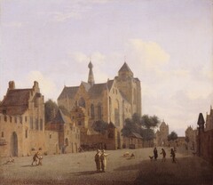 [fig. 1] Jan van der Heyden, The Church at Veere, oil on canvas, Royal Picture Gallery, Mauritshuis, The Hague. Exactly when Van der Heyden visited Veere and why he developed such a predilection for depicting this church in a small Zeeland town is not known, although Veere was a marquisate of the House of Orange, which meant it had a certain historic significance within the Dutch Republic. Otherwise, no family or business connections to Veere have been identified that would have taken him there. Van der Heyden clearly knew the church well, and must have relied on drawings he made on-site when he came to execute this work or other paintings. One can speculate that the painter found the massive, somewhat squat, stone structure appealing as a visual contrast to the more refined, seventeenth-century dwellings that lined Amsterdam’s most prominent canals. This Romanesque church grounds the painting’s compositional structure, serving as a firm apex to the receding diagonal that draws the viewer’s eye, however slowly, into the distance along the canal banks. Finally, the age and venerability of the church tower provide a sense of historical continuity to this urban landscape that presumably had great attraction for the artist’s contemporary patrons.
One of the marvels of Van der Heyden’s paintings is the remarkably realistic character of his brickwork. A notable inventor (see his biography), Van der Heyden devised a way of depicting mortar so that it would appear to be part of the buildings’ structure. So remarkable was his manner of painting bricks and mortar that his contemporaries wondered about the secret technique he must have devised to create effects that “seem impossible with the customary ways of painting.” Even today, the manner in which Van der Heyden achieved these effects is not fully understood, although it is clear that he did not represent mortar in the “customary” way, that is, solely with painted lines. Seen under a microscope, the lines of the mortar, which sit on the surface of the red color of the bricks, have a soft, fluid character comparable to that found in counterproofs. It, thus, appears that Van der Heyden devised an offset process to create these lines.
It is possible that Van der Heyden created his offset process by designing mortar patterns on separate supports. He may have painted these patterns on small pieces of paper or wood, or perhaps even etched them into copper plates. It appears that the artist pressed these designs (or impressions of these designs, if he created them as etchings) when still wet, onto the reddish brick color after the paint had dried. The application of these grid patterns came rather late in the artistic process, for mortar lines occasionally lay on top of the foliage of nearby trees [fig. 2]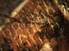 [fig. 2] detail of the façade of the second building from the left, Jan van der Heyden, View Down a Dutch Canal, c. 1670, oil on panel, National Gallery of Art, Washington, Gift of George M. and Linda H. Kaufman, 2012.73.2. Where he felt that his offset process needed reinforcing, Van der Heyden selectively applied light gray brush to indicate mortar.
This technique, which has been found in a small number of Van der Heyden’s paintings dating from the late 1660s and early 1670s, was originally thought to provide a means for the artist to paint his brick patterns more quickly than if he executed them solely with a brush. This process, however, must have been very labor-intensive and would not have speeded completion of the painting. s. Van der Heyden clearly thought carefully about the mortar patterns so that they would accurately reflect the perspective and scale of the structures to which he applied them. It is more likely that Van der Heyden invented this process to create very detailed yet diffused lines of mortar that do not appear to sit on top of the red bricks but instead become integral parts of a building’s structure.
Van der Heyden’s inventiveness is not limited to his brickwork. Microscopic examination also raises the possibility that the artist stippled his foliage by dabbing on paint with moss or a sponge rather than with a brush.
Despite the well-deserved fame of Van der Heyden’s remarkably detailed techniques, his paintings ultimately succeed because he successfully integrated architecture and natural forms to create atmospheric scenes. He carefully recorded the reality of the world around him—whether it be the earthy bricks and mortar, the glimmering reflections of water, or the tips of branches flickering in the light of a summer’s day—and brought them to life in a subtly-crafted visual experience that speaks to very basic human emotions of peace and harmony.
Arthur K. Wheelock Jr.
April 24, 2014

