Skip to Main Content

Announcing the Text: The Development of the Title Page, 1470–1900 Selections from the National Gallery of Art Library

Early printed books often followed the form of a manuscript and had no title page. Instead a brief description, called an incipit, is included at the top of the first page. The text itself garners primary attention, with the first letter receiving an illumination.

Biondo Flavio, 1392–1463, Blondi Flavii Forliviensis in Roma instaurata prefatio incipit, Rome, 1471, Letterpress and illumination, J. Paul Getty Fund in honor of Franklin Murphy and The Gladys Krieble Delmas Foundation

1 of 24

The title here is placed above a woodcut illustration with the first few lines of text below. The rest of the information regarding the production of the book appears in the colophon at the end. Just as with manuscripts, the primary focus is the text itself, and less importance is placed on the producer of the work.

Giovanni Boccaccio, 1313–1375, L’opera de misser Giouanni Boccaccio De mulieribus claris, Venice, 1506, Letterpress and woodcut, David K. E. Bruce Fund

2 of 24

In this example there is still a limited amount of information, but the title has moved to its own page. In the 1460s printers began including a blank page at the beginning of the book, possibly as a means to protect the text. Eventually, this blank received a label-title such as this, probably as an aid to identification.

Ovid, 43 B.C.–17 or 18 A.D., Habebis candide lector. P. Ouidii Nasonis Metamorphosin castigatissimam, Parma, 1505, Letterpress, Gift of Robert Erburu

3 of 24

Printers began to see themselves as important collaborators in the production of books, and soon a printer’s mark, like the woodcut device of L. A. Giunta shown here in red, began to appear along with the label-title.

Livy, Titi Livii Decades: noviter impresse, Venice, 1506, Letterpress and woodcut, A. W. Mellon Foundation New Century Fund

4 of 24

As the title page became a promotional and marketing tool, more attention was focused on its design. The longer title and combination of printing in red and black give this page a more sophisticated look than previous examples.

Plutarch, Uitae Plutarchi Cheronei nouissime post Iodocu[m] Badiu[m] Asce[n]sium lo[n]ge diligentius repositae, maiore[que] dilige[n]tia castigatae, Venice, 1516, Letterpress and woodcut, David K. E. Bruce Fund

5 of 24

Illustrations became more elaborate, as in this metalcut title vignette, and gradually more information from the colophon (printer’s note) moved forward to the title page, as seen below the illustration here.

Polydore Vergil, 1470?–1555, Polydori Vergilii Vrbinatis De inuentoribus rerum libri tres, Paris, 1517, Letterpress and metalcut, David K. E. Bruce Fund

6 of 24

In a manuscript, and likewise in early printed books, a decorative border often surrounded the text. Later, the border moved to include the title page as well. This reissue of the 1503 edition includes the addition of a beautiful woodcut title page.

Bernardino Corio, 1459–1519?, Dello eccelle[n]issimo oratore messer Bernardino Corio, milanese Historia co[n]tinente da lorigine di Milano tutti li gesti, fatti, e detti preclari…, Milan, 1520?, Letterpress and woodcut, David K. E. Bruce Fund

7 of 24

Engraving overtook the woodcut as the primary form of book illustration by the end of the 16th century. All of the information from the colophon moved to the title page, as seen in this elaborate title page and frontispiece.

Lodovico Guicciardini, 1521–1589, Descrittione di m. Lodovico Gvicciardini, gentilhvomo fiorentino, di tvtti i Paesi Bassi, altrimenti detti Germania inferiore, Antwerp, 1588, Letterpress and engraving, David K. E. Bruce Fund

8 of 24

Though it was more costly, some printers would have the text for the title page engraved directly into the copper plate, as shown here. This alleviated the problem of having to run the leaf through two different presses.

Giles Sadeler, 1570–1629, Vestigi delle antichita di Roma, Tivoli, Pozzvolo et altri lvochi, Prague, 1606, Engraving, C. Wesley and Jacqueline Peebles Fund

9 of 24

Upon its introduction in the early 16th century, pure etching did not often appear in books—at least initially, because it was seen as less formal than traditional engraving. However, in part because it was a quicker method than traditional engraving, etched title pages like the one shown here (by Stefano della Bella, 1610–1644) grew in popularity in the 17th century.

Benedetto Buommattei, 1581–1647, Descrizion delle feste fatte in Firenze per la canonizzazione di s.to Andrea Corsini, Florence, 1632 Etching, David K. E. Bruce Fund

10 of 24

The frontispiece first appeared in the 16th century. Initially a portrait, it soon evolved into a variety of forms. In this example, it is an emblematic version of the title that compliments the standard letterpress version.

Josephus Zoller, d. 1750, ConCeptVs ChronographICVs De ConCepta saCra DeIpara, Augsburg, 1712, Letterpress and engraving, David K. E. Bruce Fund

11 of 24

By the beginning of the 18th century Paris had become a leading center in the book trade. Often a combination of methods was used, as in the engraved and etched frontispiece and title vignette with letterpress text shown here.

M. de Antoine Houdar La Motte, 1672–1731, Fables nouvelles: dediées au roy, Paris, 1719, Letterpress and engraving, David K. E. Bruce Fund

12 of 24

This is an interesting variation that appears in a later edition of the same work. The frontispiece clearly depicts the same scene, re-engraved in reverse and with smaller dimensions, but the title page uses a very different typeface, red ink, and a new layout.

M. de Antoine Houdar La Motte, 1672–1731, Fables nouvelles: dediées au roy, Amsterdam, 1727, Letterpress and engraving, David K. E. Bruce Fund

13 of 24

Many new typefaces began to emerge in the 18th century. The Enlightenment brought a new scientific approach to printing and with it, the development of ornamented type using C- and S-curves based on forms from nature.

Frans van Stampart, 1675–1750, Prodromus, oder, Vor-licht des eröffneten Schau- und Wunder-Prachtes aller deren an dem Kaiserl, Vienna, 1735, Letterpress, David K. E. Bruce Fund

14 of 24

In 1710 copyright was established in England, and English printers broke away from the printing practices of the European continent. From previous designs, based on those of the Dutch, a new, modern style emerged.

John Dart, d. 1730, The history and antiquities of the Cathedral Church of Canterbury, and the once-adjoining monastery, London, 1726 Letterpress, David K. E. Bruce Fund

15 of 24

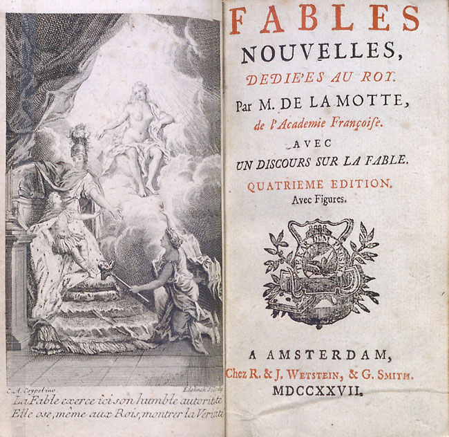
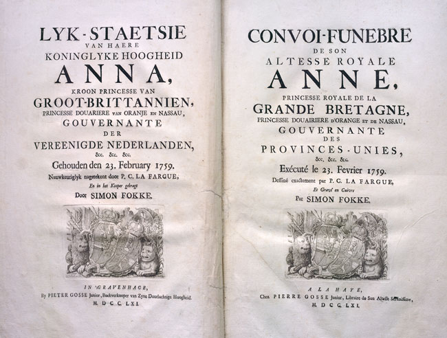
To appeal to a wider audience and still keep costs down, a printer might print a single book in multiple languages instead of printing distinct editions. Sometimes, as with the Dutch and French versions here, separate title pages may be produced.

Simon Fokke, 1712–1784, Convoi-funebre de Son Altesse Royale Anne, princesse royale de la Grande Bretagne, princesse douairiere d’Orange et de Nassau, gouvernante des Provinces-Unies Lyk-staetsie van haere koninglyke hoogheid Anna, kroon princesse van Groot-Brittannien, princesse douariere van Oranje en Nassau, gouvernante der Vereenigde Nederlanden, The Hague, 1761, Letterpress, David K. E. Bruce Fund

16 of 24

Often special editions would receive special treatment when it came to the title page. This reissue of the sheets published as the 1785 Barrois edition includes an engraved title page in each volume, in addition to the original letterpress title page.

Torquato Tasso, 1544–1595, La Gerusalemme liberate, Paris, 1792, Letterpress and engraving, David K. E. Bruce Fund

17 of 24

Another example of an addition to a standard title page, this edition includes a title page done in aquatint and engraved with a variant of the title, Picturesque views on the river Thames with observations on the works of art in its vicinity.

Samuel Ireland, d. 1800, Picturesque views on the river Thames, from its source in Glocestershire to the Nore, London, 1792, Aquatint, David K. E. Bruce Fund

18 of 24

Classically based type, inspired by the discovery of sites like Pompeii and a newfound interest in the ancient world, became popular at the turn of the 19th century, as this title page and line engraved frontispiece show.

Modeste Paroletti, 1765-1834, Description historique de la basilique de Superga, située sur la colline près Turin, ornée de vignettes et de neuf planches en taille-douce, Turin, 1808, Letterpress and line engraving, David K. E. Bruce Fund

19 of 24

Lithography became a widely used printing technique in the 19th century, especially in France, where it was applied to title pages such as this one, illustrated after a drawing by J. J. F. Le Barbier.

Mandar, 1757–1845, Détails de construction d’une maison donnés pour l’instruction de messieurs les élv́es de l’École royale des ponts et chaussées, Paris, 1818, Lithograph, J. Paul Getty Fund in honor of Franklin Murphy

20 of 24

The last book to be illustrated by the prolific 19th-century artist Gustave Doré was an edition of Orlando Furioso. This frontispiece is a line block reproduction of one of Doré’s drawings; the title page was printed with offset lithography.

Lodovico Ariosto, 1474–1533, Roland furieux poème héroïque, Paris, 1879, Lithograph and line block print, David K. E. Bruce Fund

21 of 24

A. W. N. Pugin was a leading exponent of the Gothic revival. He rejected the elevation of ornament that had come to dominate design in the 19th century and advocated a return to design based on material, structure, and function.

Augustus Welby Northmore Pugin, 1812–1852, The true principles of pointed or Christian architecture: set forth in two lectures delivered at St. Marie’s, Oscott, by A. Welby Pugin, London, 1841, Lithograph, Mark J. Millard Architectural Collection

22 of 24

Inspired by the writings of people like Pugin, William Morris began the Arts and Crafts movement in England in the 1860s. Turning to medieval handicraft to find an authentic style, he based his book designs on manuscripts and early printing.

William Morris, 1834–1896, Gothic architecture: a lecture for the Arts and Crafts Exhibition Society Hammersmith, London, 1893, Letterpress, David K. E. Bruce Fund

23 of 24

Thought to be the first manifestation of an art nouveau title page, the example seen here features stylized curvilinear designs and organic motifs inspired by nature, which typify the style that would be popularized near the turn of the 20th century.

Arthur Heygate Mackmurdo, 1851–1942, Wren’s city churches Orpington, Kent, 1883, Woodcut, David K. E. Bruce Fund

24 of 24