East Building Audio Tour: Featured Selections
Use your smartphone to explore a wide range of works through the voices of National Gallery of Art curators. Set your own pace by listening to as many stops as you like in the order you choose. Don't forget to bring your headphones!
| French (Visite du bâtiment est) | Russian (Аудиоэкскурсия по восточному зданию) |
| Japanese (東館ツアー) | Spanish (Visita guiada del Edificio Este) |
| Mandarin (博物馆东馆参观指南) | Korean (서관 투어: 특별 전시) |
To listen to information about a work of art, enter the stop number in the box below, select go, and press the play button when the stop appears. Please be mindful of other visitors and use headphones while listening to the audio tour.
Stop not found
Please try a different number.
Stop 4

Georges Braque, Still Life: Le Jour, 1929 - Still Life: Le Jour
-
Georges Braque famously worked alongside Pablo Picasso as the two artists developed the new style of cubism around 1910. This painting is typical of a later phase in Braque’s career, when he incorporated elements of cubism into still lifes and other subjects. In this work, the wood grain on the table, the design of the wallpaper in the background, and the text on the newspaper emphasize the interplay of pattern and texture.
Read full audio transcript
NARRATOR:
How does the human eye perceive the world around us? That’s one of the questions Georges Braque (and Pablo Picasso) explored in cubism at the beginning of the twentieth century. Gone was any attempt to depict the illusion of three-dimensional space. Instead, the cubists typically flattened and abstracted objects and showed them from multiple vantage points.
Harry Cooper, curator and head of modern art.
HARRY COOPER:
That’s certainly true of the table, where in the bottom part of the table, we seem to be looking straight on, barely above the drawer; we can’t quite peek in. And yet we also seem to be seeing the tabletop almost from above.
What really pops out every time I look at this painting is the knife. That seems to be floating in space, sort of poised on the edge of the table. It seems to have done some work [laughs] on the rest of the image. A lot of the things in the image are quite sliced up. There’s some playful self-reference here to his procedure, which is to take reality—as cubism did—and slice it up, turn it around, put it back together in a way that we had never seen before.
NARRATOR:
And if the work looks like a collage to you, that’s no accident. Braque and Picasso had experimented with pasting paper onto canvas to make what are called papiers collés.
HARRY COOPER:
But they soon moved past papiers collés into paintings that looked like collages. Some of it is carefully painted to fool us into thinking that we’re looking at actual wood-graining, or cutout depictions of fruit. So there’s a play there, and I think this is another important thing about cubism, this play of levels of reality, levels of representation.
Stop 5

Amedeo Modigliani, Head of a Woman, c.1911-1912 - Head of a Woman
-
This sculpture reflects Amedeo Modigliani’s distinctive stylization of figures, with the elongated features and almond-shaped eyes found in many of his paintings. Modigliani focused on sculpture from about 1909 to 1914, before his death from tuberculosis at age 35 in 1920.
Read full audio transcript
NARRATOR:
Many early twentieth century Western artists drew on ancient or non-Western art in their search for new ways of looking and thinking about representation and abstraction. For artists living in Paris, like Amadeo Modigliani, one source of inspiration was the Musée du Trocadero, the city’s ethnographic museum, which had an expansive display of objects from around the world.
Kimberly A. Jones, associate curator of French paintings.
KIM JONES:
Here we have this figure that’s very much inspired by African sculptures, but also ancient Greek sculpture, with these elongated features, these sort of sweeping, curves of the face, the elongated, geometric nose; abstracted and yet at the same time, very potent, very powerful. These are almost totemic images. They had that kind of energy and power to them.
NARRATOR:
To create this work, Modigliani used a limestone block discarded from the building of the Paris subway system.
Harry Cooper, curator and head of modern art.
HARRY COOPER:
The way the nose comes down from the eyebrows, and goes all the way right down to the mouth. It’s all about that vertical, that division. Sharply carved, so we start to feel some real resounding contrast of light and dark.
KIM JONES:
When you look at this sculpture, you would not be out of line in thinking of the Mona Lisa. It has that same sort of serenity to it, that same unknowable quality. There’s an interior life in this work of art that’s hinted at, but is never fully described. And, indeed, it invites us to look at it and wonder what this woman is thinking, what she is feeling.
NARRATOR:
In this gallery you are surrounded by paintings by Modigliani—and you’ll see they share many of the same characteristics.
Stop 6

George Bellows, New York, 1911 - New York
-
Completed in February 1911, New York is a large, ambitious painting in which George Bellows captured the essence of modern life in New York City. Bellows did not intend to represent a specific, identifiable place in the city. He instead drew on several bustling commercial districts to create an imaginary composite, an impossibly crowded image that would best convey a sense of the city’s frenetic pace.
Read full audio transcript
NARRATOR:
The year is 1911, the place is New York City—the epicenter of modernity. And George Bellows dared to take it on in this dynamic painting.
CHARLES BROCK:
What I love about it is its wild ambition. You have a very young artist willing to try anything.
NARRATOR:
Charles Brock.
CHARLES BROCK:
Willing to try as audacious a subject as putting all of New York City into one canvas.
NARRATOR:
Here Bellows imagined the city’s business district, at Madison and 23rd Street, at its most frenetic.
CHARLES BROCK:
There’s an elevated train at the far back, the skyscrapers themselves. And you see this mash up of traffic with horse-drawn carts conflicting with automobiles and pedestrian traffic. It’s a painting that for contemporary viewers was as confusing as the subject matter itself.
NARRATOR:
It’s hard even to know where to look: the streetcar on the far left loading passengers, the storefront signs, the anonymous pedestrians crowding the street. In a sea of grays and greens, Bellows picks out just a few details in red. Critics considered the work disorganized and difficult to read.
CHARLES BROCK:
But they all were attracted to the painting, to the vitality of the painting, the new way in which Bellows was trying to depict the city. And one of the writers, after criticizing the painting, said, “Someday far in the future, it will be pointed out, no doubt, as the best description of the casual New York scene left by the reporters of the present day.”
Stop 7

Edward Hopper, Ground Swell, 1939 - Ground Swell
-
The blue sky, sun-kissed figures, and vast rolling water of Ground Swell strike a calm note in the picture; however, details in the painting call into question this initial sense of serenity. A buoy confronts the small catboat in the middle of an otherwise empty seascape. Its purpose, to sound a warning bell in advance of unseen or imminent danger, renders its presence in the scene ominous. The cirrus clouds in the blue sky—often harbingers of approaching storms—reinforce this impression of disturbance.
Read full audio transcript
SARAH CASH:
It’s really a very simple composition. We have sky, ocean, sailboat, figures, bell buoy.
NARRATOR:
But the painting may not be as calm, and placid, and beautiful as we first assume when we look at it.
Sarah Cash, associate curator of American and British paintings.
SARAH CASH:
For example, the figures on the sailboat are seemingly independent of each other. Not focused on each other. The gaze of each of those sailors is on the bell buoy, suggesting that they’re very concerned that the bell buoy may present to them some kind of danger. The feathery clouds in the blue sky look to our eye just beautiful, and calm, and enjoyable, but, in fact, they can often foretell a coming storm or changing weather.
NARRATOR:
So do the rolling waves—the “groundswell” of the painting’s title—is there a hidden meaning here? Hopper painted this work in 1939, the year a hurricane swept through New England, leaving behind a path of destruction and killing hundreds—but that wasn’t all.
SARAH CASH:
Hopper painted Ground Swell from August of 1939 to September 15th of 1939—exactly the time when news of World War II was broadcast. So, it is entirely possible, that the bell buoy may serve a dual purpose in this painting. It may make us think of dangerous weather; but perhaps it symbolizes in at least a subtle way the coming of World War II.
Stop 9

Aaron Douglas, The Judgment Day, 1939 - The Judgment Day
-
In 1927 James Weldon Johnson, a key figure in the Harlem Renaissance, published his masterwork, God’s Trombones: Seven Negro Sermons in Verse. Each sermon-poem was accompanied by an illustration by Aaron Douglas, a young African American artist who had recently settled in Harlem. Several years later, Douglas began translating his illustrations into large oil paintings. The Judgment Day is the final work in a series of eight. At the center, a powerful angel Gabriel stands astride the earth and sea. With the trumpet call, the archangel summons nations of the earth to judgment.
Read full audio transcript
NARRATOR:
At the center of this painting a powerful, winged angel Gabriel stands astride both land and sea. Sent by God to summon the living and the dead to judgment, Gabriel holds the key to heaven in one hand and a trumpet in the other. At the sound of the trumpet, figures silhouetted against a ray of light and a bolt of lightning rise up to answer the call.
NANCY ANDERSON:
Aaron Douglas was looking at African art, at European modernism and combining elements of what he saw in both to create a stylized image for the African American experience in America. Evident in the painting are the flattened shapes, the eye of the figure of Gabriel, the waves, the concentric circles, and the shafts of light from above, all reflective of art deco and the fragmentation of cubism.
NARRATOR:
This painting is based on an illustration for God’s Trombones: Seven Negro Sermons in Verse, a book of poems written by James Weldon Johnson, which celebrated the passion and artistry of African American folk sermons. With this work, Douglas recast the biblical narrative and created an image as charismatic as the sermons celebrated in God’s Trombones.
Nancy Anderson, curator and head of American and British paintings.
NANCY ANDERSON:
James Weldon Johnson was a scholar and one of the key figures of the Harlem Renaissance, a cultural movement that began in the early 1920s and extended until the Great Depression. It was a post–World War I effort to establish a new cultural image and community for African Americans.
NARRATOR:
Other leading figures of the Harlem Renaissance, including the writer and activist W. E. B. DuBois, encouraged Douglas’s artistic calling, with DuBois describing his images as daring, unconventional, and “wild with beauty.”
Stop 11

Pablo Picasso, Family of Saltimbanques, 1905 - Family of Saltimbanques
-
Family of Saltimbanques is the most important painting Pablo Picasso made during his early career. For him, these wandering saltimbanques (acrobats, dancers, and jesters) stood for the melancholy of the neglected underclass of artists, a kind of extended family with whom he identified. Like them, the Spanish-born Picasso was impoverished during the first years he spent in Paris striving for recognition. The brooding Harlequin—in the diamond-printed costume, at far left—bears the face of the dark, intense young artist himself.
Read full audio transcript
NARRATOR:
From late 1904 to early 1906, Pablo Picasso painted a recurring theme: the saltimbanque, an itinerant circus juggler or acrobat. Harry Cooper, curator and head of modern art, notes that Picasso identified so closely with the subject that he put himself in this picture.
HARRY COOPER:
That is a self-portrait on the left, the tall young man standing there. A lot of avant-garde artists identified with groups like this, who were marginal members of society, wandering on the outskirts, the hinterlands, of Paris that were being developed as Paris was expanding, so the landscape itself reflects their placelessness.
NARRATOR:
The title suggests the group of performers is a family. But they seem strikingly disconnected.
HARRY COOPER:
The eyes are heavily shadowed. They may be looking one way or another. Nobody is very expressive at all. But I think what carries the narrative is the gestures that are barely linkages of body to body. The hands and the feet are almost more important than traditional ways of telling a story.
NARRATOR:
Picasso reworked his canvas several times, adding figures and altering the composition. His painting style varies greatly throughout the picture.
HARRY COOPER:
The background, especially the sky, is the most expressive, most abstract part of the painting. It’s thinly painted, at least in the final layer. There are other passages where the paint is very thick, where it’s clearly been reworked. There’s no coherent, unified manner in the painting, which is one of the things that makes it so interesting and radical.
Stop 13

Henri Matisse, Open Window, Collioure, 1905 - Open Window, Collioure
-
Today, Henri Matisse’s Open Window, Collioure may appear gentle and lyrical, but originally its thick brushstrokes and intense colors were seen as violent. A small but explosive work, this icon of early modernism is celebrated as one of the most important paintings of the fauve school, a group of artists who focused on freeing color and texture from strict representations of natural appearance. Open Window, Collioure represents the beginning of this new approach in Matisse’s art.
Read full audio transcript
HARRY COOPER:
One thing Matisse said about color is this: “When I put a green, it is not grass. When I put a blue, it is not the sky.”
NARRATOR:
And here you can see what he meant: pink waves, orange masts, a multi-colored sky.
Curator and head of modern art, Harry Cooper.
HARRY COOPER:
This little painting really had a big effect. We’re used to seeing it in posters, on calendars. But at the time, even for viewers used to impressionism, this was going much farther.
I think that central boat, which is just rendered by four thick strokes of paint, a sort of whitish pink one, a blue one, more of a salmon one, a dark green one: there is so much invention beyond what Matisse might have seen here.
NARRATOR:
The painting marked a milestone in Matisse’s career. He showed it at the 1905 Salon d’Automne, where one critic dismissed him—and some of his peers—as fauves, or “wild beasts,” calling their work an “orgy of pure tones.” But the name stuck, and Matisse led this loosely allied group in what became the first French avant-garde movement of the early twentieth century.
HARRY COOPER:
The central part is lovely and dynamic. But what’s happening around it, the framing— the walls, the windows—where he’s getting away from the impressionist stroke, the little touch- touch-touch here and there, creating that lyrical rhythm. And he’s starting to work with large areas of color and setting these against each other. I think that’s where we see the Matisse of the future.
Stop 14

Ernst Ludwig Kirchner, Two Girls under an Umbrella, 1910 - Two Girls under an Umbrella
-
This work dates to early in Ernst Ludwig Kirchner’s prolific career, when he was a founding member of the expressionist group called Die Brücke (The Bridge) in Dresden in 1905. In this painting, Kirchner has depicted two nudes in a natural setting, rather than in the contrived space of an academic studio. This work is also an example of the artist’s use of bold, often crude, forms and vibrant color.
Read full audio transcript
HARRY COOPER:
Two women out for a stroll ... but what are they doing? [laughs] Why are they naked?
NARRATOR:
Ernst Ludwig Kirchner’s portrayal of these women exemplifies the style that became known as German expressionism, cofounded by Kirchner in the early years of the twentieth century. These artists filled their canvases with slashing strokes and often distorted figures rendered in high-keyed color. Kirchner and his circle emerged within a rapidly changing world: industrialization, the threat of war, social ills. They gravitated to cities like Dresden and Berlin but also embraced primitive cultures and a return to nature.
Harry Cooper, curator and head of modern art, quotes Kirchner on this new approach.
HARRY COOPER:
Kirchner said: “We carry the future, and want to create for ourselves freedom of life and of movement, against the long-established older forces. Everyone who, with directness and authenticity, conveys that which drives him to creation, belongs to us.” I think the key phrase in that quote: freedom. We really see in this painting an attempt to break out of rules and conventions, taking what would seem to be a polite subject, and stripping it— literally stripping the figures, presenting them naked in the landscape covered with this really aggressive color and texture.
NARRATOR:
If you’ll look closely here, you’ll see the woman on the right is wearing a hat, a relic of an old-fashioned way of life.
HARRY COOPER:
And so they seem to be caught, in a way, between cultures. A sort of European fantasy maybe, of what it would be like to live without a lot of the codes that we have and letting go of a lot of the trappings of civilization.
Stop 15
")
Wassily Kandinsky, Improvisation 31 (Sea Battle), 1913 - Improvisation 31 (Sea Battle)
-
Wassily Kandinsky’s painting has some connection to the real world, but the details here have been distorted and adjusted to convey a mood. Although the amorphous shapes and colorful washes of paint may at first appear entirely abstract, they form a number of recognizable images. The central motif of Improvisation 31 (Sea Battle) is a pair of sailing ships locked in combat, their tall masts appearing as slender black lines. Kandinsky’s subject, found in a number of the Improvisations, was probably inspired by the apocalyptic imagery of the Book of Revelation.
Read full audio transcript
HARRY COOPER:
This is one of the very first paintings in the history of art that we can call “abstract” or verging on the abstract. And it was Kandinsky’s great achievement to be one of the first painters to take that risk.
NARRATOR:
Russian artist Wassily Kandinsky created this painting as part of a larger series.
Harry Cooper, curator and head of modern art, explains its title.
HARRY COOPER:
It’s really two titles. The subtitle, Sea Battle, gives us a clue about the representation. We can see a marine picture, a naval battle: masts of ships, cannons, explosions. But the principal title, Improvisation 31, is more important here, because that suggests the abstraction that is happening.
NARRATOR:
Kandinsky found inspiration from many sources, from biblical imagery to Russian folklore. Music was another muse, which is well represented here.
HARRY COOPER:
Music has a great directness—there’s nothing in between us and music. It sort of gets right into our head. These painters who wanted to break the rules and break free of these centuries- old techniques and conventions of painting reality could look to music and be inspired to paint almost with their eyes closed. Weaving together a lot of different colors, different kinds of marks. From these swirls and squiggles to these patches to these sort of searching lines. What kind of music do we see on the canvas? [laughs] Maybe that’s the question. For me, it’s rather symphonic.
Stop 16

Alberto Giacometti, No More Play, 1931-1932 - No More Play
-
One of the great surrealist sculptors, Alberto Giacometti often incorporated themes of games and play into his early work, as with this sculpture. The form the artist used here resembles a board game with moveable pieces, yet the nature of the game is unclear. The ambiguous space and unknowable rules of the “game” represented in No More Play make this feel like an object one might encounter in a dream.
Read full audio transcript
HARRY COOPER:
This is one of Giacometti’s great works. I think what’s unusual about this is that it’s flat; it’s something we look down on. It is not in the usual space of sculpture. It looks much more like a game board.
NARRATOR:
Harry Cooper, curator and head of modern art.
HARRY COOPER:
An equally good title might have been “Let’s Play,” because the work consists of a number of movable elements. Yet the title is No More Play, which has a darkness to it. I think we have these holes, these lids, coffins. The figures set up like little monuments coming up above this marble deck. Most obviously, there’s a suggestion of death, the end of something, the end of play.
NARRATOR:
Look at the adjacent piece too, also by Giacometti, The Invisible Object: Hands Holding the Void. It shares the same sense of disquiet and confinement ... and is thought to reference everything from the artist’s recently deceased father to Egyptian funerary art.
HARRY COOPER:
We don’t really know what kind of interactions are happening on that game board, nor do we know what this figure is doing, this upright figure with hands holding the void, holding nothing. It’s kind of an alien and seems to be trying to communicate something to us from another world. Maybe that’s not a bad way to think about both of these very mysterious sculptures.
Stop 17

Marcel Duchamp, Fresh Widow, original 1920, fabricated 1964 - Fresh Widow
-
Marcel Duchamp sought to challenge basic assumptions that informed traditional approaches to painting and sculpture. Fascinated by the American idea of cheap and easy reproductions, Duchamp began to appropriate found objects for his readymades, a term he borrowed from the clothing industry while living in New York. He shocked the art world by attempting to show these commonplace objects, often unaltered except for the addition of his signature, in exhibitions. The title of this work, a pun formed by dropping the letter "n" from the words "French" and "Window," refers to the double windows common in Parisian apartments as well as the women recently widowed by World War I. Duchamp himself did not make the miniature window, but rather outsourced the design to an American carpenter.
Read full audio transcript
NARRATOR:
The structure you see here are commonly called a French window. But look closely at the bottom left, where you’ll see the title of this work, Fresh Widow. This is not a typo!
Curator and head of modern art, Harry Cooper, explains Marcel Duchamp’s play on words.
HARRY COOPER:
This was made in 1920 in the aftermath of World War I, so it’s doubtless that Duchamp is referring to the widows created by the war. The fact that the windows are blacked-out might refer to the blackouts that were necessary during the war or to the color of mourning worn by widows.
NARRATOR:
Duchamp was famous for his “readymades,” found objects the artist presented as art. He also liked producing small, strange replicas of objects, as he did here. He believed art was something experienced, not made. Marcel Duchamp:
ARCHIVAL, MARCEL DUCHAMP:
All in all, the creative act is not performed by the artist alone; the spectator brings the work in contact with external world by deciphering and interpreting its inner qualification and thus adds his contribution to the creative act.
NARRATOR:
Duchamp was creating an experience here even as he signed this piece. Who is Rose Selavy?
HARRY COOPER:
That was an alias that he took. Pronounced in French, Rose Selavy sounds a lot like “c’est la vie.” That’s life. And “Rose” also sounds like “eros,” E-R-O-S. So, in a way, this pseudonym he took for himself could be translated as “eroticism is life.” We also know that it’s a female alter ego, and he was often photographed dressed in character as a rather elegant lady with hat and makeup. So he’s playing, not only [laughs] with the definition of art and the identity of the artist, but with gender as well.
NARRATOR:
Take a look at the work nearby: Boite-en-Valise, meaning box in a suitcase. The artist created this to be a small, portable Duchamp museum. Do you see Fresh Widow?
Stop 18

Constantin Brâncuși, Bird in Space, 1927 - Bird in Space
-
While this sculpture might seem abstract, Constantin Brancusi insisted that his works revealed the inner essence of his subjects. His work drew on traditions of African sculpture and Romanian folk carving, and he turned the pedestal into an integral component of the art. Brancusi worked on the Bird in Space series for years, imagining it as an ensemble that would be his crowning achievement. Unlike other sculptors, Brancusi did not have a large workshop; rather, he worked alone with his materials, in this case carving the stone and polishing the brass.
Read full audio transcript
NARRATOR:
Maiastra, a supernatural bird with magical powers in Romanian folk tradition, inspired this work by Constantin Brancusi and his other sculptures nearby. But here we see no feathers, no claws, no beak. Bird In Space is the study—or illusion—of flight itself.
Harry Cooper, curator and head of modern art.
HARRY COOPER:
The bronze form rises slowly, curving, tapering once, swelling out again, tapering again with a bit of a bevel, a sharp kind of finish at the top. It doesn’t seem to end. It seems as if it might continue. It just keeps tapering.
NARRATOR:
Over some twenty years Brancusi produced multiple works on this theme, some in marble, some with highly polished bronze, as seen here. The gleaming surface of the bronze makes the sculpture nearly disappear as you find yourself looking at your own reflection and that of the room around you.
Equally important for Brancusi was the base of the sculpture.
HARRY COOPER:
Where does the sculpture stop? It has not just one pedestal but two, and this is something that Brancusi did that was so important: taking the base, the pedestal, the plinth, which had always been a kind of utilitarian thing, something like the frame of a painting, and making those a part of the sculpture. The line is blurred between sculpture and base.
Stop 19

Piet Mondrian, Tableau No. IV; Lozenge Composition with Red, Gray, Blue, Yellow, and Black, c. 1924/1925 - Tableau No. IV; Lozenge Composition with Red, Gray, Blue, Yellow, and Black
-
Piet Mondrian intended his abstract paintings to express his spiritual notion that universal harmonies preside in nature. The horizontal and vertical elements of his compositions, carefully calibrated to produce a balanced asymmetry, represented forces of opposition that parallel the dynamic equilibrium at work in the natural world. Mondrian said the diamond compositions were about cutting, and indeed the sense of cropping here is emphatic. Forms are incomplete and sliced by the edge of the canvas, implying a pictorial continuum that extends beyond the physical boundary of the painting.
Read full audio transcript
HARRY COOPER:
This is a Mondrian. And [laughs] we say “A Mondrian” because he was one of these artists that developed a style. He was part of the movement called “The Style,” or “De Stijl,” in Dutch, which had some very particular rules about how to make abstract art.
NARRATOR:
The rules? Only horizontals and verticals. No symmetry. Primary colors, and white, black, and gray.
Harry Cooper, curator and head of modern art.
HARRY COOPER:
The colors typically are kept at the edges apart from one another, almost as if he doesn’t want us to feel those color interactions. To keep them pure. Purity is certainly a big part of this aesthetic. I think the simplest, maybe most important thing to say about Mondrian is he wanted each element of painting to have its own life, and its autonomy, its own viability.
NARRATOR:
Here he rotated the canvas 45 degrees, but maintained strict horizontal and vertical architecture, which he deemed the essential structure in nature.
HARRY COOPER:
What you get is a real challenge, because almost everything is going to be cut by the edge sooner or later; probably sooner rather than later. So his structure that was so stable and comfortable for him really gets threatened by these edges. Mondrian liked to talk about dynamic equilibrium. I think we start to feel a great deal of dynamism.
It looks simple, but the structure, the complexity is more than we think. I would challenge anybody to look at this for maybe ten minutes, and then turn away and draw it. Draw the basic structure. Not easy to do.
Stop 20
")
Jean Dubuffet, Façades d'immeubles (Building Façades), 1946 - Façades d'immeubles (Building Façades)
-
Feeling as though painting needed to start from scratch after World War II, Jean Dubuffet turned for inspiration to the art of the untrained, particularly by children or self-taught artists, which he collected and dubbed art brut (rough or raw art). In Façades d’immeubles (Building Façades), Dubuffet showed his own art brut. Using the schoolroom technique of scratching through black paint to a previously applied colored ground, Dubuffet elaborated a view of a Parisian street as it might appear to a child. However, the carefully controlled grid and imposing, allover wall of paint testify to Dubuffet’s awareness of modernist tactics.
Read full audio transcript
NARRATOR:
To make this painting, Jean Dubuffet adopted a rudimentary technique you may have tried in elementary school. He applied layers of paint on the canvas, covered that in black paint, then scratched through the paint layers to create this scene.
Harry Cooper, curator and head of modern art, describes the artist’s method.
HARRY COOPER:
He was very interested in stepping back from all of the techniques of the academies and starting over in a way, as if he doesn’t know anything. After World War II, there was a feeling that he had—and a lot of his European compatriots had, too—that they couldn’t just continue doing what they were doing. They had to try to go for something, more basic, more direct. The old techniques just hadn’t worked. They hadn’t worked in politics, and they hadn’t worked in art. The results we see here really looked like a very direct sort of, untutored, burst of painting. And I think that’s the effect he wanted.
NARRATOR:
Dubuffet was fascinated by the art of the untrained, particularly by children and the mentally ill—a genre he called “art brut,” or raw art. Here he depicts a flat, jumbled landscape just as child might, with no sense of three-dimensional space. But the work is deceptively simple. Note how he enlivens the scene with color and meticulous, witty details.
HARRY COOPER:
I think the color draws us in. It welcomes us, it makes it much more fun, more playful. But also in some of the very fine drawing—if you look at the balustrades, the railings, the brickwork—he is sometimes slashing and smearing. But sometimes the scratching is very delicate and engaging.
NARRATOR:
A tireless innovator, Dubuffet experimented across a range of mediums and techniques. The graffiti-style technique you see here—and his art-making approach in general—influenced a generation of late twentieth-century artists including Jean-Michel Basquiat.
Stop 22
")
Jackson Pollock, Number 1, 1950 (Lavender Mist), 1950 - Number 1, 1950 (Lavender Mist)
-
Jackson Pollock’s mural-size drip paintings met with mixed reactions when they debuted in 1948. For this painting, he laid a large canvas on the floor of his studio barn, nearly covering the space. Using house paint, oil paint, enamel, and aluminum, he dripped, poured, and flung pigment from loaded brushes and sticks while walking around it. He said that this was his way of being in his work, acting as a medium in the creative process. He “signed” the painting in the upper-left corner and at the top of the canvas with his handprints.
Read full audio transcript
HARRY COOPER:
Pollock said, “On the floor I feel more at ease. I feel nearer, more part of the painting, since this way I can walk around it, work from the four sides and literally be in the painting.”
NARRATOR:
Jackson Pollock began this large painting by stretching out the canvas on the floor of his barn- turned-studio on the eastern end of Long Island.
Harry Cooper, curator and head of modern art.
HARRY COOPER:
He’s using the brushes—not the brush end, but the other end—to guide paint out of the can as he does a kind of dance around the canvas, sometime stepping right into the canvas, pouring the paint, dripping it, dribbling it, flinging it, sometimes, with really big gestures. We see some of those big gestures in the black, going the full height of the canvas. There’s a sense that everything is pulverized.
NARRATOR:
Although there’s the appearance of spontaneity, the very sense that anyone, even a child, can make a painting like this one, Pollock asserted, “I can control the flow of the paint, there is no accident.” Pollock’s process initially shocked the public. But he rather quickly gained the favor of the leading art critics. One dubbed his style “action painting,” calling the canvas a place to act, an arena of sorts. Another, Clement Greenberg, gave this painting its title, “Lavender Mist”; out of the complicated tangle of paint, he saw a purplish aura.
HARRY COOPER:
We have this world of possibilities for how to approach the painting. We can approach it very physically, thinking about action and gesture. Or we can approach it very optically and maybe forget that it was painted on the floor. After all, we’re looking at it on the wall in the museum, just as we look at any other painting. It’s the kind of painting that you can spend a long time in front of. It feels endless.
Stop 25

Roy Lichtenstein, Look Mickey, 1961 - Look Mickey
-
Look Mickey may be the first time Roy Lichtenstein transposed a scene and a style from a source of popular culture: the 1960 children’s book Donald Duck: Lost and Found. Lichtenstein subtly altered the original to turn it into a more unified image, omitting background figures, rotating the point of view by 90 degrees, organizing the colors into bands of yellow and blue, and simplifying the characters’ features. Stylistically, Lichtenstein imitated printed media—its heavy black outlines, primary colors, and, in Donald’s eyes and Mickey’s face, the ink dots of the Benday printing process then used to produce inexpensive comic books and magazines.
Read full audio transcript
HARRY COOPER:
“Look Mickey.” [laughs] It’s a shock. It’s a shocking painting.
NARRATOR:
When Roy Lichtenstein first showed this painting in 1961, some questioned whether he was the worst artist in America. The source for the image was a children’s book about two Disney cartoon figures. No one had done this before: elevated pop culture icons into “art” so blatantly.
HARRY COOPER:
It looks like some kind of print, some kind of cheap reproduction.
NARRATOR:
Lichtenstein is developing his signature technique here. Notice the little dots in Donald’s eyes and on Mickey’s face? Harry Cooper, curator and head of modern art.
HARRY COOPER:
Those were Lichtenstein’s attempt to mimic the Benday dots of cheap commercial color reproduction. If you look closely at an image in a newspaper or on the comic pages, you’ll see that the colors and the black and white tones are created by this dot system.
NARRATOR:
Roy Lichtenstein explains why this was important to him.
ARCHIVAL, ROY LICHTENSTEIN:
What I’m interested in is examining printing processes, ways things are reproduced and disseminated, and the use of dots is one of the biggest ways things are printed. The simplicity—the magnifying of those dots is a way of getting you to see it more clearly.
HARRY COOPER:
We know that he took a dog grooming brush with stiff bristles, dipped it in paint and applied it to those areas to create dots. He then went onto develop much better ways of making the dots. But this is really where the dots got started. And in a lot of ways, it’s where Lichtenstein got started founding what we come to know as pop art.
Stop 27

Eva Hesse, Test Piece for "Contingent", 1969 - Test Piece for "Contingent"
-
Eva Hesse did not want to produce what she saw as a conventionally beautiful sculpture. She rejected traditional media used for sculpture, such as metal or stone, preferring instead more flexible material such as fiber, plaster, or latex, the latter of which is used in this test piece. It was one of several studies for the final Contingent work, which is made up of eight similar banners that now hang in the National Gallery of Australia. Hesse described it as “not painting, not sculpture. . . . It is really hung painting.”
Read full audio transcript
NARRATOR:
Eva Hesse experimented with industrial materials, pressing them into service of contemporary sculpture. This is a test piece for a series of works called Contingent, which consists of eight separate panels of cheesecloth painted with latex, then dipped in fiberglass. That last step made the works brittle beyond repair, prompting a conversation about how to address their fragility.
Molly Donovan, associate curator of modern art.
MOLLY DONOVAN:
With this work, Hesse is really breaking down barriers and the traditional definition of painting and sculpture and she’s combining them. She’s creating an amalgam of both.
MOLLY DONOVAN:
There are a lot of condition issues with her work. Philosophically, curatorially, what is the responsible thing to do when a work of art is made of a material that will degrade? What has been agreed upon by teams of curators and conservators is that nothing will be done. That the work will be allowed to live its own life, in its own time. This is particularly the case because the artist is no longer with us, so she can’t remake the work, she can’t fix it.
NARRATOR:
The Jewish German-born American painter died of a brain tumor at age 34.
MOLLY DONOVAN:
Test Piece for “Contingent,” to me, is a hauntingly beautiful work, and it’s even more so when one considers Hesse’s own very brief life.
Stop 29

Barnett Newman, First Station, 1958 - First Station
-
One of the great figures of the abstract expressionist movement, Barnett Newman was an intellectual who developed his ideas in his painting, sculpture, and writing. In the mid-1940s he made his first works using his signature vertical elements, or “zips,” to punctuate the single-hued fields of his canvases. This painting is the first in a series of 14 paintings that Newman eventually named The Stations of the Cross (along with a coda in the form of a 15th painting, Be II). The Stations of the Cross was Newman’s most ambitious attempt to address what he called a “moral crisis” facing artists after World War II and the Holocaust: “What are we going to paint?”
Read full audio transcript
NARRATOR:
Barnett Newman named this series The Stations of the Cross after the fourteen-stop religious practice that commemorates Christ’s last days on earth.
MOLLY DONOVAN:
... and he subtitled it Lema Sabachthani, which are the Aramaic words for Jesus’s cry from the cross, meaning: “Why have you forsaken me?”
NARRATOR:
He borrowed the name and idea for a different purpose, however.
Molly Donovan, associate curator of modern art.
MOLLY DONOVAN:
Newman, who was Jewish, is not portraying this Christian imagery in any way, shape or form. He’s simply in the title invoking this collective empathic concern of humanity. A larger, more universal consideration.
NARRATOR:
What is similar is how the stations should be experienced, both as a whole and as individual moments as you progress through the space. Let’s walk to the First Station, where we’ll take a closer look at Newman’s technique.
MOLLY DONOVAN:
On the right side of the painting, is one of Newman’s so-called signature “zips.” To make this form, he would put a piece of tape down the vertical plane of the raw canvas, and then he would scumble his brush over that tape. When he was satisfied with what he had, he would remove the tape, and what was revealed was this negative space. In describing this motif, Newman said in 1966: “I feel that my ‘zip’ does not divide my paintings. I feel it does the exact opposite.” So what Newman’s telling us here is that the “zip” doesn’t separate the elements of the canvas; it actually knits them together.
NARRATOR:
We encourage you to spend some time in this gallery, quietly taking in the atmosphere, and looking closely at the paintings themselves.
-
Stop 31
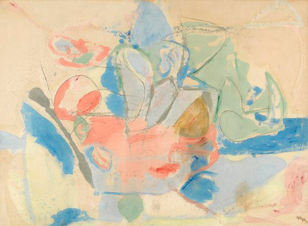
Helen Frankenthaler, Mountains and Sea, 1952 - Mountains and Sea
-
Mountains and Sea is a perfect example of Helen Frankenthaler’s technique of making works by staining, a process in which she poured thinned paint onto raw, unprimed canvas. This method results in fields of transparent color that seem to float in space, with the weave of the canvas emphasizing the flatness of the image. Her arrangements of colors and shapes often evoke the natural environment, and each work creates a unique visual space and atmosphere.
Read full audio transcript
NARRATOR:
Helen Frankenthaler visited Cape Breton, Nova Scotia, on the Atlantic coast in 1952. Inspired by its famed costal views, she came home and made this.
Molly Donovan, associate curator of modern art.
MOLLY DONOVAN:
What we’re looking at is certainly an abstraction, but it’s an abstraction that evokes a landscape. The light green edge that descends to the blue band can be really understood as a rocky shoreline that meets the water. And the blue splashes throughout the composition, could be seen as the Atlantic Ocean violently pouring over into the landscape.
NARRATOR:
Frankenthaler—just twenty-three at the time—was heavily influenced by artists like Jackson Pollock and their experiments in abstraction. But she pioneered her own style, pouring turpentine-thinned oil paint from coffee cans onto an unprimed canvas on the floor. The paint completely permeated the canvas, creating luminous pools of color.
About her canvases Frankenthaler once said, “...The thing was to decide where to leave it, and where to fill it, and where to say this doesn’t need another line or another pale of color. In other words, the very ground was part of the medium.”
MOLLY DONOVAN:
Very soon after it was made, two younger artists, Morris Louis and Kenneth Nolan, made a visit to Frankenthaler’s studio. Morris Louis was famously quoted as saying later that this work was a “bridge between Pollock and what is possible,” meaning that Frankenthaler took the example of Pollock painting abstract canvases on the floor, and she imbued this vocabulary with a fresh outlook through her staining technique.