

American Paintings, 1900–1945: Peinture/Nature Morte, c. 1924
Publication History
Published online
Entry
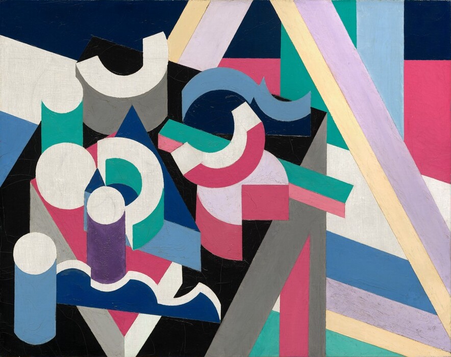
Peinture/Nature Morte is one of 25 related still-life paintings that Patrick Henry Bruce created in his Paris apartment from 1917 through 1930 . In this series, Bruce synthesized geometric forms in a shallow but legible pictorial space. The artist abstracted the horizontal plane in the Gallery’s painting from one of four antique tables he owned, only part of which is shown to suggest that it continues beyond the canvas. Although reduced to a balanced selection of geometric solids, the household objects depicted on the table are still recognizable: drinking glasses, mortars and pestles from the artist’s collection of African art, drafting tools, and wooden moldings and magnets used to secure drawings to a table or wall. All these objects are simplified to produce a composition in which specificity is irrelevant and formal relationships are emphasized. In this regard, Bruce’s composition shares traits with the avant-garde movement known as purism, whose leaders, Charles-Édouard Jeanneret (Le Corbusier) and Amédée Ozenfant, called for an art of synthesis in contrast to what they considered the disjointed, haphazard nature of analytic cubism.
A Virginia-born descendant of the Revolutionary War hero Patrick Henry, Bruce trained in New York with William Merritt Chase in 1901 and Robert Henri in 1903. During this formative period, he also spent time with friends Edward Hopper and Guy Pène du Bois. In 1903 he moved to Paris to continue his studies, returning briefly to the United States in 1905 to marry fellow artist and Chase student Helen Kibbey. The couple moved to Paris before the year’s end, and Bruce remained there for more than 30 years.
Bruce’s initial artistic explorations in Paris led him to the Musée du Louvre to study the old masters. Like his contemporaries who had studied with Chase, he honed his skills by copying portraits in the Louvre’s galleries, and his first exhibited works in Paris were full-length portraits inspired by these studies. He grew acquainted with the Paris school of modernists through Gertrude and Leo Stein, who introduced him to Henri Matisse. Bruce partnered with Gertrude and Leo’s sister-in-law Sarah Stein to organize the Matisse School, which opened in 1908. His involvement with the school brought him into daily contact with Matisse, who encouraged him to study the work of Paul Cézanne and Pierre-Auguste Renoir, two artists whose work remained extremely important to the American throughout his career. The palette of Peinture/Nature Morte—pinks, greens, pale yellow, purple, and blue—is testament to Bruce’s exposure to Matisse, as well as to his reading about the law of simultaneous contrasts, developed by 19th-century French chemist Michel Eugène Chevreul, which states that if two colors are juxtaposed, each will be influenced by the complement of the other. After 1912, Bruce’s work was exhibited and discussed in conjunction with that of the Orphic cubists Sonia Delaunay and Robert Delaunay, who promoted the idea that movement and recession in space could be created solely through contrasts of color.
Although Bruce’s career began with great promise and focus, his professional and personal stability unraveled over time. During the 1920s, when he painted Peinture/Nature Morte, he increasingly isolated himself. He wrote, “I am doing all my traveling in the apartment on ten canvases. One visits many unknown countries that way.” He did not have a dealer and was famously reticent. Bruce lost confidence in his abilities as he entered middle age and destroyed much of his work in 1933. His lack of direction was exacerbated by his struggle with failing health, financial difficulties, and a dissolving marriage. His only art world supporter of note was the French author Henri-Pierre Roché, who promoted Bruce and other avant-garde artists to American collectors (and to whom Bruce gave 21 still lifes from this late series, including this one, in 1933).
The serial approach that Bruce used when making Peinture/Nature Morte and the related still lifes was part of a larger trend in modernist painting, but it likely also reveals a more private process of personal searching. Given the difficulties Bruce was facing when he painted Peinture/Nature Morte, perhaps the series indicates the influence of his contemporaries and immediate predecessors, including Cézanne and Claude Monet, who used repetition to create meaning. Bruce’s sustained work on this series— from 1917 to 1930—may also indicate his continued longing for control. Peinture/Nature Morte belongs to the fifth and most compositionally complex of six stylistically distinct groups in this still life series; within each group, Bruce progressively removed one or two elements to distill and simplify the composition. Dating to about 1924, the four paintings in this group are characterized by an inverted V above the table and a background of pronounced geometric architectural elements. On a personal level, Bruce never achieved the sense of balance that these paintings worked toward; his life ended tragically in suicide when he was 55 years old.
Technical Summary
The painting is executed on a plain-weave, medium-weight canvas. The original tacking margins have not been retained, but the pronounced cusping toward the edges of the canvas probably indicates that the painting is very close to its original dimensions. The ground is a thin, smooth white layer that was probably applied by the artist. Although this is not certain, the strong cusping on the left side and the fact that the ground has been abraded by the artist strongly support this conjecture. The deliberately abraded white ground remains visible in a number of areas. The colored zones that make up the composition show a mostly smooth but slightly ridged texture, as if they were slathered on thickly with a palette knife. Some areas—such as the lavender section in the bottom right and the darker purple cylinder at the bottom left—have a much bumpier texture, perhaps indicating that they contain dried pieces of paint or had begun to harden when they were worked with the palette knife. In general, the sharp edges and geometric precision of the thickly applied colored zones strongly hint that they were painted with the aid of stencils or masking tape.
Pencil lines are visible in many places and seem to have served two purposes. Some lines, such as the arcs in the small circle at the bottom left, appear to represent the artist working out his composition; these may be more visible than they once were. In their 1979 catalogue raisonné, William C. Agee and Barbara Rose reproduce an early photograph of this painting showing pencil lines that are no longer visible. For example, in the lower center and at the top left there are lines that turned circles into the tops of cylinders. Agee and Rose (192–193) make a strong case that the latter pencil lines were added by the artist as part of his finished design, and were mistakenly removed in 1964–1965, before the painting was acquired by the Corcoran. Other pencil lines that appear to reflect the artist working out his design are visible in the left-hand portion of the design. Infrared examination shows all of the pencil lines described above, as well as many additional lines that are hidden under the thick paint of the design elements
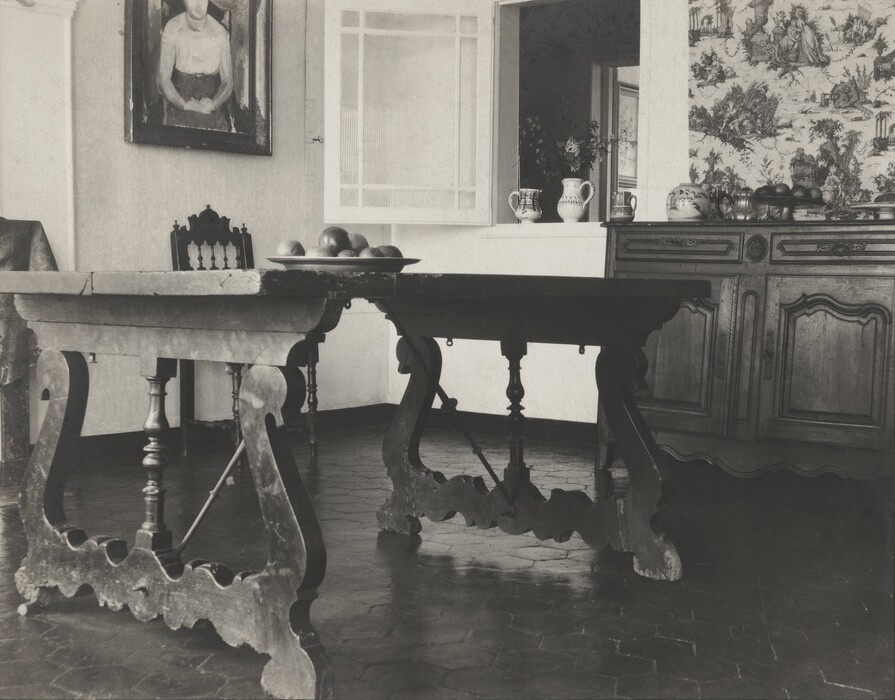 Courtesy of William Agee and B. F. Garber