
Pigment Alteration and Color Change
Publication History
Published online
Peer Review
This article has been peer-reviewed
Article DOI:
https://doi.org/test.1234On this Page:
Change is inevitable and usually irreversible. It is how we perceive the passage of time. Natural aging is unavoidable, and over time objects can acquire a mellow aspect and develop a patina that is admired. But accidents, poor environmental conditions, and inappropriate interventions cause unwanted and unintended physical and chemical damage to our tangible cultural heritage. In 1893, Umberto Rossi (1860–1896), the first director of the Musei di Bargello, described changes caused by damage and age in works he had recently added to the collection of the Museo nazionale di Firenze:
Three terracottas, reduced copies of Michelangelo’s statues in the sacristy of San Lorenzo, Dawn, Twilight, and Day, were transported here from the Accademia Gallery: extended display on a small table within reach has left them somewhat deteriorated; all of them are missing some fragments. They are the ones that Tribolo worked and that Vasari talks about: modeled with great care and colored by time with a beautiful brown patina, they look like small bronzes, also because the artist finished the heads and other parts that Michelangelo had left imperfect (fig. 1).
Fig. 1. Pericoli Niccoló Detto Tribolo (1500–1550), Giorno (Day), terracotta. Bargello Sculpture 315.
Quite aside from the visible changes that occur in objects, it is important to acknowledge our changing relationships with cultural heritage of all sorts, movable, immovable, and intangible. The aesthetics and ideas of the moment affect the way we think about worth and beauty. William Hogarth (1697–1765) intended his etching, Time Smoking a Picture (1761) (fig. 2), as a rebuke to the prevailing opinion of his era that the appearance of paintings improves as they age, and therefore artists ought to mimic its effects in their own works. Hogarth articulates his reasoning for rejecting this tenet in a long footnote in his book, Analysis of Beauty, decrying the idea that yellowed varnish and muted color improve paintings. I wonder what Hogarth might have said to Umberto Rossi about his description of Tribolo’s terracottas. The broken statue in his etching suggests that he would disagree with Rossi’s opinion.
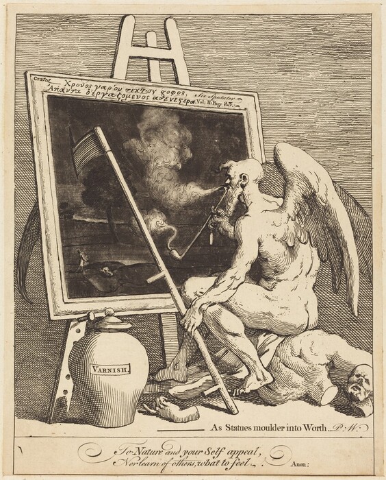
Fig. 2. William Hogarth, Time Smoking a Picture, 1761, etching and mezzotint, 22.5 × 18.1 cm, National Gallery of Art, Washington, Rosenwald Collection, 1944.5.121.
During my early experiences as a conservation scientist in the late 1980s, I saw conservators in front of easels, sweeping oversized, solvent-saturated cotton swabs over paint that came from the brushes of Titian, Velázquez, and Raphael. In intimate contact with old master icons, they were reinvigorating the original vividness of centuries-old works of art. Paintings looked so much better as they lifted the swabs loaded with grime, ancient and darkened varnish, and opaque, murky restorations from the painted surface to expose lively, clear-hued pigments (fig. 3). On one occasion a stale smell hung in the air as several conservators simultaneously used spit-moistened swabs to remove the yellow haze of tobacco smoke that covered a painting. The old smoke was activated. William Hogarth’s etching was figuratively and literally brought alive, and Time was dispatched to the waste can.
Fig. 3. François-Hubert Drouais, Family Portrait, 1756, oil on canvas, 244 × 195 cm, National Gallery of Art, Washington, Samuel H. Kress Collection, 1946.7.4. Detail during removal of deteriorated, browned varnish by Joanna Dunn.
Environment
We cannot outrun time, but conservators and curators who care for collections do everything they can to minimize change and maintain the works of art in the best condition possible. Experience shows that artifacts and painted surfaces are preserved best in stable environments where temperature and humidity change gradually and only a little, and light exposure is minimized. Artworks from collections in London that were stored in dark, air-conditioned slate quarries to protect them from bombing during World War II were in unexpectedly good condition at the end of the war. However, though the mines offered a stable environment, the collection was inaccessible to all but a few people. Finding a good balance of exhibition and access in the preservation of works of art is a challenging, sometimes fraught effort that involves many stakeholders who have different and evolving points of view. Today’s stewards of collections face the same situations as in the past, dealing with requests from competing constituencies that have different expectations. In 1885–1886, the London public advocated for more access to the National Gallery and other museums, demanding that the institutions remain open in the evenings. The director of the National Gallery issued a report on behalf of the trustees decrying the suggestion. He made his case by citing the damage to the collections caused by the polluted city air, the humidity exhaled by visitors and the nasty emanations from their damp woolen coats, and the noxious gases produced by gas lighting that would be required for evening viewing, to say nothing of its inherent danger. His arguments were overruled by members of the House of Lords, and the museums were opened three nights a week. Museumgoing was popular, and galleries were crowded, overheated, and stuffy (fig. 4).
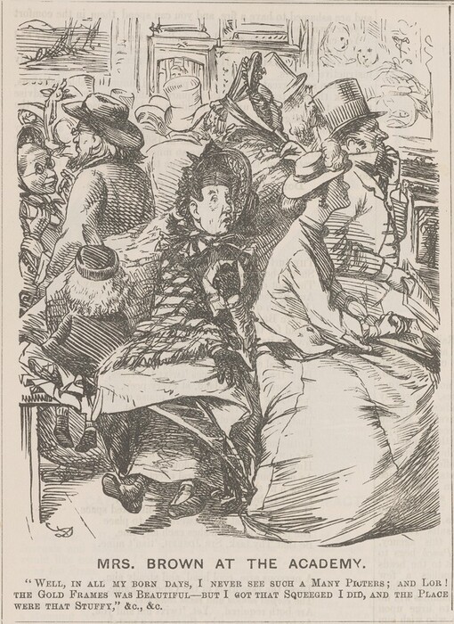
Fig. 4. Charles S. Keene, Mrs. Brown at the Academy, published in Punch 47 (July 9, 1864): 20.
The National Gallery of Art in Washington is the first museum with air-conditioning incorporated in its design from inception. It was installed for the dual purpose of “comfort of visitors and the preservation of the art works.” Nathan Stolow (1928–2016), a Canadian conservation scientist, visited the National Gallery in March 1957. In a record of his visit, he wrote that the gallery was fully air-conditioned twenty-four hours a day, and, notably, he observed that the condition of the panel paintings was very good. To maintain a stable environment, a great deal of effort goes into designing HVAC systems that can react to large spaces filled with heat from daylight, lamps, and people without big swings from set values of temperature and humidity.
In 1886, a brouhaha related to the demand for public access to museums erupted over the perceived fading of important English watercolor paintings that were exhibited at the Victoria and Albert Museum, then called the South Kensington Museum. The museum was accused of allowing the watercolors to become ruined, owing to overexposure from constant, uninterrupted display for decades. This complaint, sometimes occurring in letters to the editor of the London Times, resulted in the establishment of a working scientific committee to investigate the stability of pigments under a variety of conditions that included high humidity, anoxic (oxygen-free) atmospheres, and pollutants from gas lamps. The study, commissioned by Parliament, concluded in 1888 with the publication of a report, The Action of Light on Water Colours, submitted to the Science and Art Department of the Committee of the Council of Education. The report is an extraordinary example of the application of a comprehensively designed scientific investigation into pigment stability, with lists of the relative permanence of pigments under varying experimental conditions. The exhaustive study concluded that changes to the watercolor paintings in the South Kensington galleries would not be visible until after a century of display—with the caveat, “if painted with any but the most fugitive colours.” At this time, the highly regarded English chemist Arthur H. Church (1835–1915) had already been studying pigment permanence for several years. His book, The Chemistry of Paints and Painting, first published in 1890, identifies pigments deemed permanent. Church’s book was highly influential and widely read by color-makers and artists who wanted to provide and use stable colorants. In 1872, in Germany, concern over the deterioration of new civic wall paintings gave Adolf Wilhelm Keim incentive to form the Deutsche Gesellschaft zur Beförderung Rationeller Malverfahren (German Society for the Promotion of Rational Painting Techniques). The society produced recommendations for painting that included lists of permanent pigments. Later it became associated with the Institute for Technology at Munich (the precursor of the Doerner Institute), and its work aimed to have a broad impact, intending to influence how artists and chemists thought about the longevity of pigments and color. Ultimately, the work undertaken by the society changed how museums viewed permanence. These nineteenth-century endeavors to study color change were critical in the development of conservation science and preservation in Europe. Today the effects of light on materials are scrutinized. How our reception of the works depends on the color temperature and intensity of light is also being studied so that we can enjoy viewing artworks safely.
Impermanence
In addition to the possible harmful effects of poor environmental conditions on the physical integrity of objects, such as cracking or flaking, chemical factors contribute to aging and change in art and artifacts. All the materials in works of art, including pigments, dyes, fibers, binding media, alloys, plastics, and adhesives, degrade because they are inherently unstable to greater or lesser extents. Many chemical reactions are occurring slowly though inevitably; for example, natural and synthetic polymers lose plasticity because of oxidative cross-linking reactions or become brittle, powdery, or sticky because of depolymerization. Some pigments are readily oxidized; others are sensitive to the effects of acids or bases.
To make paint, pigments are bound in a vehicle that can be egg yolk, a gum, a drying oil, or many other carriers. These binders can be protective, or they can be bad actors. We measure the performance of colorants as pure compounds; however, it is important to assess their behavior as part of a composite because individual components within paint can react with each other. Current standards for measuring permanence specify that artists’ pigments are to be evaluated in a binding medium since we know that the binder can influence their permanence.
The reaction between metal ions from pigments and fatty acids in oil binders leads to the formation of metal carboxylates, compounds that are chemically like bar soap. This reaction was well documented in the nineteenth-century technical literature, but it was barely recognized in the art conservation community forty years ago, likely because its physical manifestation in oil paintings takes a long time. Today soap formation is known to be prevalent in oil paintings. My own experience illustrates the development of our awareness of the phenomenon. Joyce Plesters, a scientific officer at the National Gallery, London, had a remarkable eye. She taught me how to look at the surface of paintings and cross-section samples to identify pigments. She showed me how to recognize lead tin yellow by its resemblance to a microscopic honeycomb candy (a Crunchie). Sometime later, I was asked to look at a Dutch breakfast painting because of the very granular surface of a wine-filled façon de venise glass. There were small spherical bumps all through the paint, and I said with certainty that it was typical for lead tin yellow (fig. 5). In hindsight, this was quite wrong. Before the extensive research into soap formation, I did not know that I was looking at macroscopic eruptions of lead carboxylate complexes that had formed in the yellow paint. Plesters would have been the first to insist that we must revise our assumptions and change our conclusions about what we are seeing as our experience grows. The formation of metal carboxylates (lead, zinc, copper, calcium, and many more) causes changes in surface texture, as I learned. It also often leads to physical problems in paintings such as delamination. When lead soaps aggregate, the paint surface becomes bumpy, as seen in figure 5. A later consequence is the development of small craters that become filled with dirt and varnish. Furthermore, as the pigment transforms, paint becomes increasingly translucent and color diminishes.
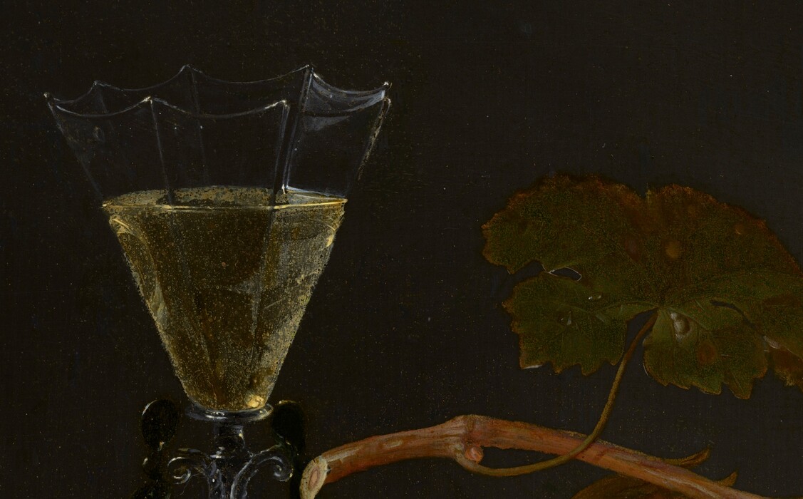
Fig. 5. Jacob van Walscapelle, Still Life with Fruit, 1675, oil on canvas, 40 × 34.7 cm, National Gallery of Art, Washington, Juliet and Lee Folger / The Folger Fund, 2001.71.1. Detail.
Pigment (In)Stability
Pigment alteration is only one facet of the many changes that occur in art over time. It has a profound effect on the appearance of painted and colored artworks, but the complexity of factors involved in alteration and deterioration is great, and there is much to learn about change. Artists’ colorants are derived from different chemical families, and their responses to environmental conditions and chemical stimuli vary so widely that it is difficult to deal with the topic comprehensively. There is a lot to consider: Colorants react with water vapor, oxygen, and volatile acids, and they undergo thermal disassociation, hydrolysis, and decomposition due to photochemical reaction. They are sensitive to gaseous pollutants and biological action. They react with binders and with the other components used in making the artists’ materials and in creating artworks.
Building our knowledge of the factors that initiate chemical reactions and color change is ongoing work. We must continue to develop this knowledge so as to recognize change and either accept it or aim to prevent it. Understanding the reasons for pigment instability allows us to improve preservation strategies, predict the long-term effects of exhibition and storage conditions, and consider the consequences of conservation treatments.
Conservation scientists are making considerable progress in understanding the reactions that lead to pigment change. Among the valuable summaries in the literature, Alessia Coccato and colleagues published a comprehensive survey of effects of environmental and other triggers that cause inorganic pigments used during the medieval period to degrade and change appearance. David Saunders and Jo Kirby’s work remains exemplary for describing the effects of humidity on pigment alteration and light-induced color change in paintings. Costanza Miliani and colleagues reviewed the causes and effects of photochemical deterioration of pigments. Artworks have been sealed in oxygen-free packages to prevent color change. However, the myriad interactions among pigments, binders, and supports means that though this strategy protects many pigments, counterintuitively, a few are more likely to change under these conditions.
Color change in artworks receives a great deal of attention from artists, conservators, art historians, and scientists. We are curious about how images, messages, and ideas carried within objects via color become obscured and even erased as hues shift and then disappear. These alterations affect artists’ carefully constructed balance of color relationships and therefore affect reception of the aesthetic merit of their work. Recent advances in instrumentation have enabled characterization and identification of minute remnants of colorant. This capability, coupled with our growing body of knowledge about the ways artists employ pigments, allows us to begin to imagine the original appearance of works with a better-informed if still imperfect perspective. The insights we gain from knowing how change has occurred can be as simple as gaining a sense of the proper colors in heraldic devices and flags, which is useful for attribution and dating works, or as subtle as intuiting figures’ complexions.
There is a long history of commentary on pigment deterioration and color change. The Roman architect-engineer Vitruvius (c. 80–15 BCE) warned that the red pigment vermilion discolored in bright light. He wrote, “In open places, such as peristylia or exedræ, and similar situations whereto the rays of the sun and moon penetrate, the brilliancy of the colour is destroyed by contact with them, and it becomes black.” Theophrastus (c. 370–287 BCE) and the naturalist Pliny the Elder (c. 23–79 CE) also gave interesting examples of color change, but they did not write from the perspective of a practicing painter. Cennino Cennini (c. 1360–1427), a Florentine artist writing around 1400, was among the first early modern painters who described the instability of painting materials. He reported that some pigments, for example, saffron, fade quickly; he warned about adverse interactions that occur between certain pigments, naming verdigris and lead white, and said that red lead and vermilion tend to darken; he recorded that some combinations of pigments and binders are incompatible; and he noted that preparation methods influence pigment stability. His advice was repeated often by later artists.
Painters anticipated that pigment fading, darkening, and discoloration would change the look of their work and affect viewers’ evaluation of its merit because tonal balance and relationships would be altered—though they could not account for the influence of changing aesthetic preferences. Artists have proposed many ways for preventing, or at least minimizing, visible changes in their works, so many that they seem capricious and even baseless. However, some of the disparate-appearing recommendations are designed to decrease oxidation and photo-oxidation, while others try to account for the inevitable effects of visible change over time. To anticipate change, some eighteenth-century French painters’ manuals advised applying yellow lake glazes as a final layer on paintings to unify fresh colors that tended to deepen over time.
Margriet van Eikema Hommes compiled comments and advice for painters from many fifteenth- to eighteenth-century sources that offer all sorts of ways to mitigate change. For example, painters could mix lead white pigment with walnut or poppyseed oil in place of the usual linseed oil since it visibly yellows quite quickly, and they ought to apply a local varnish to verdigris paint as soon as it is touch dry. Early modern artists were keenly aware that purity was an important factor in determining pigment stability, and many treatises advised artists to use the highest-quality pigments they can find to ensure their colors remain bright and lively.
Several hundred years later, Vincent van Gogh wrote about color change in correspondence to his brother and his friends. In one letter, he is quite specific about the materials and methods he uses to foresee and accommodate change.
Don’t let it bother you if I just leave the brushstrokes on my paintings as they are, with smaller or larger protrusions of paint. This doesn’t mean a thing—if one leaves them a year or so (or half a year is enough) and scrapes over them quickly with a razor blade, one gets much more permanency of colour than would be the case if the paint were put on lightly. If a painting is to remain good and keep its colours, it’s important that the light areas, in particular, are painted on heavily. And both the old masters and the French painters of today have done this scraping off. I believe that glazes of a transparent colour often sink in altogether and disappear over time if they’re applied before the painting in its preparatory phase is thoroughly dry, but applied later, they really do endure.
In the same letter, he adds, “I don’t know what to think about the chromates and madder, but I can well imagine that some, particularly American sunsets—you know those sorts of paintings that are obtained with glazes of chromates—last a terribly short time.”
Preventive methods to stop change, such as applying coatings that act as moisture barriers, have been proposed by many artists and critics. For example, Vitruvius, who bemoaned the blackening of vermilion, advised applying an oil-wax coating to protect it from damp air. Miniature painters might add alum or camphor to paint or a coating to inhibit biodeterioration. Although painters’ observations are anecdotal, they provide context for our analytical findings, inform us about how to look for change that has occurred, and suggest research topics and historical studies. Some pigments, such as vermilion, orpiment, and indigo, were scorned for centuries, even millennia, for being especially changeable. However, we have discovered that these pigments were very widely used. Artists everywhere used them despite their known impermanence. The yellow and red lake pigments, insoluble colorants made using colored aqueous extracts of plants or animals, that are so useful for their wide range of colors and translucency in oil bleach on exposure to light, but nothing could take their place on the artists’ palette. The ancient, manufactured pigment verdigris darkens to a disagreeable brown, but it was indispensable in mixtures for making a variety of greens used to depict fabrics and foliage. Nineteenth-century inventions, including cadmium yellow, chrome yellow, and most of the novel synthetic organic pigments, are prone to rather rapid discoloration or fading. The chromate yellows that Van Gogh mentioned, a mainstay on the impressionists’ palette, are unreliable; some sorts, especially the lighter and brighter varieties, lose their brilliance and discolor to brown and green hues over time, particularly when exposed to light (fig. 6). The highlights on Claude Monet’s Rouen Cathedral, West Façade, Sunlight that depicted the speckled pattern of reflections from the cathedral are brown instead of the lively yellow color of sunbeams (fig. 7). They were painted using cadmium yellow that has discolored.
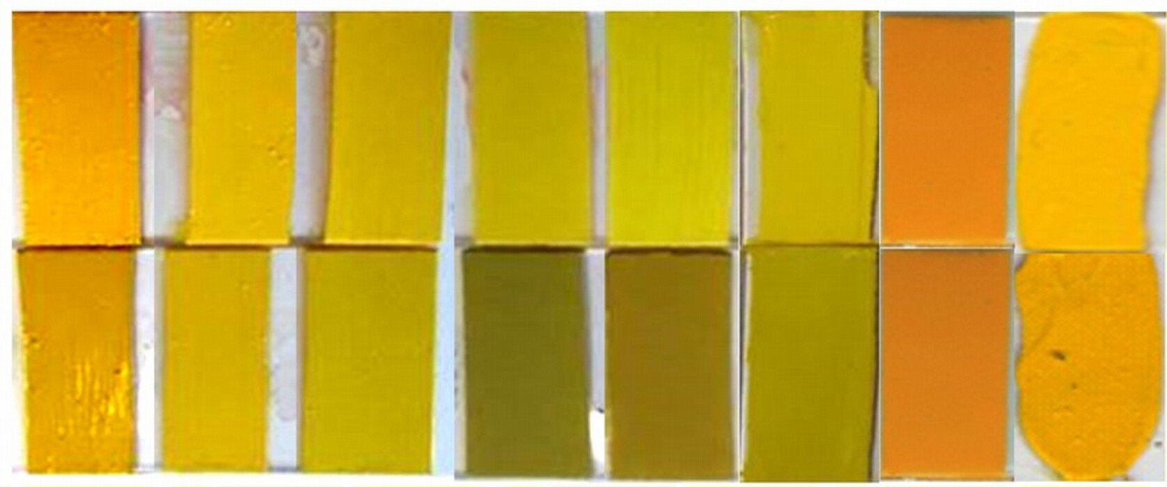
Fig. 6. Chrome yellow pigments before (top row) and after (lower row) light exposure. Courtesy Letizia Monico.
Fig. 7. Claude Monet, Rouen Cathedral, West Façade, Sunlight, 1894, oil on canvas, 100.1 × 65.8 cm, National Gallery of Art, Washington, Chester Dale Collection, 1963.10.179. Detail.
A convenient way to look at the relative stability of related pigments is to graph measured and/or calculated thermodynamic data obtained at various conditions and draw relative or field stability diagrams. These graphs help us see the conditions under which pigments are stable and unstable. The lines on field stability diagrams indicate the conditions where two compounds are equally stable, and the areas bounded between lines indicate the locus of conditions where one compound is stable relative to others in the system. The generalized diagrams given here are a qualitative—not quantitative—guide to determining regions of conditions where pigments are stable. They are based on thermodynamic equilibrium calculations, and though the data were obtained in systems that are very different from paint, they are useful for thinking about pigment stability. The examples of azurite and lead white given next show how we obtain clues about the stability of pigments from field stability diagrams, though we must remember that paint is a complex material.
Azurite and malachite
Azurite and malachite are formed in conditions far from those that scientists regard as NTP, or normal temperature and pressure, that is, 20°C and 1.0 atmosphere (101.325 kPa). They occur as secondary minerals, formed from other copper ores in an oxidative environment. When azurite loses carbon dioxide, malachite forms:
2[Cu3(CO3)2(OH)2] + H2O ⇋ 3[Cu2(CO3)(OH)2] + CO2
Both azurite and malachite can decompose into copper(II) oxide:
Cu3(CO3)2(OH)2 → 3CuO + H2O + 2CO2
Cu2(CO3)(OH)2 → 2CuO + H2O + CO2
Figure 8 is a simplified field stability diagram of the system Cu2+–CO2–H+, showing the thermodynamic equilibrium relationships of blue azurite (Cu3(CO3)2(OH)2), green malachite (Cu2(CO3)(OH)2), and black tenorite (CuO) over a range of pH and partial pressures of carbon dioxide (CO2). The concentration of CO2 in air (partial pressure, P, 3.9 × 10⁻⁴ atm) is indicated by a horizontal dotted line. The diagram shows that neither azurite nor malachite ought to be stable at NTP, owing to the low partial pressure of carbon dioxide in the atmosphere, and, in fact, these mineral pigments are metastable. From the relationships of the fields on the diagram, we see that at ordinary conditions azurite is less stable than malachite and that both are unstable with respect to tenorite. In damp conditions, copper ions, Cu2+, can leach slowly from azurite and malachite because the minerals are very slightly soluble in mild acids. If dissolution happens, tenorite may form since it is the most stable phase over a wide pH range and blues darken. Dark passages of azurite in wall paintings are evidence of the effect of hundreds of years of extremely slow change. Oil or tempera binding media seem to protect the pigment from change at rates we can observe.
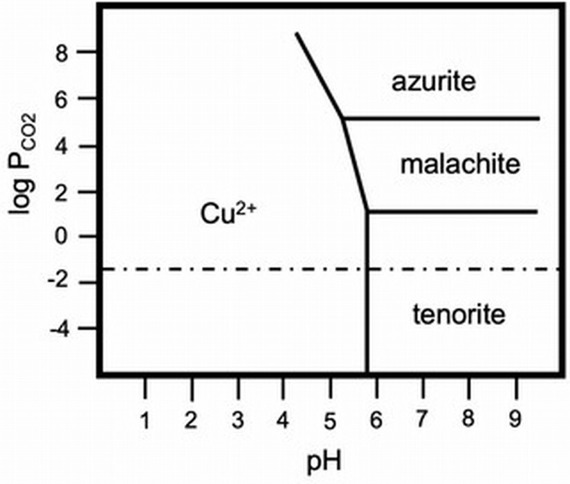
Fig. 8. Field stability diagram for the H2O–CO2–Cu2+ system at room temperature and copper (II) concentration of 0.1 mM. The horizontal dotted-dashed line is the partial pressure of CO2 at normal conditions. Adapted from Irina A. Kiseleva, Lyubov P. Ogorodova, Lyubov V. Melchakova, Mira R. Bisengalieva, and N. S. Becturganov, “Thermodynamic Properties of Copper Carbonates: Malachite Cu2(OH)2CO3 and Azurite Cu3(OH)2(CO3)2,” Physics and Chemistry of Minerals 19, no. 5 (1992): 322–333.
Conversion of azurite into tenorite is exceedingly rare in panel paintings, and the darkening of azurite in tempera and oil paint seems to have different causes, among them, perhaps, the reaction between azurite and oil. The blue background of Michele Giambono’s St. Peter, circa 1465 (fig. 9), has changed for another reason. It was entirely repainted in the nineteenth or twentieth century; zinc white in the paint, in use only after about 1800, gives us this time frame. We do not know why the background was replaced. Perhaps there was an alteration in or damage to an azurite background that was unacceptable at the time so it was completely removed. It is also possible that much earlier an unscrupulous artist had scraped off costly ultramarine for reuse. Whatever the reason, the background of Giambono’s painting is not quite the color we expect to see on a fifteenth-century painting.

Fig. 9. Michele Giambono, St. Peter, 1445/1450, tempera on poplar panel, 88.7 × 35.9 cm, National Gallery of Art, Washington, Samuel H. Kress Collection, 1939.1.80.
The presence of additional ions or compounds can have a significant effect on pigment stability. In the case of azurite, salt migration through masonry causes its conversion into green compounds. When chloride salts react with azurite, hydroxy copper chlorides, bluish-green or green compounds, form. This occurs because if chloride ions are present, the hydroxy copper chlorides are more stable than malachite or azurite when the pH is neutral or acidic. The color change caused by a blue to green conversion can be dramatic, as for example in the Virgin’s robe in a wall painting in the apse of the Church of the Virgin Mary in Mӑlâncrav, Romania (fig. 10). There are instances where green hydroxy copper chlorides were used intentionally as pigments, and as we learn more about the variety of artists’ choices, we are able to distinguish altered pigments from artists’ intentional use of green copper minerals and artificial green pigments.
Fig. 10. Wall painting in the Church of the Virgin Mary, Mӑlâncrav, Transylvania, Romania. Detail. Note the color change of the Virgin Mary’s mantle from blue to green due to formation of hydroxy copper chlorides. Photograph David Hradil.
Azurite is not thermodynamically stable at NTP, but there are kinetic barriers to its transformation into more stable compounds. Metastable pigments such as azurite do, in fact, last over very long periods, and field stability diagrams remind us to choose storage and exhibition conditions and treatment protocols that do not stimulate unwanted changes.
Lead-based pigments
Fresh surfaces of lead oxidize, though the process stalls in moderate conditions when the metal becomes protected by a passivating layer of corrosion. The route for production of lead white, one of the first manufactured pigments, exploited this. Theophrastus gave a recipe that described a protocol that changed little over subsequent centuries. The pigment is obtained by a series of steps that begin with oxidation of lead metal coils, sheets, or buckles that are set in a stack where there is a source of acetic acid, either liquid or vaporous, to cause the oxidation of lead and the formation of lead acetate. Fermentable material in the stack, such as dung or wine, or burning a fuel within the stack creates a warm environment enriched in carbon dioxide to promote the formation of a variety of lead hydroxy carbonate compounds—namely, cerussite, hydrocerussite, and plumbonacrite. The very low solubility of lead carbonates in near-neutral pH environments drives the reaction in the lead stacks from lead acetate toward the lead white pigment.
Lead white pigment in early modern paintings often contains a high proportion of hydrocerussite compared to cerussite, though the proportion varies considerably. The thermodynamic equilibrium between cerussite and hydrocerussite is dependent on acidity (pH), temperature (T), and the partial pressure (P) of carbon dioxide, and therefore on the conditions in the stack, and it is also dependent on the procedures used to work up the corrosion product to make a useful pigment (fig. 11a). Literature values for the formation energy of the various lead carbonate phases vary widely. Some authors suggest cerussite is the dominant, more stable phase in acidic environments, up to the slightly alkaline pH 8.4. The presence of other ions, such as calcium, affects the ratios of the compounds. The diagram in figure 11a shows that the stability fields of cerussite and hydrocerussite move significantly when the temperature changes from 25°C to 100°C. The influence of other ions on the “activity” (a) of lead ions in paint films compared to the concentration (c), and hence the relevance of stability field diagrams to our study of the stability of lead white within paint films is for all practical purposes impossible to determine precisely. Conservators’ instincts about paint are based in looking at and treating many works of art, and their observations are invaluable for recognizing that paint behaves differently from the textbook reactions of its separate components. The discoveries of plumbonacrite in oil paintings, a lead carbonate phase that is thermodynamically stable in only a narrow range of conditions and possibly other phases too, are evidence that the chemical environment of paint is not easily predictable from literature values or experiments in a beaker.
Lead white and other lead-based pigments, for example, red lead, sometimes darken and become quite brown or even black. Dramatic color changes have been noted in works on paper and parchment, in wall paintings, and, less frequently, in oil paint. The alteration is so disfiguring that Filipo Baldinucci, author of Vocabolario Toscano dell’arte del disegno, a dictionary of terms for craft and art first published in 1681, includes specific instances of lead white applied a secco in wall paintings turning black in his definition of biacca, the pigment lead white. In wall paintings, the dark phase that forms when lead white (and also red lead and litharge) oxidizes is plattnerite (PbO2), although phase diagrams suggest that plattnerite is stable only in highly oxidizing and highly alkaline conditions (fig. 11b). Perhaps the high concentration of calcium is influencing the stability fields of the lead carbonates. Plattnerite can be reduced using chemical methods or laser irradiation to restore some lightness to the paintings. A different reaction is responsible for the darkening of lead white highlights on drawings or paintings on paper or parchment. In these cases, the black phase is usually galena (PbS), which forms by reaction with sulfur or sulfide ions in the air and is stable compared to the carbonates over a wide range of conditions (fig. 11b). White highlights on Sandro Botticelli’s metalpoint drawing on prepared paper, Head of a Youth Wearing a Cap; a Right Forearm with the Hand Clutching a Stone; and a Left Hand Holding a Drapery, 1480/1485 (figs. 12, 13), became noticeably darkened and disfiguring. The decision was made to oxidize the galena to lead sulfate (PbSO4), a stable white compound. Through treatment, the color change was reversed, but the original pigment was not re-created. We are not turning back the clock.
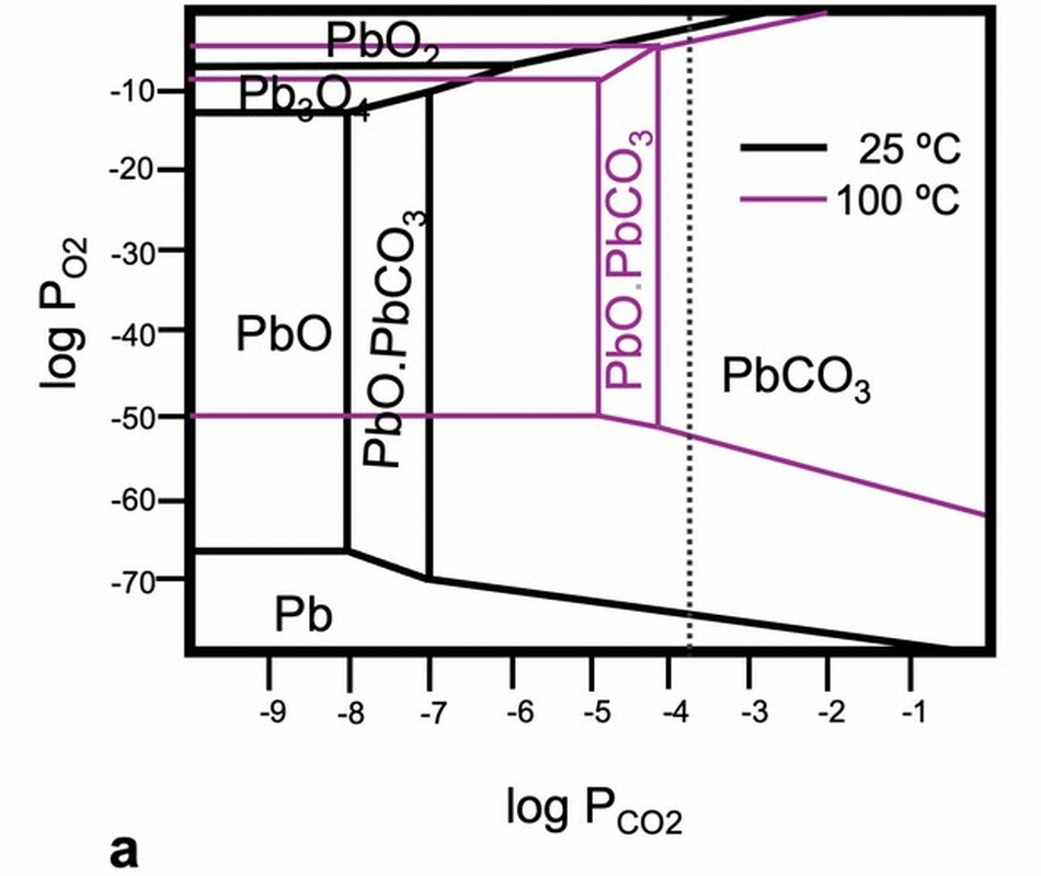
Fig. 11a. Field stability diagram for Pb-CO2-H2O. The dotted-dashed line represents the partial pressure of CO2 at normal conditions. The lines denoting equilibrium between lead complexes were calculated at two temperatures, 25°C (black) and 100°C (magneta). Adapted from Nicolai R. Lobanov, David C. Weisser, and Nicholas J. Welham, “Re-Plating the Anu Linac,” Paper presented at conference “RF Superconductivity,” September 6–11, 2002, Tsukuba, Japan.
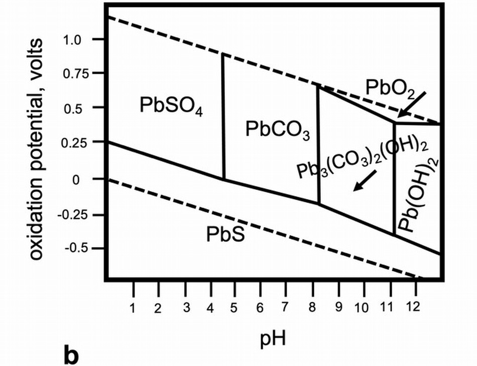
Fig. 11b. Field stability diagram of the system containing lead-sulfur-oxygen in air. Water is stable with respect to oxygen and hydrogen between the sloping dashed lines. The fields of stabilty for a system containing lead, sulfur, water, and air are shown. The alteration products of lead white found in wall paintings (plattnerite, PbO2) and drawings (galena, PbS) are stable at very different conditions. Adapted from Richard T. Wilkin, Patrick V. Brady, and Douglas B. Kent, “Lead,” in Monitored Natural Attenuation of Inorganic Contaminants in Ground Water, edited by Robert B. Ford, Richard T. Wilkin, and Robrt W. Puls (Ada, OK, 2007), 13.
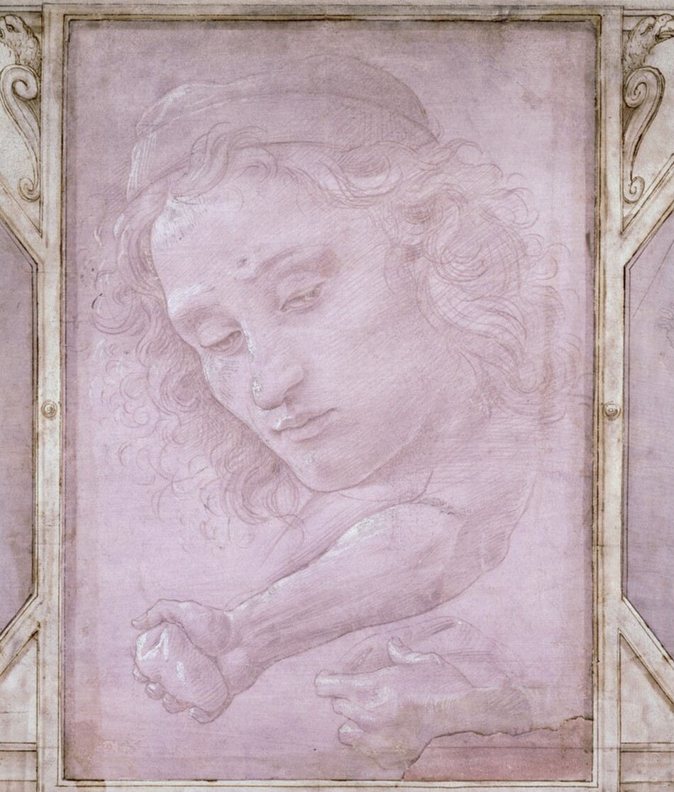
Fig. 12. Sandro Botticelli, Head of a Youth Wearing a Cap; a Right Forearm with the Hand Clutching a Stone; and a Left Hand Holding a Drapery, 1480/1485, metalpoint heightened with white gouache on mauve prepared paper, 28.7 × 20.1 cm, National Gallery of Art, Washington, Woodner Collection / Patrons Permanent Fund, 1991.190.1.a.
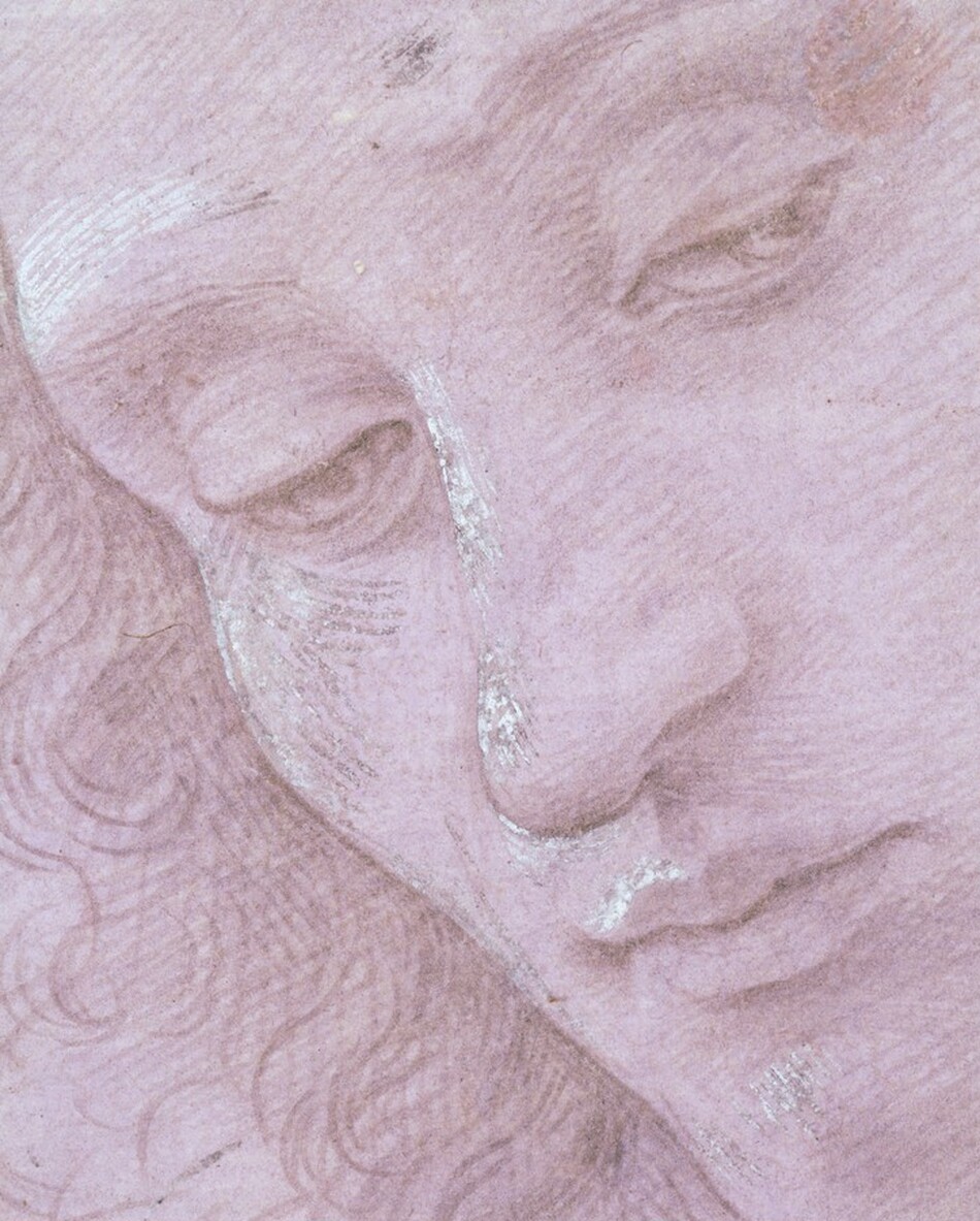
Fig. 13. Detail of figure 12 taken before 1998–1999 treatment. Note the darkened hatching on the proper right temple, the nose, and the chin.
The stability field diagrams for systems that contain Pb, CO2, and H2O show that lead carbonates are soluble in mildly acidic environments. This solubility leads to instability. Eugena Ordonez and John Twilley characterized the hazy coatings they found on works of art, and although the majority were blooms of fatty acids, they found cotunnite, PbCl2, in crusty surfaces on two paintings. They described the salt as an inorganic efflorescence to indicate that it had formed at the paintings’ surfaces owing to the transport of ions through the paint film. It is important to recognize that ions do in fact move through hydrophobic oil paint films, and the changes occurring due to this kind of transport are only beginning to be studied in depth. Cotunnite and a rare lead compound, challacolloite (KPb2Cl5), were found on the flesh paint of Christ in Pietà (1943.4.70), a glazed and painted terracotta sculpture by Giovanni della Robbia, c. 1510/1520. The small, glittering crystals of challacolloite stood proud of the surface and must have formed as an efflorescence. There is no information for the source of potassium that is in the challacolloite or any evidence that the sculpture got wet, but the crystal formation is clear evidence that paint is a dynamic system and there is ion mobility.
Soap formation, described earlier, is one reason that lead-containing paint is different from other paints. Lead soaps provided paint films that were durable (elastic) and more water-resistant than others. Georges Petit, a civil engineer, quotes a Belgian chemist, Stas, “It is wrongly imagined that white lead paint is a mixture of a white powder with oil and that, consequently, it is possible to replace white lead by any other white powder mixed with oil, with oil rendered siccative if need be.” However, over the life of a work of art, which is much longer than an industrial application, soap molecules slowly migrate and aggregate, leading, eventually, to a surface pocked with small holes or dotted with translucent pustules. Our understanding of these pustules has changed over the past decades. It was thought they were globules of excess medium, or droplets of oil-egg emulsions, or translucent particles, perhaps coarse sand, added to impart texture and visual interest. The soap reaction is a simple one, but the effects in paint films are consequential, affecting the physical and aesthetic integrity of artworks.
Light
Some pigments are very sensitive to light and rapidly change on exposure. Although fugitive synthetic and natural organic pigments are notoriously susceptible to fading, many inorganic pigments are affected by light, including some that are used frequently, such as vermilion, orpiment, chrome yellow (see fig. 6), and cadmium yellow. Some are inherently unstable, but impurities from the raw materials used to prepare the pigments or from manufacturing processes act as catalysts or promoters of the significant changes. Measuring the light sensitivity of works of art has been used to predict how they might change on exposure to light. The results are essential for making decisions about access and preservation of our cultural and artistic assets. The case studies presented here are typical examples of the changes that pigments undergo under the influence of light.
Natural lake pigments
Natural yellow and red lake pigments and dyes have been prepared from local plants and insects for millennia. When trade networks offered new sources of raw materials that provided higher yields, brighter colors, and more stable pigments, the commercial use of native materials was supplanted by imported color. We likely underestimate the prevalence and possible brilliance of traditional colorants and color in vernacular artifacts as paint that once may have been richly hued is now pale and dull.
Until the introduction of synthetic colorants, color-makers prepared natural organic yellow pigments using berries from buckthorn, leaves and twigs from fustic or weld and other native plants, or resins such as gamboge. Yellow lakes were added to natural earths to enliven their hue. Artists mixed yellow lakes with other pigments or used them in translucent glazes to make orange and green, but the colors shift as the lakes fade. Sometimes we are hardly aware that there has been a change over time, but it is easily recognized in paintings where the foliage appears blue because we expect leaves to be green. However, alterations from green to blue have occurred in places where we find blue perfectly acceptable, such as has occurred in Jean-Baptiste Greuze’s portrait Ange Laurent de La Live de Jully, painted probably in 1759 (fig. 14). The subject is portrayed sitting on a chair upholstered in damask silk and playing his harp. A small sample of the paint from the cushion shows the top layer of the paint for the upholstery contains ultramarine and a lot of chalk (fig. 15). Chalk frequently indicates lost yellow because it is an integral part of the preparation of lake pigments. Examination of samples from La Live using fluorescence microscopy shows that there are colorless particles in the blue paint that emit yellow light under violet-blue illumination. Their emission spectra are like those of fresh yellow lakes (see fig. 15), which indicates that the damask on the chair was painted using a mixture of ultramarine and yellow lake, likely buckthorn, which Greuze lists in his painting notes using its pigment name, stil de grain. The upholstery was green, though its exact hue is impossible to know. Dyers’ workbooks contain names for green fabrics that cover the gamut, from parrot green to olive green and many blue-green turquoise shades.
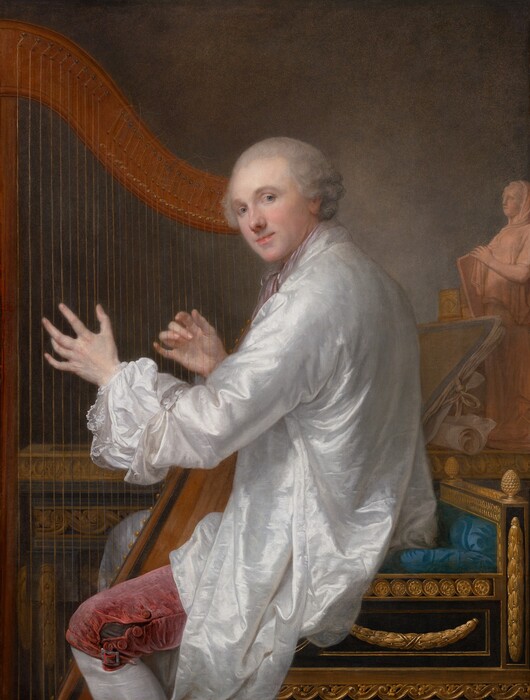
Fig. 14. Jean-Baptiste Greuze, Ange Laurent de La Live de Jully, 1759, oil on canvas, 117 × 88.5 cm, National Gallery of Art, Washington, Samuel H. Kress Collection, 1946.7.8.
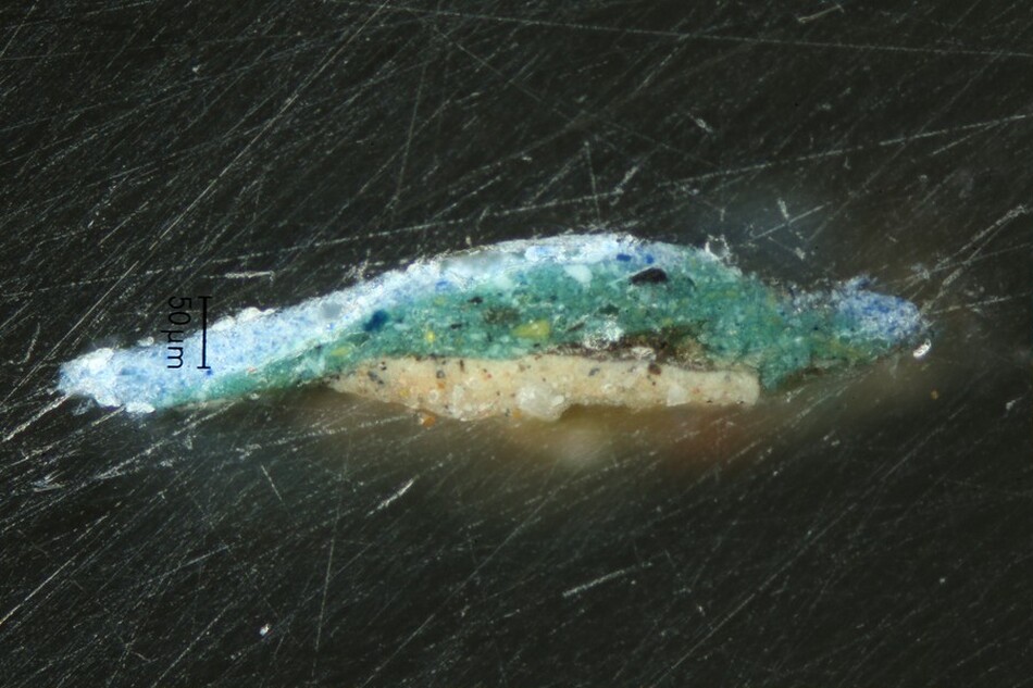
Fig. 15a. Cross section (photographed at 20×) from the blue upholstery in Ange Laurent de La Live de Jully (fig. 14). The top layer of bright blue paint contains ultramarine and chalk, which was a base for a yellow lake.
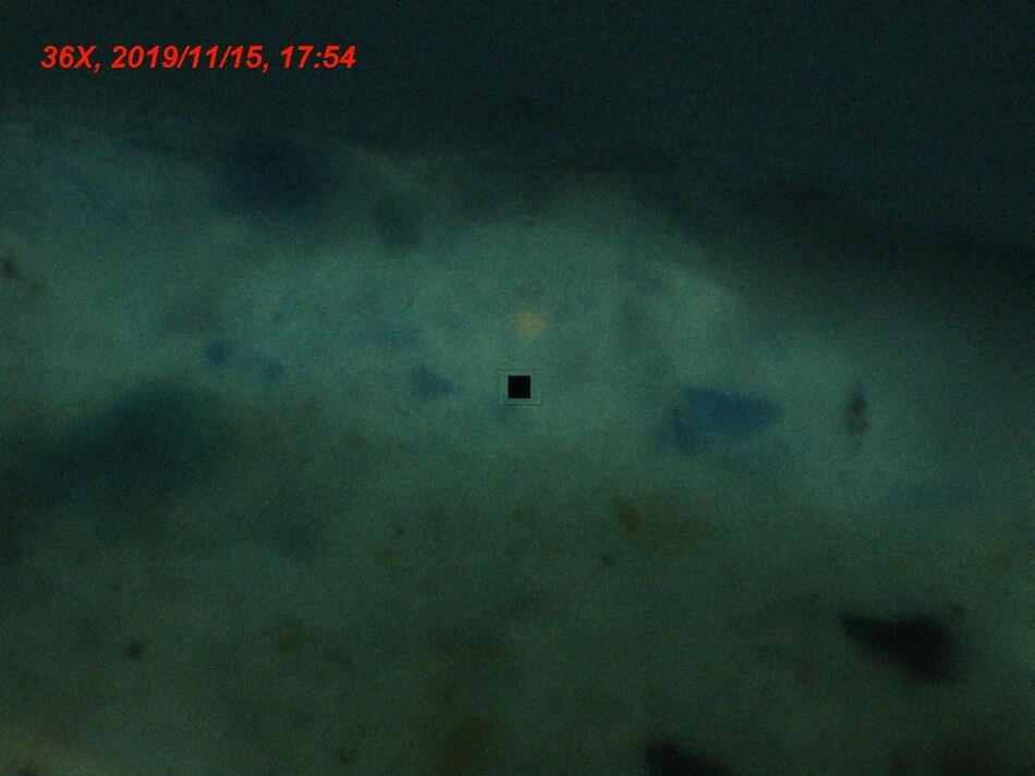
Fig. 15b. Cross section imaged using the Craic microspectrophotometer (photographed at 36×). The black square is the analysis area.
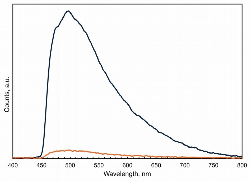
Fig. 15c. The black trace is the emission spectrum of a particle that appears colorless but has enough remaining lake molecules to observe yellow luminescence. The orange spectrum is a background emission obtained adjacent to the particle that emits yellow.
Red lakes are used with blue pigments to provide a host of violet and purple hues, but loss of red color moves the spectrum to blue. Cennini was aware that formulation of red lake pigments affected their stability. He cautioned painters to avoid alum-mordanted kermes: “Lacca is made from the clippings of drapery or of cloth and is very pleasing to the eye. . . . I tell you that you should watch out for this kind though because it always retains grease on account of the alum, and it does not last at all, either with binders or without binders and it loses its colour straight away.” Cennini’s observation that these sorts of pigments change color made me wonder about the effects of increasing acidity in paper on pigment change. A simple experiment using pigments made from cochineal showed that at neutral pH, the alum-mordanted pigment is the least stable form, fading rapidly when exposed to light, and that the pH of the paper substrate influences the rate of change (fig. 16).
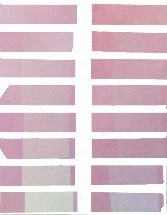
Fig. 16. Cochineal made using three recipes and applied onto three different papers treated to have extreme pHs was light aged to observe how recipes and conditions affect stability. Swatches of paint-outs of cochineal watercolor paints prepared on acidic paper (left), neutral paper (middle), and alkaline paper (right). Each array has swatches of unlaked cochineal (carmine) (left column), alum-laked cochineal (middle column), and tin-laked cochineal (right column). In the columns, the swatches have been exposed to intense light for longer times from top to bottom. The pigment color changes depending on the mordant and on the pH of the paper support. The relative rates of fading on exposure to intense light vary. Adapted from Berrie and Strumfels 2017.
Red lakes mixed with iron earths and varying amounts of lead white are used to paint complexions. Writers describe how to paint the skin tones of males using more earth pigments and darker hues than when painting those of women. Women’s complexions are created using red lakes as well, but the difference between the appearances of the sexes must become more noticeable when lakes fade and earth pigments do not. My sense is that we often cannot be sure if a sitter was blushing or was always pale. Leonardo’s portrait of Ginevra de’ Benci (fig. 17) depicts the young woman with a complexion that he painted using lead white, earths, and a lake made from the shearings or toppings (cimature) of red-dyed wool that, based on our knowledge of natural red pigments, must have faded to some extent. Ginevra’s pale skin has been discussed in light of her health, which her husband said was poor, and also in a paean to her natural beauty and according to the ideals of feminine beauty in the late fifteenth century. In her own time, the poet and rhetorician Cristofaro Landino (1424–1498) describes Ginevra’s “snow-white brow, her teeth like ivory, and her dark eyes set in rosy cheeks.” But what was Ginevra’s complexion? Neither her portrait, which has changed over time, nor the poems written about her answer this question, and Ginevra is inscrutable in many respects.
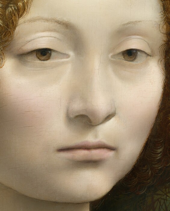
Fig. 17. Leonardo da Vinci, Ginevra de’ Benci, c. 1474/1478, oil on panel, 38.1 × 37 cm, National Gallery of Art, Washington, Ailsa Mellon Bruce Fund. 1967.6.1.a. Detail.
Artists use tone and hue to balance compositions. Often the way they used these aspects of color is so adept that the loss of red or yellow does not spoil the color relationships, though it might affect their expression of mood or the suggestion of time of day or season. When we have information about artists’ intentions to use color for specific purposes and we recognize that the color has changed, we gain better insight into how the artist used color to record visual or emotive aspects of the scene or sights depicted. Van Gogh and Winslow Homer were intensely interested in using harmonious and complementary contrast of color to provoke emotional and visual responses. They carefully created compositions with juxtapositions of harmonious colors such as blue and green and complementary colors such as red and green or blue and yellow. Homer, unlike Van Gogh, did not leave a large record of his thinking, though he did call John Spanton’s 1859 translation of Michel-Eugène Chevreul’s Laws of Contrast of Color “his Bible.” Homer’s watercolor palette contains the red lake carmine, which has faded in many of his watercolor paintings. In his Casting, Number Two, 1894 (fig. 18), there is a narrow band of violet paint along the top left edge where it was covered by a mat. This small area has carmine pigment that has not faded completely. Homer used red mixed with the blues and greens in the wooded bank across the river to make colors with violet and warm brown undertones to evoke a sense of stillness through harmonious contrast of color.
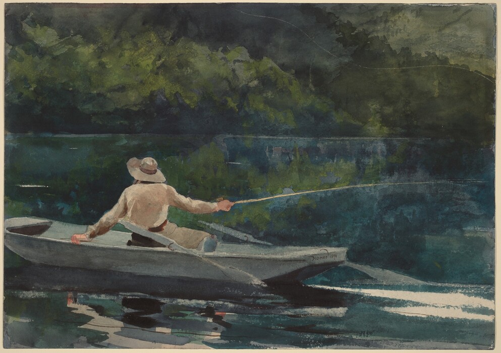
Fig. 18. Winslow Homer, Casting, Number Two, 1894, watercolor over graphite on wove paper, 38.5 × 54.5 cm, National Gallery of Art, Washington, Gift of Ruth K. Henschel in memory of her husband, Charles R. Henschel, 1975.92.2.
Vermilion
Vermilion (mercuric sulfide, HgS), as we know from Vitruvius’s observation, is light-sensitive. Nevertheless, it has been used around the globe since antiquity for its vibrant orange-red hue. Vermilion handles well in many media: glue, glair, tempera, gum Arabic, and oil. In current nomenclature, the synthetic form of mercury sulfide is called vermilion to distinguish it from the naturally occurring mineral cinnabar, but these names did not differentiate the origin of the pigment in historical times. The manufactured pigment is prepared by combining elemental mercury and sulfur to obtain black mercuric sulfide, metacinnabar. This intermediate can be converted into the red form either by heating the black compound and collecting red crystals formed when the gaseous compound condenses on a cold surface or by heating a solution of the black form with ammonium or potassium sulfide from which the red pigment precipitates. As is the case for other pigments, there are likely several, independent factors that catalyze the alteration of vermilion in different circumstances. Small substitutions of cadmium or zinc in the mineral change the temperature at which the conversion between the red and black forms occurs. Samples of cinnabar ores that contain halide ions, iodide especially, as well as bromide and chloride ions, darken on exposure to light. Researchers studying the reasons for the blackening of vermilion in paintings have found that visible light, chloride ions, and/or other factors can be implicated as agents of change. In the early twentieth century, Alexander Eibner, a chemist working for the German Society for the Promotion of Rational Painting Technique, undertook careful investigations that revealed that preparations of vermilion that contain excess thiosulfate ions are particularly prone to darkening on light exposure. He advocated changing the production protocols to make a “permanent” vermilion. These findings suggest that impurities affect the stability of vermilion in both natural and synthesized forms.
In Antonello da Messina’s Madonna and Child, circa 1475 (fig. 19), scarlet drapery winds around the Christ Child and gathers into folds where it falls across the body. The sense of its volume is confusing, because the vermilion has blackened causing the loss of relationships between shadowed and lit hues on the undulating fabric. A photomicrograph shows the deteriorated black surface of the painting (fig. 19a).
The black phase is only at the surface of the red paint film. Optical microscopy of a small scraping of the dark paint revealed that inside each blackish particle, the orange-red color of vermilion remains. X-ray powder diffraction did not confirm the presence of the black phase metacinnabar, and most of the lines in the pattern can be attributed to unaltered vermilion.

Fig. 19. Antonello da Messina, Madonna and Child, c. 1475, oil and tempera on panel transferred from panel, 58.1 × 43.2 cm, National Gallery of Art, Washington, Andrew W. Mellon Collection, 1937.1.30. A modern red lake glaze helps balance the discordant dark/light junctions in areas of altered vermilion.
Fig. 19a. Photomicrograph of the blackened vermilion.
Treatment
Treating works of art changes the way they look. Stoner quotes the renowned conservator, John Brealey: “And everything a paintings conservator does, from setting down a blister to applying a varnish, affects the eventual look of a painting.” Over the long term, objects may respond in unanticipated and occasionally undesirable ways to restoration and conservation treatments. Removing obscuring coatings reveals delightfully bright colors but also deteriorated pigments and damage, including physical problems such as cracks in the support and craquelure and loss of paint. When these are exposed, they are dealt with appropriately for the security of the objects. Covering losses and visually reintegrating small or large lacunae that appear after dirt, varnish, and old restorations have been removed, as well as re-creating lost parts of works of art, seem to me to require even more boldness than taking off varnish. While these interventions might be taken to mean restoration, and long ago they did, contemporary conservators are sensitive to the condition of works of art and the changes they make.
Documented historical procedures for cleaning surfaces and removing varnishes were harsh. The oil-containing varnishes most common until the nineteenth century darken and become insoluble as they oxidize. Restorers used physical methods to remove these old varnishes, sometimes pumice or ashes, and the artists’ paint was often abraded as the deteriorated coatings were taken off. Varnish removal using chemicals was also harsh: strong acids and bases such as nitric acid and highly corrosive potassium carbonate (lye) were employed. Most pigments and paint are affected badly by these cleaning agents. New industrial production methods in the late nineteenth century produced organic solvents such as acetone and benzene, which gave conservators new ways to approach removing old coatings. The use of mastic and dammar resins instead of oil-resin varnishes and the availability of many solvents have made it easier to clean paintings without causing damage. New materials, such as stable, easily solubilized varnishes, make the goal of reversible interventions closer to reality. Similarly, for lining delicate fabric supports, conservation scientists have developed adhesives that require less heat and moisture than traditional glues, reducing the risk of causing change and improving reversibility.
The philosophy and practice of restoration and conservation have changed dramatically over time, especially from the mid-twentieth century. The materials used and the aesthetic approaches are dependent on local expectations and practice and, of course, the medium of the artwork. Our relationships with objects and change are part of the historiography of the conservation profession and art history. Conservation methods changed significantly throughout the twentieth century; so too did the approach to the intended outcome of cleaning and restoration. Changing attitudes and methods on the extent of intervention to ameliorate the effects of deterioration and the selection of ways to treat artworks affect the outcomes of conservation treatments. Conservators’ practice intersects with the theories of art history and heritage preservation at this node. In a paper on the Venetian restorer Pietro Edwards (1746–1821), Elizabeth Jane Darrow wrote, “The restorer has played a critical role in the physical and aesthetic survival of art and has had an immense, yet still barely acknowledged, influence on the story as it has been told so far.” In a wide-ranging 1999 interview, the conservator-restorer Paul Philippot discusses patina, the role of conservators and conservation, and changes in conservators’ and art historians’ thinking regarding the effects of time on paintings. Today the connection between art history and art conservation is being examined from the perspective of the relationships that scholars and society have had over time with cultural heritage objects.
Concluding Thoughts
Works of art are shaped using materials that are not permanent. Almost all the pigments that artists have used from time immemorial discolor or disappear from artifacts (charcoal might be an exception if it is tightly bound to a substrate; otherwise it is erased as quickly as a yellow lake fades). We have a large tolerance for alteration, which is often misleading rather than disfiguring, though some frequently used pigments change color dramatically, as shown in paint-outs in Philipp Otto Runge and Heinrick Steffen’s book on color harmony (fig. 20). Such changes destroy the subtlety of coloristic effects and eventually lead to some works becoming unreadable.
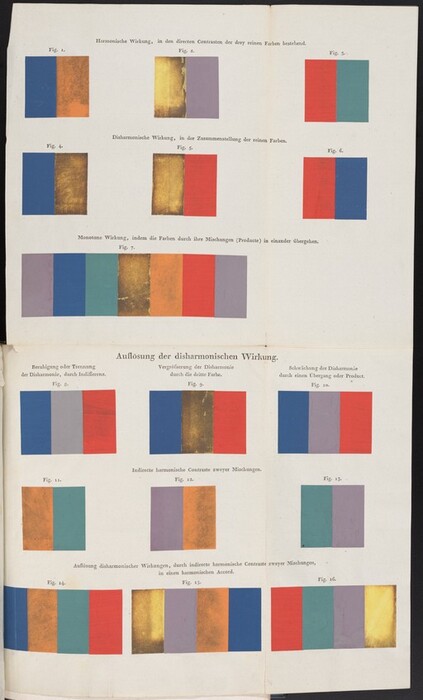
Fig. 20. A series of paint-outs that aimed to show the effects of various color pairings. The intention has been destroyed by pigment alteration. Image from Philipp Otto Runge and Heinrick Steffens, Farben-Kugel; oder, Construction des Verhältnisses aller Mischungen der Farben zu einander, und ihrer vollständigen Affinität, mit angehängtem Versuch einer Ableitung der Harmonie in den Zusammenstellungen der Farben von Philipp Otto Runge, Mahler. Nebst einer Abhandlung über die Bedeutung der Farben in der Natur, von Heinrik Steffens (Hamburg, 1810), facing p. 60.
Although the rate of change is constant, the magnitude of change slows exponentially since less and less material remains. This means that changes in new works are very noticeable and that ancient works are still changing, though we might not be able to perceive it. We do not know all the factors that initiate anticipated or sudden, unexpected pigment deterioration, but we can be mindful of many that we do know about. We can limit the amount of light used for displaying and examining works of art. Moderate conditions are better for most pigments, and maintaining stable conditions is good for pigments and works of art generally. However, from careful observations made in the past and the present we know that a watchful eye is required, and we are not usually dealing with textbook scenarios. Some factors that affect stability are beyond our control; we must deal with the mixtures, the additives, the purity of the pigments, and the binders that artists used. However, we can consider the protocols we use for treatments and the roles that heat, humidity, water and aqueous acidic or alkaline agents, and the presence of ions, especially chloride and other halide ions, even in very low concentrations, play in deterioration pathways. Despite all that could go wrong, many artworks are durable. We treasure objects that have stood the test of time, physically and aesthetically. They are not immune to change, but we can work to understand the factors that might harm them and manage the conditions that might lead to damage so that these objects, records of the time and place they were created, endure and that artworks made today will carry our ideas forward.
Acknowledgments and References
I am grateful to all my colleagues for sharing their thoughts about changes in works of art from their own points of view. They suggested the myriad ways to consider the topic of change. The Facture board members Daphne Barbour’s and Peter Lukehart’s critical reading of an early draft was most useful. I benefited greatly from David Saunders’s and Narayan Khandekar’s comments on the text. I am certain I missed correcting some of the weaknesses and missed examples of change that they told me about. I thank Cecilia Frosinini for tracking down unpublished reports on pigment degradation that make me reconsider how we report analytical findings. Analyzing faded yellow lakes was only possible with the assistance of scientific research department staff. I am especially grateful to Kathryn Morales, who helped me collect the spectra on cross sections; Mike Palmer, who prepared the cross sections; Lisha Deming Glinsman, who made the lake pigments used for comparison; and Joan Walker, who helped me plot the data. Many thanks to Yuri Long from the National Gallery of Art Library for finding the image of altered pigments in a paint-out for me.
“Adolf Wilheim Kein” 2022
“Adolf Wilheim Kein: The History of Our Company Founder.” 2022. https://www.keim.com/company/history/ (accessed February 18, 2024).
Ambrose 2023
Ambrose, Trevor. “ASTM Lightfastness Testing for Oil Paints.” Just Paint, September 24, 2023. https://justpaint.org/astm-lightfastness-testing-for-oil-paints/ (accessed February 26, 2024).
Anderson 2014
Anderson, Jaynie. The Restoration of Renaissance Painting in Mid Nineteenth-Century Milan: Giuseppe Molteni in Correspondence with Giovanni Morelli. Florence, 2014.
Aze et al. 2008
Aze, Sébastien, Jean-Marc Vallet, Vincent Detalle, Olivier Grauby, and Alain Baronnet. “Chromatic Alterations of Red Lead Pigments in Artworks: A Review.” Phase Transitions 81, no. 2–3 (2008): 145–54. https://doi.org/10.1080/01411590701514326.
Baldinucci 1800
Baldinucci, Filipo. Opere di Filipo Baldinucci. Vol 2: Vocabolario toscano dell’arte del disegno. Milan, 1800.
Barclay 2012
Barclay, Marion H. “The National Gallery of Canada and Nathan Stolow.” Journal of the Canadian Association for Conservation 37 (2012): 22–40.
Berrie and Matthew 2011
Berrie, Barbara, and Louisa C. Matthew. “Lead White from Venice: A Whiter Shade of Pale?” In Studying Old Master Paintings: Technology and Practice, edited by Marika Spring, 295–301. London, 2011.
Berrie and Strumfels 2017
Berrie, Barbara H., and Yoonjoo Strumfels. “Change Is Permanent: Thoughts on the Fading of Cochineal-Based Watercolor Pigments.” Heritage Science 5, no. 1 (2017): 30. https://doi.org/10.1186/s40494-017-0143-4.
Berrie et al. 2014
Berrie, Barbara H., Francesca Casadio, Kristi Dahm, Yoonjoo Strumfels, Martha Tedeschi, and Judith Walsh. “A Vibrant Surface: Investigating Color, Texture and Transparency in Winslow Homer's Watercolors.” In Science and Art: The Painted Surface, edited by Antonio Sgamellotti, Brunetto G. Brunetti, and Costanza Miliani, 404–428. Cambridge, 2014.
Berrie et al. 2023
Berrie, Barbara H., John K. Delaney, Kathryn A. Dooley, and Lisha D. Glinsman. “Leonardo da Vinci’s Ginevra de’ Benci: Technical Findings in Light of the Artist’s Notes on Painting.” In Leonardo and His Circle: Painting Technique in the Light of Restorations and Scientific Studies, 267–294. Rome, 2023.
Bezur et al. 2015
Bezur, Anikó, Gwénaëlle Kavich, Jens Stenger, Elena Torok, and Carol Snow. “Discovery of Challacolloite, an Uncommon Chloride, on a Fifteenth-Century Polychrome Terracotta Relief by Michele Da Firenze.” Applied Physics A 121, no. 1 (2015): 83–93. https://doi.org/10.1007/s00339-015-9386-7.
Bomford et al. 1989
Bomford, David, Jill Dunkerton, Dillian Gordon, and Ashok Roy, with contributions from Jo Kirby. Italian Painting before 1400. Exh. cat. London, 1989.
Broecke 2015
Broecke, Lara. Cennino Cennini’s “Il Libro dell’Arte”: A New English Translation and Commentary with Italian Transcription. London, 2015.
Brokerhof, Kuiper, and Scholten 2018
Brokerhof, Agnes, Pieter Kuiper, and Steph Scholten. “Spread or Sacrifice: Dilemma for Lighting Policies.” Studies in Conservation 63, suppl. 1 (2018): 28–34. https://doi.org/10.1080/00393630.2018.1504439.
Brommelle 1956
Brommelle, Norman. “Material for a History of Conservation: The 1850 and 1853 Reports on the National Gallery.” Studies in Conservation 2, no. 4 (1956): 176–188. http://www.jstor.org/stable/1504963.
Brommelle 1964
Brommelle, Norman S. “The Russell and Abney Report on the Action of Light on Water Colours.” Studies in Conservation 9, no. 4 (1964): 140-52.
Burmester 2022
Burmester, Andreas. “Gemäldekunde: German Pioneers of the ‘Science of Painting.’” In Histories of Conservation and Art History in Modern Europe, edited by Sven Dupré and Jenny Boulboullé, 178–194. Milton Park, UK, 2022.
Campbell 2009
Campbell, J. P. “Time and Change: Colour, Taste and Conservation.” International Journal of Design and Nature and Ecodynamics 4, no. 3 (2009): 245–265.
Cardon et al. 2020
Cardon, Dominique, Iris Brémaud, Anita Quye, and Jenny Balfour Paul. “Exploring Colors from the Past: In the Steps of Eighteenth-Century Dyers from France and England.” Textile Museum Journal 47, no. 1 (2020): 8–27.
Casadio et al. 2019
Casadio, Francesca, Katrien Keune, Petria Noble, Annelies van Loon, Ella Hendriks, Silvia Centeno, and Gillian Osmond, eds. Metal Soaps in Art. Cultural Heritage Science. Cham, 2019.
Catalano et al. 2001
Catalano, Maria Ida, Angela Cerasuolo, Lanfranco Secco Suardo, and Giulia Zorzetti. “A colloquio con Paul Philippot.” Bolletino ICR, n.s., 2 (2001): 4–43.
Cerasuolo 2004
Cerasuolo, Angela. “Considerazioni sull’integrazione nel restauro: Il dibattito sulle esperienze contemporanee.” Bollettino ICR, n.s., 8–9 (2004): 40–45.
Church 1915
Church, Arthur H. The Chemistry of Paint and Painting. London: Seeley, Service & Co.
Clarricoates, Dowding, and Gent 2015
Clarricoates, Rhiannon, Helen Dowding, and Alexandra Gent, eds. Colour Change in Paintings: Appearance and Reality. London, 2015.
Coccato et al. 2017
Coccato, Alessia, Luc Moens, and Peter Vandenabeele. "On the Stability of Mediaeval Inorganic Pigments: A Literature Review of the Effect of Climate, Material Selection, Biological Activity, Analysis and Conservation Treatments." Heritage Science 5, no. 1 (2017): 12. https://doi.org/10.1186/s40494-017-0125-6.
Conti 2007
Conti, Alessandro. A History of the Restoration and Conservation of Works of Art. Translated by Helen Glanville. Amsterdam, 2007.
Cooper 1987
Cooper, Helen A. Winslow Homer Watercolors. New Haven, 1987.
Corbeil and Sirois 2007
Corbeil, Marie-Claude, and Jane Sirois. “A Note on a Modern Lead White, Also Known as ‘Synthetic Plumbonacrite.’” Studies in Conservation 52, no. 4 (2007): 281–88.
Darrow 2001
Darrow, Elizabeth Jane. “Necessity Introduced These Arts: Pietro Edwards and the Restoration of the Public Pictures of Venice 1778–1819.” Occasional Paper British Museum (2001): 61–66.
De la Rie and McGlinchey 1990
De la Rie, E. René, and Christopher W. McGlinchey. “New Synthetic Resins for Picture Varnishes.” Studies in Conservation 35, suppl. 1 (1990): 168–173. https://doi.org/10.1179/sic.1990.35.s1.036 .
Dreyer 1939
Dreyer, Robert M. “Darkening of Cinnabar in Sunlight.” American Mineralogist 24, no. 7 (1939): 457–460.
Druzik and Eshøj 2007
Druzik, James, and Bent Eshøj. “Museum Lighting: Its Past and Future Development.” In Museum Microclimates, 51–57. Copenhagen, 2007.
Dupré and Boulboullé 2022
Dupré, Sven, and Jenny Boulboullé, eds. Histories of Conservation and Art History in Modern Europe. London, 2022.
Edwards et al. 1992
Edwards, R., R. D. Gillard, P. A. Williams, and A. M. Pollard. “Studies of Secondary Mineral Formation in the PbO-H2O-HCl System.” Mineralogical Magazine 56, no. 382 (1992): 53–65. https://doi.org/10.1180/minmag.1992.056.382.07.
Eikema Hommes 2004
Eikema Hommes, Margriet van. Changing Pictures: Discoloration in 15th–17th-Century Oil Paintings. London, 2004.
Elkadi et al. 2021
Elkadi, Hisham, Sura Al-Maiyah, Karen Fielder, Inji Kenawy, and D. Brett Martinson. “The Regulations and Reality of Indoor Environmental Standards for Objects and Visitors in Museums.” Renewable and Sustainable Energy Reviews 152 (2021): 111653.
Feller 1967
Feller, Robert L. “Studies on the Darkening of Vermilion by Light.” Report and Studies in the History of Art 1 (1967): 99–111. http://www.jstor.org/stable/42618061.
Flora 2018
Flora, Holly. “New Light on Cimabue’s Lead White at Assisi.” I Tatti Studies in the Italian Renaissance 21, no. 2 (2018): 351–388. https://www.journals.uchicago.edu/doi/abs/10.1086/699666.
Gervais et al. 2013
Gervais, Claire, Marie-Angelique Languille, Solenn Reguer, Martine Gillet, Sebastien Pelletier, Chantal Garnier, Edward P. Vicenzi, and Loic Bertrand. “Why Does Prussian Blue Fade? Understanding the Role(s) of the Substrate.” Journal of Analytical Atomic Spectrometry 28, no. 10 (2013): 1600–1609. https://doi.org/10.1039/C3JA50025J.
Giovannoni, Matteini, and Moles 1990
Giovannoni, Sabino, Mauro Matteini, and Archangleo Moles. “Studies and Developments Concerning the Problem of Altered Lead Pigments in Wall Painting.” Studies in Conservation 35, no. 1 (1990): 21–25. http://www.jstor.org/stable/1506278.
Gliozzo 2021
Gliozzo, Elisabetta. “Pigments—Mercury-Based Red (Cinnabar-Vermilion) and White (Calomel) and Their Degradation Products.” Archaeological and Anthropological Sciences 13, no. 11 (2021): 210. https://doi.org/10.1007/s12520-021-01402-4.
González et al. 2019a
González, Victor, Marine Cotte, Gilles Wallez, Annelies van Loon, Wout de Nolf, Myriam Eveno, Katrien Keune, Petria Noble, and Joris Dik. “Unraveling the Composition of Rembrandt’s Impasto through the Identification of Unusual Plumbonacrite by Multimodal X-Ray Diffraction Analysis.” Angewandte Chemie International Edition 58, no. 17 (2019): 5619–22. https://doi.org/10.1002/anie.201813105.
González et al. 2019b
González, Victor, Gilles Wallez, Thomas Calligaro, Didier Gourier, and Michel Menu. “Synthesizing Lead White Pigments by Lead Corrosion: New Insights into the Ancient Manufacturing Processes.” Corrosion Science 146 (2019): 10–17. https://doi.org/https://doi.org/10.1016/j.corsci.2018.10.033.
Hall 1992
Hall, Marcia B. “Can We Know What Renaissance Color Was?” In Color and Meaning: Practice and Theory in Renaissance Painting, 1–13. Cambridge, 1992.
Harley 2001
Harley, Rosamond D. Artists’ Pigments c. 1600–1835: A Study in English Documentary Sources. Edited by Derek Linstrum. London, 2001. https://books.google.com/books?id=mRLrAAAAMAAJ.
Harrison, Higgitt, and Padfield 2018
Harrison, Lynne, Catherine Higgitt, and Joseph Padfield. “Finding Common Ground: The Role of Preventive Conservation in Response to the Expectations of Contemporary Audiences at the National Gallery, London.” Studies in Conservation 63,. suppl. 1 (2018): 101–107. https://doi.org/10.1080/00393630.2018.1504449.
Hayes 2021
Hayes, Matthew. The Renaissance Restored: Paintings Conservation and the Birth of Modern Art History in Nineteenth-Century Europe. Los Angeles, 2021.
Hoeniger 1999
Hoeniger, Cathleen. “The Restoration of the Early Italian ‘Primitives’ during the 20th Century: Valuing Art and Its Consequences.” Journal of the American Institute for Conservation 38, no. 2 (1999): 144–161. http://www.jstor.org/stable/3180043.
Jackall et al. 2023
Jackall, Yuriko, Barbara H. Berrie, John K. Delaney, and Michael Swicklik. “Greuze’s Greens: Ephemeral Colours, Classical Ambitions.” Burlington Magazine 165, no. 1440 (2023): 268–279.
Keisch 1971–1972
Keisch, Bernard. “X-Ray Diffraction and the Composition of Lead White.” Studies in the History of Art, National Gallery of Art 4 (1971–1972): 121–133.
Kinseher 2006
Kinseher, Kathrin. “Paintings Are Made of Paint: The Exhibtion of Painting Techniques in the Munich Glaspalast, 1893.” Studies in Conservation 51, suppl. 2 (2006): 41–48. https://doi.org/10.1179/sic.2006.51.Supplement-2.41.
Lehmann 2008
Lehmann, Ann-Sophie. “Fleshing out the Body.” In Body and Embodiment in Netherlandish Art, edited by Ann-Sophie Lehmann and H. Roodenburg, 87–109. Zwolle, 2008.
Lobanov, Weisser, and Welham 2001
Lobanov, Nicolai R., David C. Weisser, and Nicholas J. Welham. “Re-Plating the Anu Linac.” Paper presented at conference “RF Superconductivity,” September 6–11, 2002, Tsukuba, Japan.
Lussier and Smith 2007
Lussier, Stephanie, and Gregory Smith. “A Review of the Phenomenon of Lead White Darkening and Its Conversion Treatment.” Studies in Conservation 52, no. 1 (2007): 41–53. https://doi.org/10.1179/sic.2007.52.Supplement-1.41.
Ma and Berrie 2020
Ma, Xiao, and Barbara H. Berrie. “Lead Chlorides in Paint on a Della Robbia Terracotta Sculpture.” Analytical Chemistry 92, no. 7 (2020): 4935–4942. https://doi.org/10.1021/acs.analchem.9b05045.
Mass et al. 2013
Mass, Jennifer, Julia Sedlmair, Catherine Schmidt Patterson, David Carson, Barbara Buckley, and Carol Hirschmugl. “SR-FTIR Imaging of the Altered Cadmium Sulfide Yellow Paints in Henri Matisse’s Le Bonheur de vivre (1905–6): Examination of Visually Distinct Degradation Regions.” Analyst 138, no. 20 (2013): 6032–6043. https://doi.org/10.1039/c3an00892d.
Michalski 2018
Michalski, Stefan. “Agent of Deterioration: Light, Ultraviolet and Infrared.” Government of Canada, 2018. https://www.canada.ca/en/conservation-institute/services/agents-deterioration/light.html (accessed February 22, 2024).
Miliani et al. 2018
Miliani, Costanza, Letizia Monico, Maria J. Melo, Simona Fantacci, Eva M. Angelin, Aldo Romani, and Koen Janssens. “Photochemistry of Artists’ Dyes and Pigments: Towards Better Understanding and Prevention of Colour Change in Works of Art.” Angewandte Chemie International Edition 57, no. 25 (2018): 7324–7334. https://doi.org/https://doi.org/10.1002/anie.201802801.
Miller and Poh 2022
Miller, Peter N., and Soon Kai Poh, eds. Conserving Active Matter. New York, 2022.
Mills 1996
Mills, John S. “Obituary: Joyce Plesters.” Independent (London), August 27, 1996. https://www.independent.co.uk/news/people/obituary-joyce-plesters-1311884.html.
Mitchell, Clifford, and Vasanthakumar 2022
Mitchell, Ralph, Jennifer Clifford, and Archana Vasanthakumar. Cultural Heritage Microbiology: Recent Developments. London, 2022.
Monico et al. 2011
Monico, Letizia, Geert Van der Snickt, Koen Janssens, Wout De Nolf, Costanza Miliani, Johan Verbeeck, He Tian, et al. “Degradation Process of Lead Chromate in Paintings by Vincent Van Gogh Studied by Means of Synchrotron X-Ray Spectromicroscopy and Related Methods. 1. Artificially Aged Model Samples.” Analytical Chemistry 83, no. 4 (2011): 1214–1223. https://doi.org/10.1021/ac102424h.
Nagy et al. 1995
Nagy, Zoltan, Jean-Philippe Blaudeau, N. C. Hung, Larry A. Curtiss, and D. J. Zurawaki. “Chloride Ion Catalysis of the Copper Deposition Reaction.” Journal of the Electrochemical Society 142 (1995): L87–L89. https://www.osti.gov/biblio/82897.
Ordonez and Twilley 1997
Ordonez, Eugena, and John Twilley. “Clarifying the Haze: Efflorescence on Works of Art.” Analytical Chemistry 69 (1997): 416A–422A. https://doi.org/10.1021/ac971692l.
Padfield and Landi 1966
Padfield, Tim, and Sheila Landi. “The Light-Fastness of the Natural Dyes.” Studies in Conservation 11, no. 4 (1966): 181–196. https://doi.org/10.2307/1505361.
Petit 1907
Petit, Georges. The Manufacture and Comparative Merits of Lead and Zinc White Paints. Translated by Donald Grant. London, 1907.
Photos-Jones et al. 2020
Photos-Jones, Effie, Pieter Bots, Efstathios K. Oikonomou, Aaron Hamilton, and Charles W. Knapp. “On Metal and ‘Spoiled’ Wine: Analysing Psimythion (Synthetic Cerussite) Pellets (5th–3rd Centuries BCE) and Hypothesising Gas-Metal Reactions over a Fermenting Liquid within a Greek Pot.” Archaeological and Anthropological Sciences 12 (2020): 243. doi: 10.1007/s12520-020-01184-1.
Pollard, Thomas, and Williams 1990
Pollard, A. M., R. G. Thomas, and P. A. Williams. “Connellite: Stability Relationships with Other Secondary Copper Minerals.” Mineralogical Magazine 54, no. 376 (1990): 425–430.
Pollio 1826
Pollio, Marcus Vitruvius. The Architecture of Marcus Vitruvius Pollio. Translated by Joseph Gwilt. London, 1826.
Rossi 1893
Rossi, Umberto. “Il Museo nazionale di Firenze nel triennio 1889–1991.” Archivio Storico dell’ Arte, anno VI, fasc. 1 (1893): 1–24.
Runge and Steffens 1810
Runge, Philipp Otto, and Heinrick Steffens. Farben-Kugel; oder, Construction des Verhältnisses aller Mischungen der Farben zu einander, und ihrer vollständigen Affinität, mit angehängtem Versuch einer Ableitung der Harmonie in den Zusammenstellungen der Farben von Philipp Otto Runge, Mahler. Nebst einer Abhandlung über die Bedeutung der Farben in der Natur, von Heinrik Steffens. Hamburg, 1810.
Russell and Abney 1888
Russell, William James, and William de Wiveleslie Abney. Report to the Science and Art Department of the Committee of Council on Education on the Action of Light on Water Colours: Presented to Both Houses of Parliament by Command of Her Majesty. London, 1888.
Saunders 2021
Saunders, David R. Museum Lighting: A Guide for Conservators and Curators. Los Angeles, 2021. https://books.google.com/books?id=7egSEAAAQBAJ.
Saunders and Kirby 1994
Saunders, David, and Jo Kirby. “Light-Induced Colour Changes in Red and Yellow Lake Pigments.” National Gallery Technical Bulletin 15 (1994): 79–97. https://www.nationalgallery.org.uk/research/research-resources/technical-bulletin/light-induced-colour-changes-in-red-and-yellow-lake-pigments.
Saunders and Kirby 2004
Saunders, David, and Jo Kirby. “The Effect of Relative Humidity on Artists’ Pigments.” National Gallery Technical Bulletin 25 (2004): 62–72. http://www.jstor.org/stable/42616177.
Schmitt 1990
Schmitt, Sibylle. “Examination of Paintings Treated by Pettenkofer’s Process.” Studies in Conservation 35, suppl. 1 (1990): 81–84. https://doi.org/10.1179/sic.1990.35.s1.019.
Scuello et al. 2004
Scuello, Michael, Israel Abramov, James Gordon, and Steven Weintraub. “Museum Lighting: Optimizing the Illuminant.” Color Research & Application 29, no. 2 (2004): 121–127. https://doi.org/10.1002/col.10231.
Spring and Grout 2002
Spring, Marika, and Rachel Grout. “The Blackening of Vermilion: An Analytical Study of the Process in Paintings.” National Gallery Technical Bulletin 23 (2002): 50–61. https://www.nationalgallery.org.uk/technical-bulletin/spring_grout2002.
Starn 2002
Starn, Randolph. “Three Ages of ‘Patina’ in Painting.” Representations 78, no. 1 (2002): 86–115. https://doi.org/10.1525/rep.2002.78.1.86.
Stols-Witlox, Megens, and Carlyle 2012
Stols-Witlox, Maartje, Luc Megens, and Leslie Carlyle. “‘To Prepare White Excellent . . . ’: Reconstructions Investigating the Influence of Washing, Grinding and Decanting of Stack-Process Lead White on Pigment Composition and Particle Size.” In The Artists’ Process: Technology and Interpretation, edited by Sigrid Eyb-Green, Joyce H. Townsend, Mark Clarke, Jilleen Nadolny, and Stefanos Kroustallis, 112–129. London, 2012.
Stoner 1985
Stoner, Joyce Hill. “Ascertaining the Artist’s Intent through Discussion, Documentation and Careful Observation.” International Journal of Museum Management and Curatorship 4, no. 1 (1985): 87–92. https://doi.org/10.1080/09647778509514957.
Stoner 1994
“The Impact of Research on the Lining and Cleaning of Easel Paintings.” Journal of the American Institute for Conservation 33, no. 2 (1994): 131–140. http://www.jstor.org/stable/3179422.
Stoner 2017
Stoner, Joyce Hill. "Art History, Science and Practice: The Training of Paintings Conservators in the Twentieth Century." The Burlington Magazine 159, no. 1373 (2017): 630–37. https://www.jstor.org/stable/pdf/44870012.pdf.
Švarcová et al. 2021
Švarcová, Silvie, David Hradil, Janka Hradilová, and Zdeňka Čermáková. “Pigments—Copper-Based Greens and Blues.” Archaeological and Anthropological Sciences 13, no. 11 (2021): 190. https://doi.org/10.1007/s12520-021-01406-0.
Taylor and Lopata 1984
Taylor, Peter, and Vincent J. Lopata. “Stability and Solubility Relationships between Some Solids in the System PbO-CO2-H2O.” Canadian Journal of Chemistry 62, no. 3 (1984): 395–402. https://doi.org/10.1139/v84-070.
Vanmeert et al. 2015
Vanmeert, Frederik, Geert van der Snickt, and Koen Janssens. "Plumbonacrite Identified by X‐Ray Powder Diffraction Tomography as a Missing Link during Degradation of Red Lead in a Van Gogh Painting." Angewandte Chemie 127, no. 12 (2015): 3678–3781. https://doi.org/doi:10.1002/ange.201411691.
Walker 1967
Walker, John. “‘Ginevra de’ Bencı’ by Leonardo da Vinci.” Report and Studies in the History of Art 1 (1967): 1–38. http://www.jstor.org/stable/42618056.
Watin 1778
Watin, Jean-Félix. L’Art du peintre, doreur, vernisseur . . . Liège, 1778. Reprint facsimile edition. Paris, 1976.
Whitmore and Cass 1989
Whitmore, Paul M., and Glen R. Cass. “The Fading of Artists’ Colorants by Exposure to Atmospheric Nitrogen Dioxide.” Studies in Conservation 34, no. 2 (1989): 85–97. https://doi.org/10.1179/sic.1989.34.2.85.
Whitmore, Pan, and Bailie 1999
Whitmore, Paul M., X. Pan, and Catherine Bailie. “Predicting the Fading of Objects: Identification of Fugitive Colorants through Direct Nondestructive Lightfastness Measurements.” Journal of the American Institute for Conservation 38 (1999): 395–409. http://dx.doi.org/10.2307/3179999.
Wilkin, Brady, and Kent 2007
Wilkin, Richard T., Patrick V. Brady, and Douglas B. Kent. “Lead.” In Monitored Natural Attenuation of Inorganic Contaminants in Ground Water, edited by Robert B. Ford, Richard T. Wilkin, and Robrt W. Puls, 11–20. Ada, OK, 2007.
Windon 2012
Windon, Katrina. “The Right to Decay with Dignity: Documentation and the Negotiation between an Artist’s Sanction and the Cultural Interest.” Art Documentation: Journal of the Art Libraries Society of North America 31, no. 2 (2012): 142–157. https://doi.org/10.1086/668108.