
James Van Der Zee’s Portrait Photographs
Technical Insights from the National Gallery’s Prints
On this Page:
James Van Der Zee (1886–1983) was a prominent photographer of the twentieth century, most well-known for his portraits of the Harlem Renaissance. Along with his wife, Gaynella, he ran a successful photography studio in Harlem from 1917 through the 1960s, with his most prolific period from about 1920 to 1945. Declining business compounded by financial hardship forced him to close the studio in 1969. However, that same year his work was featured in the exhibition Harlem on My Mind at the Metropolitan Museum of Art. Though the exhibition was controversial for its exclusion of Black artists, it led to a resurgence of his career and public profile. Since then, more nuanced explorations of his work have examined his photographs not only as a record of Harlem, but as creative interpretations of his subjects. That artistic expression is most evident in his portrait photographs, which are characterized by intervention and change (fig. 1). He adjusted and customized each print to suit his subject. As he explained:
I began to think that there was something about them [the photographs] that they didn’t see everywhere. And then I noticed the different showcases of other photographers and I saw that all of them had the same type of pictures. I posed everybody according to their type and personality, and therefore almost every picture was different. In the majority of studios they just seem to pose everybody according to custom, according to fashion and therefore the pictures seem to be mechanical-looking to me. And so my showcases attracted attention, because I posed them all differently, and I tried to pose each person in such a way that the picture would tell a story.
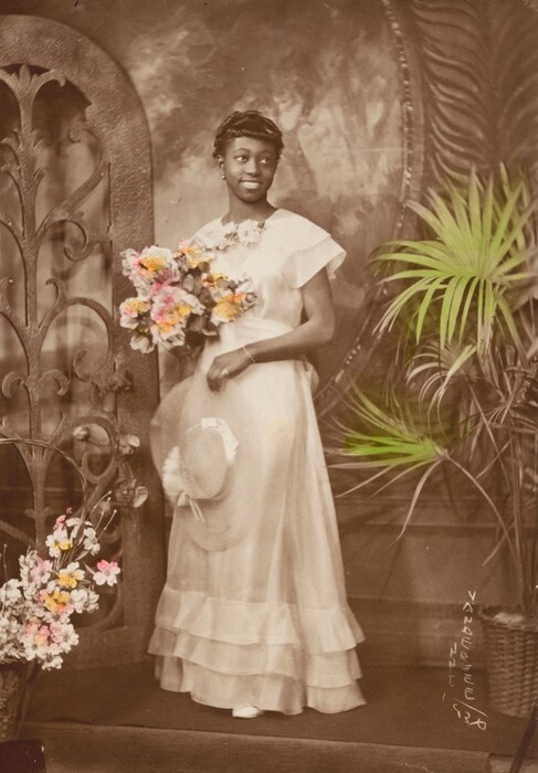
Fig. 1. James Van Der Zee, Portrait of a Young Woman, 1930, gelatin silver print with applied color, image: 17.3 × 11.8 cm, sheet: 17.8 × 12.5 cm, National Gallery of Art, Washington, Pepita Milmore Memorial Fund, 2019.58.2. © James Van Der Zee Archive, The Metropolitan Museum of Art.
The impact of Van Der Zee’s props and posing is significant, but his affinity for customizing portraits was not limited to staging the image. He manipulated the material aspects of his photographs at almost every step, from retouching the negatives to varying the papers and hand coloring the prints.
Van Der Zee’s manipulation of his photographs has been considered in the cultural context of the early twentieth century. Deborah Willis has written extensively about his retouching as a means of expressing and emphasizing the rising status and aspirations of Black Americans during the period, suggesting his many embellishments convey an affluence that may or may not have existed outside the studio doors. Louise Siddons and Emilie Boone, among others, have explicitly tied Van Der Zee’s photography to the aims of the New Negro movement, which sought to resist the racism of the Jim Crow era in part by celebrating the cultural and economic achievements of Black individuals. For many proponents of the New Negro movement, photographic depictions of prosperous Black subjects were crucial for countering the violent, racist, and stereotyped images that were common in the visual culture of the period. In this context, Van Der Zee’s embellishments are understood as examples of intentional Black self-representation and image-making. In her recent book, A Nimble Arc, Boone has broadened the context for understanding Van Der Zee’s approach. She considers his portraits not only in relation to narratives of Black uplift but also as reflective of a Black vernacular culture and his dual concerns as a commercial photographer and an artist, integrating these seemingly conflicting interests into a holistic understanding of his work.
This more recent scholarship has come at a time of renewed interest in the artist with the establishment of the James Van Der Zee Archive at the Metropolitan Museum of Art, in partnership with the Studio Museum in Harlem. It has also coincided with research at the National Gallery of Art, prompted by the exhibition James Van Der Zee’s Photographs: A Portrait of Harlem (November 28, 2021–May 30, 2022). Curated by Diane Waggoner, the exhibition highlighted some forty prints from the National Gallery collection. In preparation for the exhibition, close examination of the portrait photographs revealed many examples of Van Der Zee’s interventions.
The National Gallery holds fifty-three photographs by Van Der Zee, thirty-five of which are vintage prints (prints made close to when the negative was made). The vintage prints date largely to the 1920s–1930s, except for one from 1914 and five from the 1940s–1950s. The majority of the National Gallery’s prints are studio portraits (24), but there are several photographs of Harlem storefronts (4) and large groups taken outdoors (4), as well as two outdoor portraits of the Jamaican political activist Marcus Garvey and one funeral portrait. While Van Der Zee made significant contributions in genres like street and documentary photography, his material changes were concentrated on his studio portraiture. Thus our research focused on his vintage studio portraits in the National Gallery’s collection.
The existence of a robust scholarship on Van Der Zee’s practice provided a framework for an in-depth study of the materials and techniques he used to create his portraits. In turn, the study of his work at the National Gallery adds important insights to the revived conversation about his photographs. This essay delves into how Van Der Zee refined and embellished his portraits by retouching the negatives, using a variety of papers, and retouching and hand coloring the prints. Placing his portraits within the material history of photography reveals how technical constraints and possibilities may have informed his choices for representing a Black clientele, and it illuminates the extent to which his techniques were and were not exceptional in twentieth-century photography, allowing for a fuller appreciation of his creative process.
Change in the Negatives
Van Der Zee’s material interventions began before he made any prints. He made the first of a series of changes in the negatives—the unique original of each image created in the camera. While the National Gallery collection does not include any of Van Der Zee’s negatives, many of the prints hold clues about the materials and techniques he used to make and alter the corresponding negatives.
Of the thirty-five vintage prints in the National Gallery collection, seven contain evidence that they were printed from glass plate negatives, such as lifting or lost gelatin and chipped glass at the edges of the image. Thirteen prints were made from plastic sheet film negatives, indicated by notch codes and/or safety film markings visible in the margins of the prints. For example, “EASTMAN—SAFETY—KODAK” appears, reversed by the printing process, in the margins of nine prints (fig. 2), and “DEFENDER SAFETY BASE” appears at the edge of one print. “Safety” was a term used to describe cellulose acetate film, to distinguish it from the more flammable cellulose nitrate film. Kodak and Defender were two of the largest manufacturers of photographic film in the United States in the first half of the twentieth century. The small triangular or square notches along the same edge as the printed text identify various types of large-format sheet film (as opposed to 35 mm film, which would have sprocket holes, the rows of small holes at the top and bottom edges of a roll of film that allow it to be unwound in the camera). All seven prints made from glass negatives date from 1924 to 1926; the thirteen prints made from film negatives are dated between 1930 and 1938. This suggests Van Der Zee switched to sheet film in the middle of his most commercially successful period, sometime around 1930.
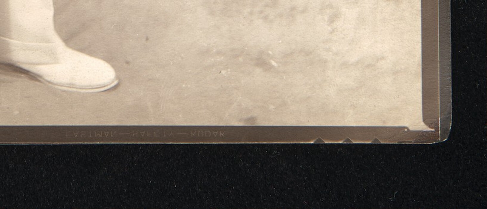
Fig. 2. Detail of James Van Der Zee, Tennis Player (fig. 15). The brand information and notch code from the negative film is printed into the margin of the photograph.
Van Der Zee’s artistic practices directly influenced his choice of negative. Based on his own recollections, he preferred large glass plate negatives and used sizes that ranged from 4 × 5 inches through 11 × 14 inches. He explained this choice by noting the ease of retouching larger negatives.
With the camera and the tripod and all the other contraptions, I couldn’t blame those people for buying these small cameras, but I never admired them very much myself, because a great deal of my success in my work was retouching the pictures. That means I could alter the faces and make them look better than the people, and on the small negatives you could not retouch them so well. But on the big plates you could retouch them and I could see what I was doing, and I made a very nice picture, providing the retouching was done fine enough.
Cellulose acetate “safety” film was introduced in the 1920s and used for professional sheet film only in the early 1930s, so despite his stated preference for glass, Van Der Zee switched to cellulose acetate film soon after it was introduced. The rigid support would have made glass negatives especially easy to retouch, but acetate sheet film would have been available in large sizes similar to glass plates. Many of Van Der Zee’s prints in the National Gallery that were made from film negatives were also heavily retouched, indicating that while he may have preferred glass, he found film perfectly adequate for retouching.
Retouching
Retouching was a significant component of Van Der Zee’s negative-making process, as the above quote suggests. Retouching negatives was a common practice in studio photography throughout the nineteenth and twentieth centuries. It was most often used to correct flaws in the negative, like scratches, or perceived flaws in the subject, such as wrinkles, blemishes, or harsh shadows. Retouching could be either additive or reductive. Additive retouching involved drawing or painting onto the negative with pencil, ink, or other opaque media. The added media blocked light as it passed through the negative during printing, preventing development of image material in the corresponding area of the positive print and producing a white mark. This technique could be used to remove dark marks from a light or mid-tone area of the image. Reductive retouching required scraping or scratching away the emulsion on the negative with a sharp tool, a technique sometimes referred to as “etching” the negative. Removing image material allowed more light to pass through the negative in the scraped area during printing, developing more image material in the corresponding area of the positive print and producing a dark mark. This technique could be used to emphasize or deepen shadows or to remove light-colored flaws from a dark area.
The prints in the National Gallery’s collection indicate that Van Der Zee primarily used additive retouching to correct and enhance his negatives. There are only a few examples of corrections that were etched into the negatives, but there are numerous examples of drawing onto them. Most commonly, he drew over lines or shadows on faces, such as in Blumstein’s Sales Girls, 1930 (figs. 3, 4). The white scratchy lines appear messy when viewed at high magnification, but at a normal viewing distance the white retouching and the dark lines or shadows merge into an even mid-tone that blends with the surrounding area. Van Der Zee used retouching to exaggerate the whites of the eyes in several of the women, a correction visible in many of his prints, such as A Casual Affair, 1932 (fig. 5). In Tennis Player, 1932 (see fig. 15), he nipped in the waist and straightened the shoulder of the player’s jacket, and in Lady with Wide-Brimmed Straw Hat, 1934 (figs. 6, 7), he slimmed the woman’s wrist. Although most of the retouched prints were studio portraits, Van Der Zee sometimes applied the same techniques to his outdoor group photographs, such as Alpha Phi Alpha Basketball Team (2015.19.4507) and Uniform Rank of the Black Knights of Pythias (2019.127.18), where he used retouching to soften harsh shadows produced by the strong outdoor sunlight.
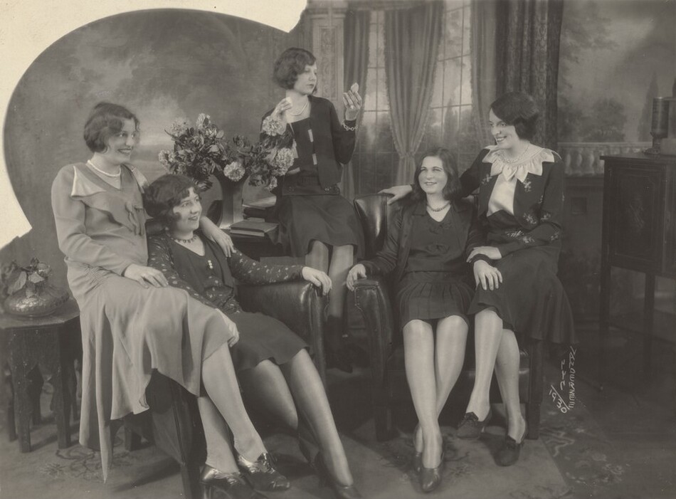
Fig. 3. James Van Der Zee, Blumstein’s Sales Girls, 1930, gelatin silver print, image: 17.78 × 23.81 cm, sheet: 20.32 × 25.4 cm, National Gallery of Art, Washington, Alfred H. Moses and Fern M. Schad Fund, 2021.33.3. © James Van Der Zee Archive, The Metropolitan Museum of Art
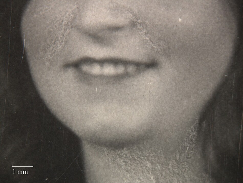
Fig. 4. Macrograph (15×) of Blumstein’s Sales Girls (fig. 3), showing retouched lines and shadows around the mouth and neck of one of the women.
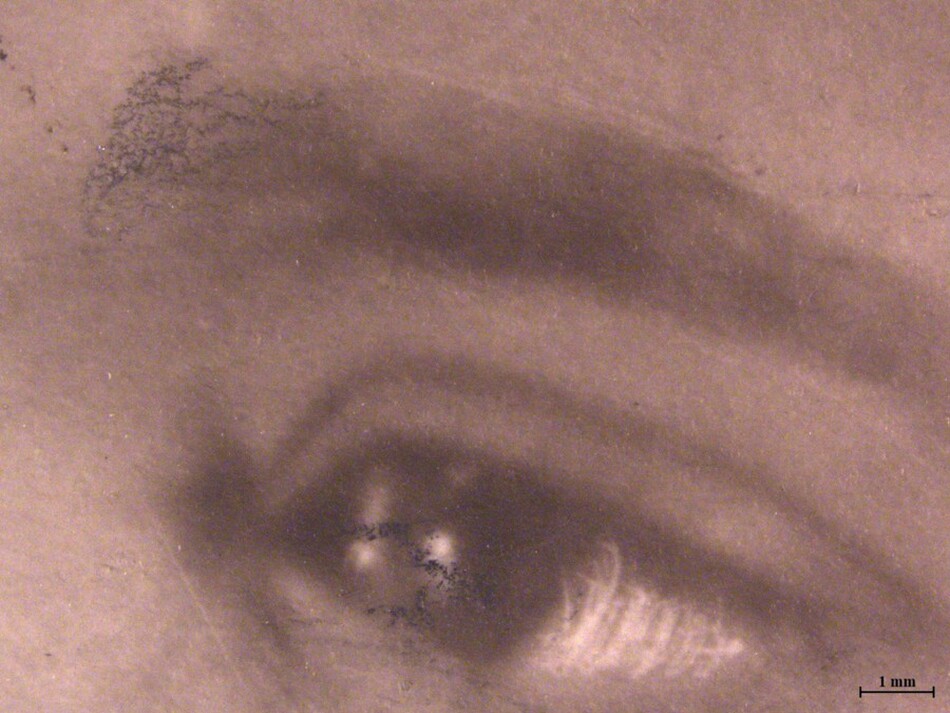
Fig. 5. Macrograph (7×) of James Van Der Zee, A Casual Affair (fig. 15). Graphite retouching on the print was used to define the eyebrow and iris of the eye, in addition to retouching on the negative to brighten the white of the eye.
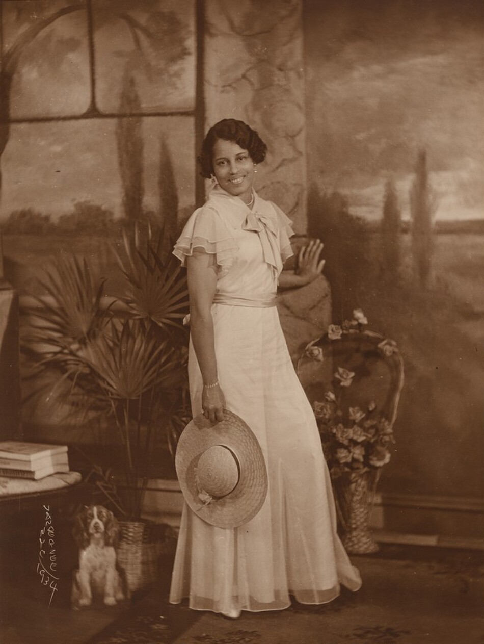
Fig. 6. James Van Der Zee, Lady with Wide-Brimmed Straw Hat, 1934, gelatin silver print, image/sheet: 24.1 × 18.1 cm, National Gallery of Art, Washington, Pepita Milmore Memorial Fund, 2019.58.1. © James Van Der Zee Archive, The Metropolitan Museum of Art.
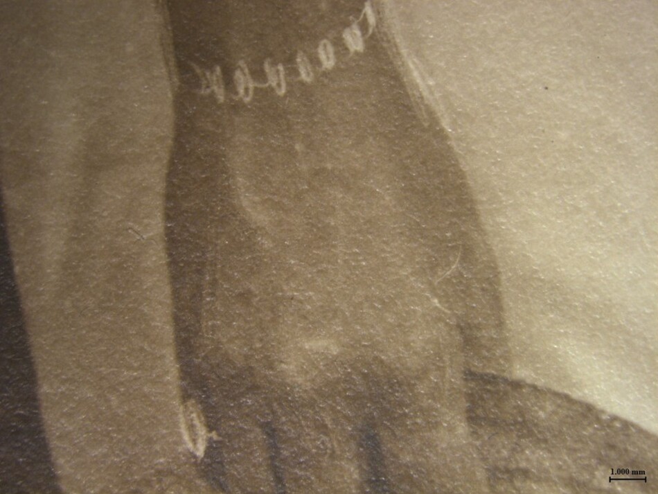
Fig. 7. Macrograph (7×) of Lady with Wide-Brimmed Straw Hat (fig. 6). Van Der Zee added a bracelet and ring to the image by drawing them onto the negative. He also slimmed the woman’s wrist using the same technique.
This focus on his sitter’s appearance is very much in keeping with Van Der Zee’s attitude toward his clients. He strongly believed that his interventive approach to portrait-making was critical to his commercial success, but he was also driven by his own aesthetic standards.
Well, it seemed as though I had a personal interest in the pictures I made, and I did my best and I tried to make them as good as I could. And if they were satisfactory to me, then I just kept them. Sometimes they seemed to be more valuable to me than they did to the people I was photographing, because I put my heart and soul into them and tried to see that every picture was better looking than the person—if it wasn’t better looking than the person I was taking, then I wasn’t satisfied with it. . . . I would retouch the pictures and take out the unnecessary lines and shadows so the pictures would always look a little better than they did.
However, Van Der Zee’s retouching went considerably further than simply removing “unnecessary lines and shadows.” As has been described in previous publications, he also used these retouching techniques to add dramatic flourishes to his images, such as wisps of smoke to the end of a cigarette. Such theatrical additions were largely absent from the National Gallery’s prints. However, as the photographs were carefully inspected under a microscope during their conservation treatment for exhibition, a subtler type of addition became obvious: items of jewelry that had initially appeared photographic were found to have been drawn into the negative. When the photographs were viewed at normal distance, the bright white lines created by the retouching read as the bright reflection of jewelry sparkling under the studio lights. It was only with magnification that the pieces appeared hand drawn, like pencil marks, for example, the necklace in Beautiful Bride, circa 1930 (figs. 8, 9) and the ring drawn into Blumstein’s Sales Girls (fig. 10). Strikingly similar bracelets and rings were observed on Portrait of a Young Woman (see fig. 1) and Lady with Wide-Brimmed Straw Hat (see fig. 7). The pattern of stylistic repetition is not confined to the National Gallery’s prints; nearly identical bracelets and rings appear in many published examples of his studio portraits.
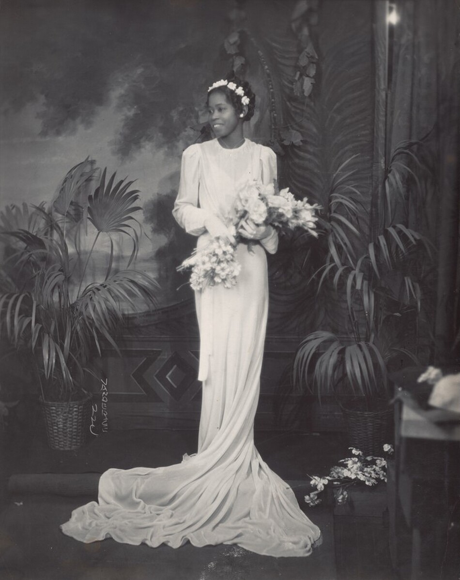
Fig. 8. James Van Der Zee, Beautiful Bride, c. 1930, gelatin silver print, image: 24.77 × 19.37 cm, sheet: 25.4 × 20 cm, National Gallery of Art, Washington, Alfred H. Moses and Fern M. Schad Fund, 2021.33.1. © James Van Der Zee Archive, The Metropolitan Museum of Art.
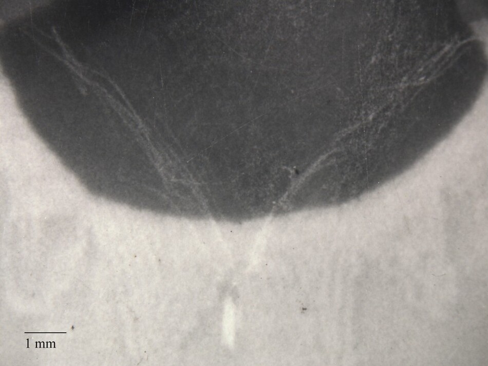
Fig. 9. Macrograph (15×) of Beautiful Bride (fig. 8). Van Der Zee added a necklace to the image by drawing it onto the negative.
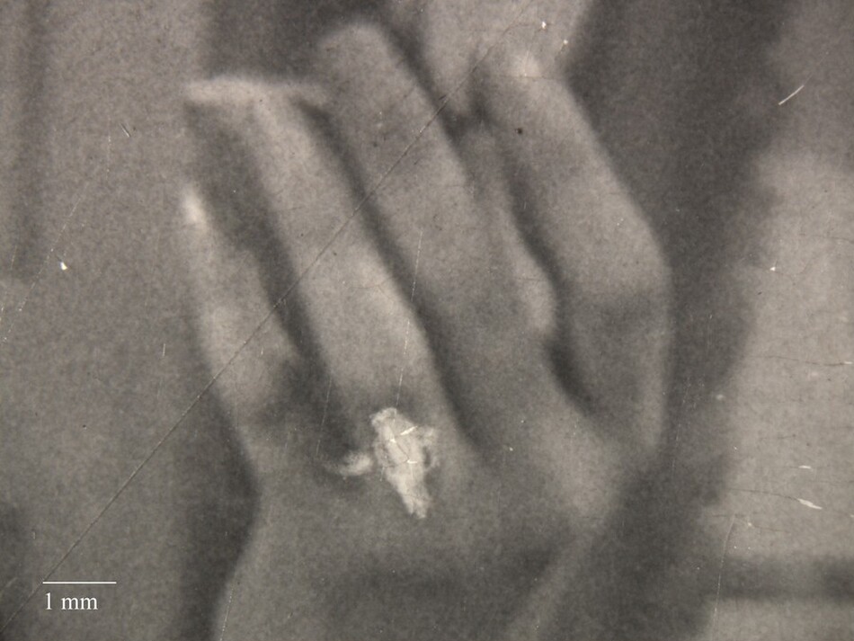
Fig. 10. Macrograph (15×) of Blumstein’s Sales Girls (fig. 3). Van Der Zee added a ring to the image by drawing it onto the negative.
These added adornments are not only in keeping with Van Der Zee’s expressed interest in making his subjects look even better than reality, but they also speak to his desire to emphasize their wealth and sophistication. Moreover, his retouching demonstrates his eye for composition. The bright jewelry he added with retouching contrasted with the mid-tones of the surrounding photograph in a way the sitters’ real jewelry did not. This is evident in Blumstein’s Sales Girls. The actual ring is rendered in the same mid-tones as the woman’s finger (fig. 11), but the ring added with retouching stands out (see fig. 10). By introducing jewelry, Van Der Zee could add contrasting elements to certain areas of the image, thus drawing the viewer’s eye. That compositional impact is also evident in Lady with Wide-Brimmed Straw Hat and Portrait of a Young Woman. As in Blumstein’s Sales Girls, the vivid white pops against the mid-tone areas of the image, making it more dynamic by bringing attention to the hands of the sitters (see figs. 1, 6).
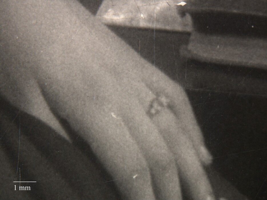
Fig. 11. Macrograph (15×) of Blumstein’s Sales Girls (fig. 3), showing a ring worn by the sitter at the time the photograph was taken.
There are other examples of this compositional fine-tuning. For example, in Soldier, 1944 (fig. 12), Van Der Zee traced the soldier’s proper left sleeve to delineate it against a background of similar value. The effect of this is particularly evident when compared to the soldier’s pants, which blend almost seamlessly into the background. Small tweaks like these refined the composition by rendering certain elements more visually assertive, thereby bringing balance to the whole.
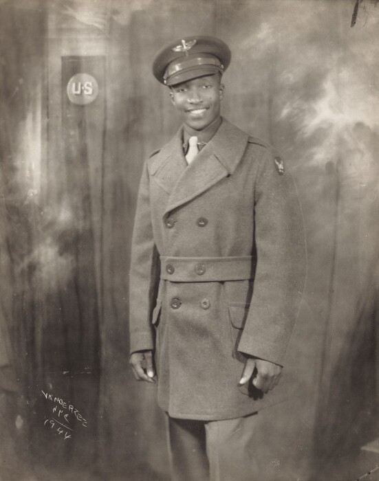
Fig. 12. James Van Der Zee, Soldier, 1944, gelatin silver print, image: 24.5 × 19.6 cm, sheet: 25.2 × 20.3 cm, National Gallery of Art, Washington, Avalon Fund, 2019.127.13. © James Van Der Zee Archive, The Metropolitan Museum of Art.
There is notable variation in the line quality of Van Der Zee’s retouching. Sometimes the lines appear heavy and carefully placed, and sometimes they appear wispy, sketchy, or poorly defined (cf. figs. 7, 9). Van Der Zee indicated that he proofed his negative retouching: “Once in a while somebody would say, ‘What’s that scratch over there?’ if I had done some hurried retouching, or a proof retouching.” Perhaps he did initial rough retouching with lighter pencil strokes to show his clients and later reinforced it with darker graphite or pen strokes. It is possible that some of the more loosely retouched prints in the National Gallery’s collection capture this proofing stage of an image. The provenance of many prints in the collection traces back to Van Der Zee’s studio rather than his patrons. It would be logical that he would have held on to proof copies and sold the finished copy to his client. As he notes in the previous quote, he retained images that he particularly liked.
Close examination of the National Gallery’s prints revealed a subtlety to Van Der Zee’s compositional changes. His retouching practice suggests an artist concerned not only with the appearance of his sitters for their own sakes but also with the technical quality, visual interest, and beauty of the photographs themselves.
Double Printing
In addition to altering individual negatives, Van Der Zee combined his negatives to create new images. This technique, called double printing, has been described previously and explored in detail with respect to his funerary photography. The National Gallery’s collection contains three prints made by combining multiple negatives. One, Child’s Funeral, 1929 (fig. 13), is an example of this funerary photography. Van Der Zee inserted a portion of a religious scene into his own photograph, probably by exposing the negatives one after the other. He likely printed the funeral image using a dodging tool, a small scrap of cardstock or similar material attached to a thin piece of wire that is used to block light while a print is exposed in the enlarger, preventing the image from forming in that area of the print; moving the tool rapidly produced soft, blurry edges around the area being dodged. The tool would have created a void in the upper right corner, allowing him to expose the second negative only in that area, dodging it at the edges to create the soft-edged overlap of the two images. More precise masking or cutting-and-pasting of the negatives themselves would have produced a hard border between the two images. The fragment of inserted image in Child’s Funeral appears in another published example of his funeral photography, indicating reuse of the same negative years apart.
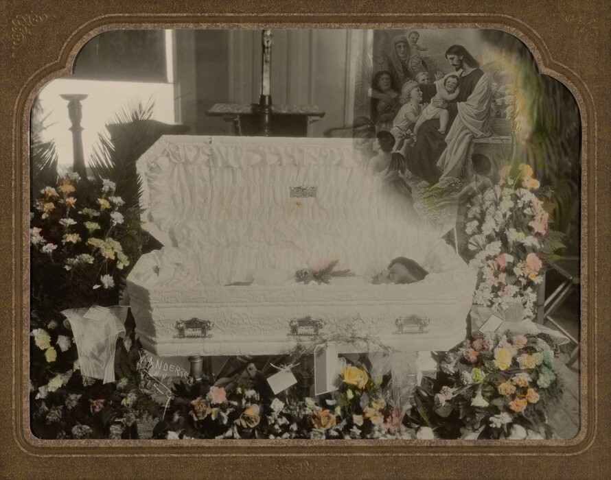
Fig. 13. James Van Der Zee, Child’s Funeral, 1929, gelatin silver print with applied color, image (visible): 17.7 × 24 cm, mat: 26.8 × 30.8 cm, overall: 70.8 × 32.7 cm, National Gallery of Art, Washington, Avalon Fund, 2019.127.16. © James Van Der Zee Archive, The Metropolitan Museum of Art.
The two other examples of double printing in the National Gallery’s collection, Altar Boy, circa 1930 (fig. 14), and Soldier (see fig. 12), rely on similar techniques. They exemplify the variation that Van Der Zee achieved by playing with double printing. He could change the composition with every print he made. Altar Boy combined at least two negatives, possibly three, to produce the background of the image. Those background features are much stronger in a different print made from the same negatives, while the National Gallery’s copy of Soldier has a background completely different from a published variation. It seems likely that Soldier is an example of a “system” he devised in the 1940s that allowed him to insert different backgrounds into portraits taken against a plain backdrop. These examples not only illustrate the changes made possible by double printing but also point to a degree of experimentation in Van Der Zee’s practice. All three examples of double printing in the National Gallery’s collection came from Van Der Zee’s studio, again raising the possibility that these are proofs or alternate versions that offer a glimpse into his process.
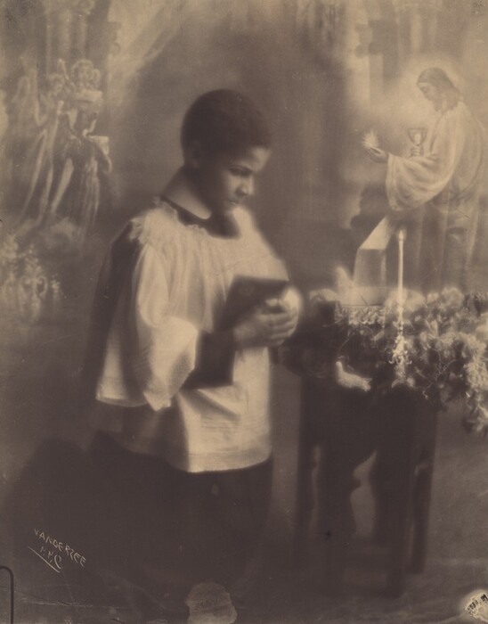
Fig. 14. James Van Der Zee, Altar Boy, c. 1930, gelatin silver print, image: 24.3 × 19.2 cm, sheet: 25.2 × 20.2 cm, National Gallery of Art, Washington, Avalon Fund, 2019.127.8. © James Van Der Zee Archive, The Metropolitan Museum of Art.
Change in the Positive Prints
Van Der Zee’s desire to adjust and improve his images extended to his prints. The interventions into his prints included paper choice, retouching, and hand coloring. Unlike the evidence from his negatives, these changes to the prints left material traces that could be studied with the aid of analytical methods.
Papers
In contrast to many of Van Der Zee’s creative choices, his photographic papers have not been discussed in the existing literature. Previous publications of Van Der Zee’s work captured the variety of papers he used but did not explicitly identify paper selection as one of his many intentional artistic choices. Although gelatin silver prints are often referred to as “black-and-white,” the process is better described as monochrome, as it allows for numerous variations in the color of the image material. This was especially true in the mid-twentieth century, the commercial peak of gelatin silver photography and the period in which Van Der Zee was active. By purchasing a variety of papers or by manipulating the printing process, photographers could produce monochrome prints rendered in muted shades of black, brown, red, yellow, blue, green, or purple. To capture subtle differences in color, image material that may appear black or brown is often also described as either warm (having undertones of red or yellow) or cool (having undertones of blue, green, or purple). Subtle shifts in image color can produce highly evocative prints, and especially warm or cool papers were often used for professional portraits and fine art photography.
The color of a gelatin silver print is determined by the color of the silver image material (the metallic silver particles that clump together to form the dark areas of the image) and the color of the support below the image material. The color of the image material is largely dictated by the composition and physical morphology of the metallic particles that form during development of the photograph. Manufacturers manipulated the chemical composition of the emulsion to affect its behavior during exposure and development, producing silver image particles of variable shape and size and therefore color. Photographic papers were also made with a variety of paper supports and colored and/or textured baryta (a layer of barium sulfate pigment suspended in gelatin that covered the paper, obscuring its color and texture), which could impart a range of colors to the image highlights.
Photographers were also able to manipulate commercial papers to achieve a range of colors of image material. Using different developers or changing the pH and temperature of the developer bath affected the size and shape of the silver particles and therefore their color. Chemical toning could also alter the color of the image material. Chemical toning is an optional step in the process of making a print, typically done after the image is developed and fixed. The print is passed through additional chemical bath(s) that replace or alloy some of the metallic silver particles with another metal, commonly platinum or gold. The resulting image material has a different color from that of silver alone. In other popular toning processes, such as selenium or sulfur toning, toning baths react with some silver to create silver compounds, such as silver sulfide, whose color is different from that of metallic silver. Van Der Zee was known to have done a lot of experimentation with photographic chemistry early in his career, mixing his own solutions to save money. As he moved into professional photography in Harlem, one of his first jobs was working in the darkroom of a commercial photographer. One can infer that Van Der Zee had a relatively sophisticated knowledge of darkroom printing—not necessarily true for all photographers—and would have understood the range of options for achieving different image colors.
Even within the relatively small group of prints in the National Gallery’s collection, the variety of image color is striking. Van Der Zee’s prints include examples of cool, warm, and neutral black and brown image material (fig. 15). Though a limited sampling, the National Gallery prints indicate that Van Der Zee frequently varied the papers he chose for his portraits but not his street views. This points to Van Der Zee’s particular focus on giving clients a unique portrait but perhaps more specifically to a special sensitivity to capturing a variety of complexions. Skilled representation of the full range of Black skin tones was particularly important for Black activists and photographers during the early twentieth century. The range of image colors in Van Der Zee’s papers may have been an attempt to convey the warm or cool undertones of his sitters’ complexions, an ability of photography that has been discussed and explored by other artists. Boone has considered how the inverse—the flattening of skin tone that occurred when Van Der Zee’s photographs were reproduced as newspaper images—created a sense of racial similarity rather than individuality. The variety of Van Der Zee’s papers would have been especially emphasized to patrons in his studio. Siddons has pointed out, for example, the cumulative effect of his portraits displayed “salon-style” on his studio walls. In that context, his Black clients may well have understood his use of varied papers as a signal of his skill in producing sensitive, individualized portraits.
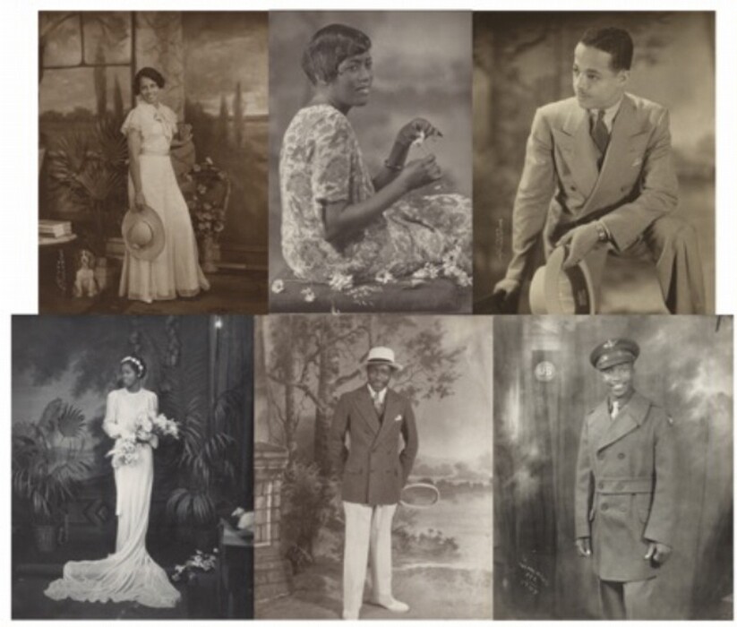
Fig. 15. Clockwise from top left: James Van Der Zee, Lady with Wide-Brimmed Straw Hat (fig. 6); James Van Der Zee, Daisye, 1931, gelatin silver print, image/sheet: 15.1 × 10.1 cm, National Gallery of Art, Washington, Avalon Fund, 2019.127.4. © James Van Der Zee Archive, The Metropolitan Museum of Art; James Van Der Zee, A Casual Affair, 1932, gelatin silver print, image: 24.8 × 19.3 cm, sheet: 19.8 × 25.2 cm, National Gallery of Art, Washington, Gift of Ellen and Richard Sandor, 2000.171.2. © James Van Der Zee Archive, The Metropolitan Museum of Art; James Van Der Zee, Soldier (fig. 12); James Van Der Zee, Tennis Player, 1932, gelatin silver print, image: 24.45 × 19.37 cm, sheet: 20.32 × 25.4 cm, National Gallery of Art, Washington, Alfred H. Moses and Fern M. Schad Fund, 2021.33.2. © James Van Der Zee Archive, The Metropolitan Museum of Art; James Van Der Zee, Beautiful Bride (fig. 8).
Analysis
Conservators and scientists at the National Gallery investigated whether the different colors of Van Der Zee’s papers were the result of chemical toning. The adjustments paper manufacturers made to achieve different colors did not always rely on elemental changes to the image material and are therefore not necessarily identifiable with analytical techniques. Even when elemental variations are identified, due to the proprietary nature of any formulation changes, there is not a well-understood relationship between the fine adjustments manufacturers made to their emulsions and the final color of the image material. The same is true for the more minor adjustments a photographer might make when developing a print: they do not alter the print in a chemically identifiable manner. However, because chemical toning baths do alter the elemental composition of the image material, their use can be identified with analytical techniques.
A selection of sixteen photographs was analyzed using x-ray fluorescence (XRF) spectroscopy to determine their elemental compositions (table 1). By acquiring spectra in different areas of the print (e.g., highlights and shadows), the analysis can help identify the image material and process used to create the image, as well as the presence of inorganic materials in the photographic paper. The XRF spectra of the silver gelatin prints in this study all showed the presence of barium, sulfur, and strontium, which are expected components of the baryta layer. They also all showed the presence of silver from the silver image material. No evidence of chemical toners such as gold or selenium was found. However, subtle differences in the elemental composition of the papers indicate that Van Der Zee was using a variety of papers. For example, Altar Boy (see fig. 14) is a noticeably warm-toned print and was found to contain small amounts of both cadmium and bromine. Those elements were not found in Van Der Zee’s more neutral tone prints, indicating that he chose paper with a specific formulation for a warm brown color when printing Altar Boy. Analytical testing indicated that Van Der Zee achieved the different colors visible in the National Gallery’s collection through his selection of commercially available materials or subtle changes in the printing process, or some combination of both, but not through chemical toning.
| Acc. No. | Ag | Ba | S | Sr | Ca | K | Fe | Cu | Cd | Br | P |
|---|---|---|---|---|---|---|---|---|---|---|---|
| 2000.83.2 | m | M | m | m | m | - | m | t | - | - | - |
| 2000.171.2 | m | M | m | m | m | t | m | t | - | - | - |
| 2019.58.1 | m | M | m | m | m | - | - | - | - | - | - |
| 2019.127.4 | m | M | m | m | m | - | m | t | - | - | - |
| 2019.127.8 | m | M | m | m | m | - | - | - | m | t | - |
| 2019.127.19 | m | M | m | m | m | - | - | - | - | - | - |
| 2021.33.2 | m | M | m | m | m | m | m | - | - | - | - |
| 2019.127.2 | m | M | m | m | m | - | - | t | - | - | - |
| 2019.127.6 | m | M | m | m | m | - | - | - | - | - | - |
| 2019.127.10 | m | M | m | m | m | t | m | t | - | - | t |
| 2019.127.11 | m | M | m | m | m | - | - | - | - | - | - |
| 2019.127.13 | m | M | m | m | m | - | m | m | - | - | - |
| 2021.33.1 | m | M | m | m | m | - | - | - | - | - | - |
| 2019.58.2 | m | M | m | m | m | m | m | t | - | - | - |
| 2019.127.3 | m | M | m | m | m | - | - | - | - | - | - |
| 2015.19.4389 | m | M | m | t | t | - | - | - | - | - | - |
Retouching
Van Der Zee continued to fine-tune his prints with retouching. Photographers often retouched their positive prints for the same reasons they retouched negatives. It was sometimes necessary to retouch at both stages because imperfections could be introduced during printing. Dust or debris that was left on the negative when a print was made would appear as white spots on the print. For this reason, retouching to eliminate flaws in a photographic print is sometimes referred to as “spotting.” But much like retouching in the negative, photographers were not limited to hiding dust spots and often used retouching to emphasize or adjust elements of the image. Retouching in photographic prints could be done with a variety of materials and, like retouching negatives, could be additive or reductive. Graphite pencils and photography-specific inks and dyes were commonly used. If a photographer wished to lighten an area of the image or remove a dark spot, they would often etch the surface of the print with a sharp tool to reveal the white baryta or paper layers below. Many photographers retouched their prints instead of their negatives because those changes were less permanent; if the results were unsatisfying, it was easy to make a new print and start over. However, the evidence from the National Gallery photographs suggests that Van Der Zee retouched his prints sparingly, especially compared to the amount of work he did on the negatives. In all cases, he used graphite pencil to make tiny adjustments to eyebrows, facial hair, or subtle shadows, evident on five prints: Portrait of a Young Woman (see fig. 1), A Casual Affair (see fig. 5), Portrait of a Woman (2019.127.20), Portrait of a Man and Dogs (2019.127.7), and Portrait of a Couple (2000.83.1).
Hand Coloring
Perhaps the most obvious change that Van Der Zee made to his prints was hand coloring them. Even after the introduction of color photography, Van Der Zee preferred hand coloring his monochrome prints, stating that he found the colors more natural than those produced by early color film and enjoyed the ability to select any color he wanted. It is yet another indication that Van Der Zee reveled in the malleability of photographs. However, it also raises the possibility that hand coloring was preferable to color film due to the difficulty of representing darker skin tones with color film processes. Hand coloring came with its own biases; many photo colors had “flesh” tones only for fair skin, and hand-coloring manuals provided detailed instructions for coloring a variety of only light complexions. But it offered greater flexibility for working around those limitations. Unsatisfying results with early color films and papers, combined with Van Der Zee’s long practice with hand coloring, pushed him to continue hand coloring rather than switch to full-color photography.
Hand coloring monochrome photographs was common from the invention of photography. By the early twentieth century, there were many photography-specific colors on the market, including oil paints, watercolors, and aniline dyes. These were in addition to numerous other artists’ materials that were used to color photographs, such as crayons, chalk, pencils, airbrush, and dry pigments. The most popular were oil-based paints and watercolors or water-soluble dyes, both of which Van Der Zee mentioned using: “We colored them by hand in oil colors and transparent water colors.” Oil-based paints contained pigments in an oil binder and could be thinned with mineral spirits, extenders, or oil medium. They were designed to be rubbed into the photograph’s surface with cotton wads or swabs to create light washes of color. Watercolor paints were composed of a colorant in a gum binder that was soluble in water. Synthetic aniline dyes were also often used for watercolors due to their superior solubility and brilliant colors. These water-soluble colors were applied to photographs with a paint brush. Coatings were sometimes applied to photographs before or after coloring, to improve the receptivity of the photograph’s surface to the colorants and to protect the color after it was applied. Coatings were more commonly recommended for very glossy surfaces, as matte surface gelatin silver prints had more tooth and more readily absorbed colors.
The National Gallery holds four hand-colored prints: Portrait of a Young Woman (see fig. 1), Child’s Funeral (see fig. 13), Portrait of a Girl (fig. 16), and Violinist (fig. 17). These prints raised several questions about Van Der Zee’s hand-coloring practice. First, they indicated a wider variety of hand-coloring materials than Van Der Zee described using. Three of the four prints, Portrait of a Young Woman, Portrait of a Girl, and Child’s Funeral, were colored with liquid colors, which could have been either the oil paints or the watercolors Van Der Zee described. However, Violinist was embellished with colored pencil. Although the use of colored pencil is documented in the literature, in the first half of the twentieth century it was mentioned primarily for retouching or fine line work. Pastels and dry pigments were the more common dry media for hand coloring as they were more easily blended to give the translucent washes of color sought by photo colorists. The loose application of pencil in this case was puzzling since Van Der Zee used it not for details or fine line work but to sketchily color large areas, leaving visible pencil strokes.
Fig. 16. James Van Der Zee, Portrait of a Girl, 1924, gelatin silver print with applied color, image/sheet: 17.15 × 12.07 cm, National Gallery of Art, Washington, Corcoran Collection (Gift of Eric R. Fox), 2015.19.4389. © James Van Der Zee Archive, The Metropolitan Museum of Art.
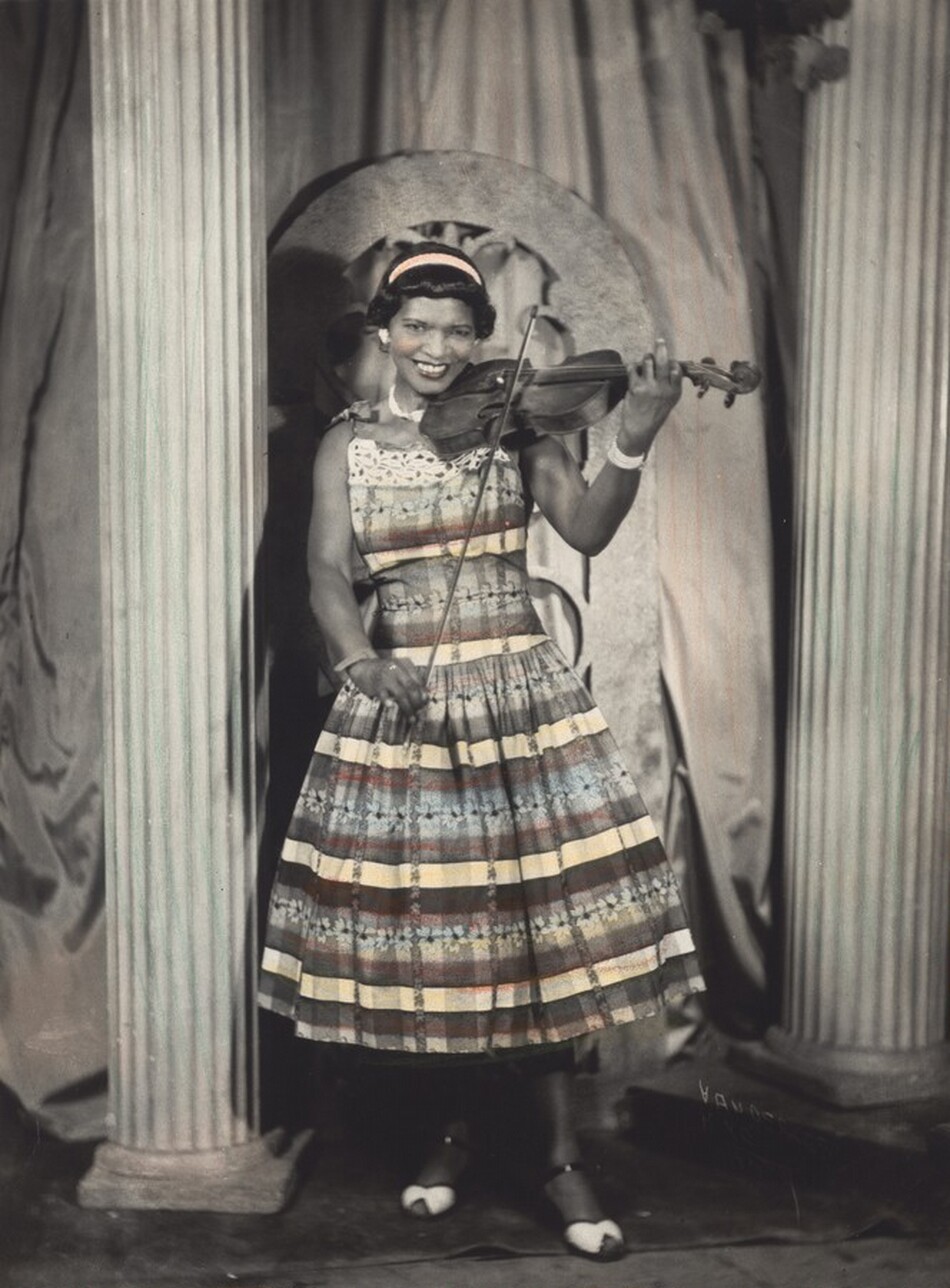
Fig. 17. James Van Der Zee, Violinist, c. 1956, gelatin silver print with applied color, image: 23.9 × 17.7 cm, sheet: 25.2 × 19.5 cm, National Gallery of Art, Washington, Avalon Fund, 2019.127.3. © James Van Der Zee Archive, The Metropolitan Museum of Art.
This was not only a question for Violinist, as all four prints were incompletely and loosely colored, with the media only slightly adhering to the contours of the image elements. Searches of catalogs and other collections for works by Van Der Zee returned numerous partially colored examples, as well as examples of very precisely and completely colored prints, where colors were carefully blended and hewed closely to the outlines of the image elements. In his 2004 essay in The James Van Der Zee Studio, Colin Westerbeck suggests that the loose coloring is indicative of experimentation, particularly given the existence of multiple images from the same sitting that have been colored differently. This seemed like a plausible explanation for the National Gallery’s photographs, especially when taken in the context of Van Der Zee’s remarks about proof retouching. If he proofed his retouching, it follows that he might have done the same with hand coloring. At least three of the National Gallery’s hand-colored prints came from Van Der Zee’s personal collection (Portrait of a Young Woman, Child’s Funeral, and Violinist). It is possible that the pencil used for Violinist was a convenient way to map the colors that would ultimately be applied with oil- or water-based colors.
These questions prompted conservators and scientists to explore the specific materials Van Der Zee used to color his prints. Historical samples were used to produce mock-ups, allowing the authors to understand the application methods, working properties, and appearance of different materials. Both the mock-ups and Van Der Zee’s prints were analyzed visually and using noninvasive techniques with the aim of distinguishing between oil-based and water-based paints, identifying specific pigments, and obtaining a better understanding of why Van Der Zee might have used colored pencil. The hand-colored works were also assessed for their light sensitivity to determine their propensity for change during display and exhibition.
Experimental replication
Experimenting with historical materials can lead to insights into artists’ methods and the appearance of finished artworks. The photograph conservation department at the National Gallery holds many examples of twentieth-century hand-coloring materials, as well as nonaccessioned photographs, to be used for experimentation and comparative analysis. Several brands and types of oil colors, watercolors, dyes, and pencils were applied to a gelatin silver print selected for its similarity to Van Der Zee’s hand-colored prints (mid-twentieth century, matte surface) (fig. 18).
Fig. 18. Mock-up showing the application of different hand-coloring materials on a study collection photograph.
Experimentation with the historical photo coloring pencils was especially illuminating. Several sets of Marshall’s Photo Coloring Pencils, dating from the 1930s or 1940s to the 1970s, were tested. All came with similar instructions that indicated the pencils could be used for coloring large areas, not just for detail work. After loosely applying the pencil over a large area, it was rubbed in with the accompanying “P.M. Solution.” Although the initial sketchy strokes resembled those in Violinist, once the pencil was blended there was no remaining trace of pencil marks. The resulting wash of color could be vibrant, with the “oxide green” appearing especially similar to the bright green palms in Portrait of a Young Woman (see fig. 1). Understanding that pencil would have so easily transformed into washes of color raised the possibility that Violinist may simply have been left in an unfinished state. Applying the pencil would have been the first step of a two-step process that could have produced a delicately colored print. In fact, testing showed that regardless of whether the pencils used were photograph-specific, the loose lines could have easily been transformed into washes of color like those present on Portrait of a Young Woman, Portrait of a Girl, and Child’s Funeral.
Comparison of watercolors and oil colors, and of both to the photo pencils, was also informative. Two brands of watercolors made specifically for coloring photographs were tested. Peerless and Velox were both “watercolor stamps”: the pigments were adhered to a sheet of paper with minimal binder, and small sections of the paper (“stamps”) could be broken off for use. Just add a small amount of water, and the paint is reconstituted. Both brands rely on synthetic aniline dyes to produce bright, transparent colors. Three brands of photograph-specific oil colors were tested: Marshall, Roehrig, and Devoe. These oil colors were often sold with numerous accompanying materials that allowed for manipulation of their working properties. The study collection included samples of oil medium, turpentine, extenders, and driers to mix with the paints, as well as pretreatments and finishing coatings. Several of these materials were included in the experiments.
When applied over large areas, the watercolors and oils required different handling. The watercolors were applied with a brush, and the oil colors were rubbed in a circular motion using a wad of cotton. With these methods, it was possible to produce washes of color that appeared very similar to those produced with the colored pencils (see fig. 18). While the oil-based paints were thick, they could be thinned with oil medium or extender; even without thinning, rubbing them in with cotton could produce smooth washes of color. (When washes of oils were applied with a brush over large areas, they left brushstrokes, even when mixed with extender or thinned with large quantities of medium.) The Peerless and Velox watercolors applied very evenly with a brush, even when concentrated washes were used. They did not leave brushstrokes or accumulate at the edges of areas of application. However, although both oils and watercolors produced even washes of color, there were differences in the finished results. Even when applied with cotton, oils retained a slight surface sheen and remained tacky over time, collecting dust, whereas the watercolors sank into but did not alter the surface of the matte print.
The watercolors and oil paints were also applied in a concentrated fashion, to mimic detailed applications in Van Der Zee’s Portrait of a Girl (fig. 19). When applied in concentrated amounts, the differences were more apparent. Watercolors mostly left soft borders and again did not alter the paper surface. Oils applied with a brush for detailed work left hard edges and often dried into a glossy raised bump, sometimes trapping air bubbles (fig. 20). However, the effects varied with brands and paint thickness, and it was possible to achieve flat areas of color with no hard edges, although they remained glossy.
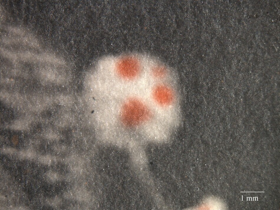
Fig. 19. Macrograph (15×) of James Van Der Zee, Portrait of a Girl (fig. 16), showing three distinct dots of red media that were applied to a flower near the girl’s hat.
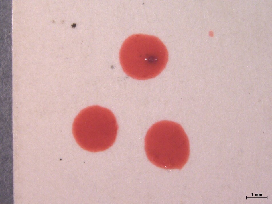
Fig. 20a. Macrograph (7×) of Roehrig’s Oil Colors “Lip” diluted in prepared medium and applied with a brush to a bare print. The oil color remained glossy, sat proud of the surface, and trapped air bubbles.
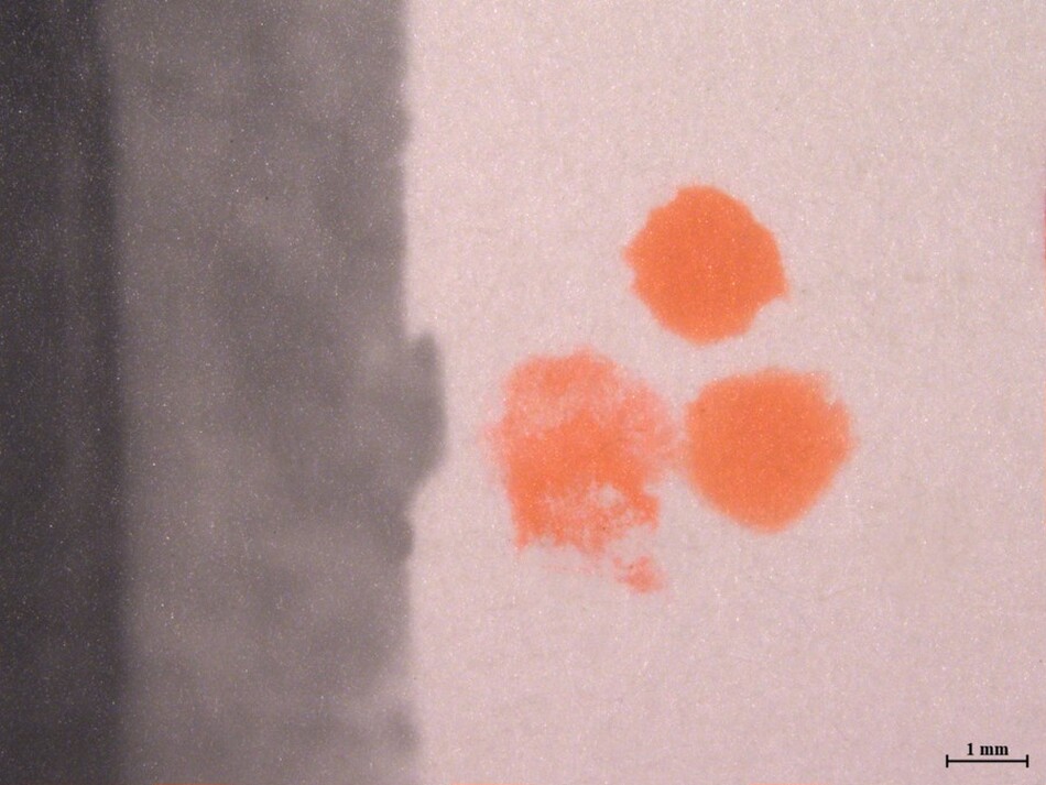
Fig. 20b. Macrograph (7×) of Peerless “Geranium Pink” diluted with water and applied with a brush to a bare print. The Peerless watercolor sank into the surface and left soft edges.
Mock-ups indicated that pencils, oil colors, watercolors, and dyes could be used to produce overall washes of color that would be very difficult to distinguish from one another visually in a finished print. The passages of more concentrated coloring, which appear to have been applied with a brush, offer more insight. Characteristics like shine, sitting proud of the surface (rising above the level of the photograph surface), or trapped air bubbles would indicate oil. No such characteristics are present with Van Der Zee’s prints. The red dots in Portrait of a Girl do not sit proud of the surface, do not alter the gloss, and do not exhibit hard edges, pointing to watercolor (see fig. 19). However, the myriad application methods available for oil-based paints (rubbed in, applied to a prepared surface, degree of dilution) suggest infinite manipulation of their properties would be possible.
Analysis
Three in situ analytical techniques were employed to noninvasively investigate the materials of Van Der Zee’s hand-colored prints and the mock-up photographs. XRF spectroscopy determines the elemental composition at the analysis location. Fourier transform infrared (FTIR) spectroscopy operating in reflectance mode and dispersive Raman spectroscopy are two techniques that provide complementary information regarding the chemical bonds of materials present at the analysis location. For gelatin silver photographs, the data collected using these techniques is usually dominated by strong signals from barium sulfate (in XRF, FTIR, and Raman), gelatin (in FTIR), and/or silver (in XRF). Thus the noninvasive identification of thinly applied colorants on gelatin silver photographs is extremely challenging. The analysis of the mock-ups generated for this project bore out this assumption.
Pigment identification was generally only possible in areas with more material present, such as areas of thick application, or if a pigment particle could be found under magnification. The addition of a medium to the oil colors made it significantly more difficult to identify colorants, possibly due to sinking into the gelatin surface or spreading out more thinly across the surface. Raman spectroscopy was particularly helpful in identifying synthetic organic pigments (SOPs), which are industrially produced pigments not found in nature. SOPs have known patent dates that can be used to determine the earliest possible date for their use in an artwork. Rather than their full chemical names, they are often referred to by their Colour Index numbers; for example, a modern reference sample of Schmincke watercolor labeled “Chrome Orange” actually contains a benzimidazolone pigment called Pigment Orange 62. This class of pigments was introduced commercially around 1970 and is still in use today. Most of the pigments identified in the mock-ups are SOPs; however, a few inorganic pigments were also detected by XRF, Raman, and FTIR spectroscopy, such as mixtures of chrome yellow (PbCrO4) and Prussian blue (Fe4[Fe(CN)6]3) in two Roehrig’s Transparent Oil Photo-Colors labeled “oxide green” and “tree green.” Overall, a wide variety of pigments were identified in the study collection materials, indicating that a vast palette was available to colorists from the 1930s through the 1970s.
For the hand-colored Van Der Zee prints, the thin washes used for many of the applied colors prevented their identification. One exception is the green colorant on Portrait of a Girl (see fig. 16), which was identified by Raman spectroscopy as Pigment Green 8 (sodium iron(II) 1-nitrosonapthalen-2-olate), which has a patent date of 1921. The presence of iron was confirmed using XRF spectroscopy. In Portrait of a Young Woman (see fig. 1), Raman spectroscopy suggests that the orange colorant could be a beta-naphthol pigment, such as Pigment Orange 5, although conclusive identification was not possible.
When an extender or medium was used with the oil colors on the mock-up photograph, the oil binder material could typically be detected using in situ FTIR spectroscopy in reflectance mode. Analysis of Van Der Zee’s prints did not identify any binder or medium. This was further suggestive of watercolor for Child’s Funeral, Portrait of a Girl, and Portrait of a Young Woman. However, it is unknown how the age of a hand-colored print might affect the ability to detect an organic medium compared to a newly prepared mock-up. Although literature that accompanied hand-coloring materials advised the use of pretreatments or coatings to prepare the surface for coloring, analysis indicated that Van Der Zee’s prints were not coated overall.
Analysis by FTIR and Raman spectroscopy proved to be more fruitful for Violinist, likely because the waxy colored pencil marks sit on top of the gelatin surface of the photograph. XRF spectroscopy also returned useful information, due to either the amount of material present or the specific inorganic pigments and fillers in the applied media. Through the combined use of these techniques, several components of the applied media were identified. Four different colors are present on the work: blue, green, yellow, and red-orange. All appear to be similarly formulated with a waxy medium and kaolin clay filler, typical for colored pencils. The pigments identified include a brominated indigo derivative, chrome yellow, chrome orange, and Prussian blue (table 2). Brominated indigo in a blue pencil was also found in a historical reference sample of Marshall’s/Marquise pencils thought to date to the 1930s or 1940s. Brominated indigo derivatives were available to the US market from the 1910s. Although we do not know that Van Der Zee used Marshall’s pencils, the company was (and remains) a major marketer of photo coloring pencils. Founded in 1919 in Brooklyn, New York, its products certainly would have been readily available to Van Der Zee. Other manufacturers may have also used this particular blue pigment, but its discovery gives a tantalizing clue to the creation of Violinist.
| Color | Elements Detected by XRFa | Raman Peak Positions (cm-1)b | Pigment(s) Identifiedc |
|---|---|---|---|
| Red-orange | Pb, Cr, Cu, Zn | 825, 340 | chrome orange |
| Yellow | Pb, Cr | 838, 358 | chrome yellow |
| Green | Pb, Cr, Fe, K | 2160, 840 | Prussian blue, chrome yellow |
| Blue | Br, K | 1705, 1631, 1592, 1457, 1340, 1263, 1235, 1200, 1163, 1076, 858, 738, 582, 350, 303, 170 | brominated indigo |
Table notes
a. Elements attributable to the photograph, including Ba, S, Sr, and Ag, were detected in all areas. In areas of heavy application, elements (Al, Si) attributable to a kaolin component in the pencil media were detected.
b. The main Raman band for barium sulfate at 985 cm-1 was also present in many spectra.
c. Pigment identification is inferred from visual color, spectral data, and context. Pigments listed may not account for all minor components present. Other materials may be present at levels below the detection limit of the techniques employed.
While silver gelatin prints are typically considered somewhat stable to light exposure, photographs with applied media are considered potentially light sensitive. Microfade testing measures color changes induced by light exposure in comparison to Blue Wool (BW) standards. The International Organization for Standardization (ISO) BW standards range from BW1 (most light sensitive) to BW8 (least sensitive); however, typically only BW1 through BW3 are relevant to museum lighting conditions. This method of evaluating a work of art’s susceptibility to change has proven to be extremely useful for identifying its most vulnerable components and provides helpful benchmarks for making display decisions.
Looking at the four hand-colored prints, only one area proved to be fugitive during microfade testing: the orange color on Portrait of a Young Woman (approximately equivalent to BW1). Thus this entire object must be considered very light sensitive. The orange, pink, and blue on Child’s Funeral and the yellow on Portrait of a Girl were each measured as approximately equivalent to BW2, indicating moderate light sensitivity. The other colored areas, including all the colors on Violinist, proved to be no more sensitive to light exposure in their current state than the underlying photograph (approximately equivalent to BW3). The range of sensitivities represented emphasizes the importance of performing adequate testing of objects before display. For the 2021–2022 National Gallery exhibition, Portrait of a Young Woman was removed halfway through the six-month exhibition period and replaced with another print to limit the effects of light exposure.
It has been noted that some of the colors in Van Der Zee’s prints appear brighter than others. In the National Gallery’s prints, Portrait of a Girl (see fig. 16) and Child’s Funeral (see fig. 13) appear quite muted in comparison to Portrait of a Young Woman (see fig. 1). Westerbeck interpreted the appearance of brighter colors in prints from the 1950s as possible evidence of Van Der Zee’s vision fading or tastes changing. However, it is more likely related to the vibrance of colors initially selected and possibly the light sensitivity of materials used. Some of the early hand-coloring materials in the study collection, such as the Velox and Peerless watercolors, produce extremely bright, vivid colors. Moreover, the prints themselves indicate Van Der Zee used bright colors well before the 1950s: for instance, the vibrant green palm leaves or bright orange flowers in Portrait of a Young Woman, dated to 1930. While the orange color in that print is currently very strong, microfade testing indicated that it is highly fugitive. In contrast, the soft blue-green foliage in Portrait of a Girl, dated 1924, had very good lightfastness. The pigment identified in that area, Pigment Green 8, is described as having a dull, subdued hue and somewhat variable lightfastness, depending on formulation and conditions. Therefore, it is likely that the color was never particularly bright. With such a range of pigments of varying lightfastness present, it is difficult to know with certainty how the hand-colored prints appeared initially or how they may have changed over time. However, the evidence suggests that Van Der Zee was using a mixed palette of both bright and subdued colors for much of his career. Furthermore, the light sensitivity of some of the most brilliant colors illustrates why it is important to identify the most vulnerable areas on works of art to prevent fading during display.
Conclusion
James Van Der Zee was aware of the extent to which the continuous changes in his backdrops, props, and poses yielded a uniquely heterogeneous body of work. A technical understanding of his prints shows that this awareness extended to his selection and manipulation of photographic materials. From retouching, combining, and recombining his negatives to paper selection and hand coloring his prints, he never fixed on a single approach for his photographs. The National Gallery’s collection of his work captures this variety. It confirms a particular sensitivity to producing highly individualized portraits and a keen awareness of how the photographic materials at hand could be selected and changed to better represent his clientele. Examined as a group, they also provide a visual expression of Van Der Zee’s mind at work as he edited, refined, and reimagined his photographs.
The National Gallery’s collection offers a small sampling of the variety of Van Der Zee’s work, and there are many avenues of further research. Comparison of possible proof prints with finished versions could further elucidate Van Der Zee’s process and the extent of his experimental approach. Examination of his original negatives would offer a better understanding of his transition from glass to film negatives and the materials he used for retouching. With the recent acquisition of the James Van Der Zee Archive by the Metropolitan Museum of Art, we can look forward to more information gleaned from a greater quantity and breadth of materials that will doubtless lead to an even richer understanding of his process.
Acknowledgments and References
We would like to thank Diane Waggoner for her encouragement of this research, as well as her input during the editing of this essay. We are especially grateful for her interest in including aspects of this research in the object labels for the exhibition James Van Der Zee’s Photographs: A Portrait of Harlem (National Gallery of Art, November 28, 2021–May 30, 2022). Additional thanks are due to Sarah Wagner, Maggie Wessling, and Veronica Diaz Méndez for their support of this research and for the treatment work they did on the National Gallery’s Van Der Zee photographs prior to the 2021 exhibition.
Adelstein 1987
Adelstein, Peter. “From Metal to Polyester: History of Picture-Taking Supports.” In Pioneers of Photography: Their Achievements in Science and Technology, edited by Eugene Ostroff, 30–36. Springfield, VA, 1987.
Akomfrah 2010
Akomfrah, John. “Digitopia and the Spectres of Diaspora.” Journal of Media Practice 11, no. 1 (2010): 21–30. doi: 10.1386/jmpr.11.1.21/1.
Ali and Henin 2022
Ali, Maha Ahmed, and Emil Henin. “Spectroscopic Analysis of Vintage Hand-Colored Real Photo Postcard of French Stage Actress Melle Charclais by Reutlinger, Paris.” Spectroscopy Letters 55, no. 2 (2022): 99–113.
Ayres 1883
Ayres, George B. How to Paint Photographs in Watercolors and in Oil, How to Work in Crayon, Make the Chromo-Photograph, Retouch Negatives, and Instructions in Ceramic Painting: A Practical Hand-Book Designed for the Use of Students and Photographers, Containing Directions for Brush-Work in All Kinds of Photo Portraiture. 6th ed. New York, 1883.
Boone 2020a
Boone, Emilie. “Reproducing the New Negro: James Van Der Zee’s Photographic Vision in Newsprint.” American Art 34, no. 2 (2020): 4–15.
Boone 2020b
Boone, Emilie. “An Ode to James Van Der Zee: Lorna Simpson’s 9 Props.” Metropolitan Museum Journal 55 (2020): 76–90.
Boone 2023
Boone, Emilie. A Nimble Arc: James Van Der Zee and Photography. Durham, NC, 2023.
Cooks 2016
Cooks, Bridget R. “Harlem on My Mind: The Many Lives of a Contested Exhibition Catalog.” Aperture Vision and Justice 233 (Summer 2016): 23–24.
Daffner 2014
Daffner, Lee Ann. “Retouching Revealed: Finishing Practices Observed in the Thomas Walther Collection.” In Object: Photo: Modern Photographs: The Thomas Walther Collection 1909–1949, an Online Project of the Museum of Modern Art, edited by Mitra Abbaspour, Lee Ann Daffner, and Maria Morris Hambourg. New York, 2014. http://www.moma.org/interactives/objectphoto/assets/essays/Daffner.pdf.
Eastman Kodak Company 1952
Eastman Kodak Company. Kodak Professional Handbook: Materials, Processes, Techniques. Rochester, NY, 1952.
Fetsko 1974
Fetsko, Jacqueline M. NPIRI Raw Materials Data Handbook: Physical and Chemical Properties, Fire Hazard and Health Hazard Data. Bethlehem, PA, 1974.
Fischer and Wagner 2005
Fischer, Monique C., and Sarah S. Wagner. “An Overview of Coatings for Hand-Colored Black-and-White Photographs.” In Coatings on Photographs: Materials, Techniques, and Conservation, edited by Constance McCabe, 156–167. Washington, DC, 2005.
Freeman et al. 2014
Freeman, Sarah, Jim Druzik, Marc Harnly, and Christel Pesme. “Monitoring Photographic Materials with a Microfade Tester.” In ICOM-CC 17th Triennial Conference Preprints, Melbourne, 15–19 September 2014, edited by Janet Bridgland, 1–9. Paris, 2014.
Golden 2016
Golden, Thelma. “Object Lessons: James Van Der Zee’s Christmas Morning, 1933.” Aperture Vision and Justice 233 (Summer 2016): 152.
Gates 2015
Gates, Henry Louis, Jr. “Frederick Douglas’s Camera Obscura: Representing the Antislave ‘Clothed and in Their Own Form.’” Critical Inquiry 42, no. 1 (Autumn 2015): 31–60.
Haskins 1979
Haskins, James. James Van Der Zee, the Picture-Takin’ Man. New York, 1979.
Hoppe 2010
Hoppe, Jonathan. “Spectroscopic Analysis of Hand-Colored Photographs and Photographic Hand-Coloring Materials.” Senior thesis, University of Delaware, 2010.
Hunger and Schmidt 2018
Hunger, Klaus, and Martin U. Schmidt. Industrial Organic Pigments: Production, Crystal Structures, Properties, Applications. 4th ed. Weinheim, Germany, 2018.
Jamison 2003
Jamison, Jamye. “A Survey of Photographic Negative Collections from 1925–1950: Some Results and Observations.” Topics in Photographic Preservation 10 (2003): 162–177.
Lehmann 2015
Lehmann, Anne-Sophie. “The Transparency of Color: Aesthetics, Materials, and Practices of Hand Coloring Photographs between Rochester and Yokohama.” Getty Research Journal 7 (2015): 81–96.
Lewis 2019
Lewis, Sarah. “The Racial Bias Built into Photography.” New York Times, April 25, 2019, Lens. https://www.nytimes.com/2019/04/25/lens/sarah-lewis-racial-bias-photography.html (accessed January 25, 2024).
Marshall 1944
Marshall, Lucile Robertson. Photo-Oil Coloring for Fun or Profit. New York, 1944.
McGhee 1969
McGhee, Reginald. The World of James Van Der Zee: A Visual Record of Black Americans. New York, 1969.
Messier 2014
Messier, Paul. “Image Isn’t Everything: Revealing Affinities across Collections through the Language of the Photographic Print.” In Object: Photo: Modern Photographs: The Thomas Walther Collection 1909–1949, edited by Mitra Abbaspour, Lee Ann Daffner, and Maria Morris Hambourg, 332–339. New York, 2014.
Metropolitan Museum of Art 2021
Metropolitan Museum of Art. “Press Release: The Metropolitan Museum of Art Announces the Establishment of the James Van Der Zee Archive in Partnership with the Studio Museum in Harlem, Donna Van Der Zee Announces Next Chapter of Her Late Husband’s Archive.” New York, December 7, 2021. https://www.metmuseum.org/press/news/2021/james-van-der-zee-archive (accessed May 2, 2024).
Namde and Walker 2017
Namde, Ronel, and Joan Walker. “Platinum Toning of Silver Prints.” In Platinum and Palladium Photographs: Technical History, Connoisseurship, and Preservation, edited by Constance McCabe, 186–191. Washington, DC, 2017.
Neblette 1952
Neblette, C. B. Photography: Its Materials and Processes. 5th ed. New York, 1952.
Pénichon 1999
Pénichon, Sylvie. “Differences in Image Tonality Produced by Different Toning Protocols for Matte Collodion Photographs.” Journal of the American Institute for Conservation 38, no. 2 (1999): 124–143.
Reilly 1986
Reilly, James M. Care and Identification of 19th-Century Photographic Prints. Rochester, NY, 1986.
Siddons 2013
Siddons, Louise. “African Past or American Present? The Visual Eloquence of James Van Der Zee’s ‘Identical Twins.’” African American Review 46 (2013): 439–459.
Smith 2004
Smith, Shawn Michelle. Photography on the Color Line: W. E. B. Du Bois, Race, and Visual Culture. Durham, NC, 2004.
Smith et al. 2019
Smith, Gregory Dale, Victor J. Chen, Amanda Holden, Melinda H. Keefe, and Shannon G. Lieb. “Analytical Characterization of 5,5’-dibromoindigo and Its First Discovery in a Museum Textile.” Heritage Science 7, no. 62 (2019). https://doi.org/10.1186/s40494-019-0305-7.
Stulik and Kaplan 2013
Stulik, Dusan, and Art Kaplan. The Atlas of Analytical Signatures of Photographic Processes. Los Angeles, 2013.
Van Der Zee, Dodson, and Billops 1978
Van Der Zee, James, Owen Dodson, and Camille Billops. The Harlem Book of the Dead. Dobbs Ferry, NY, 1978.
Wagner, Fischer, and Von Waldthausen 2001
Wagner, Sarah S., Monique Fischer, and Clara von Waldthausen. “The Hand-Coloring and Retouching of Photographic Prints: An Annotated Bibliography.” Topics in Photographic Preservation 9 (2001): 118–126.
Wagner, McCabe, and Lemmen 2001
Wagner, Sarah, Connie McCabe, and Barbara Lemmen. 2001. “Guidelines for Exhibition Light Levels for Photographs.” Topics in Photographic Preservation 9 (2001): 127–128.
Westerbeck and Bey 2004
Westerbeck, Colin, and Dawoud Bey. The James Van Der Zee Studio. Chicago, 2004.
Whitmore, Pan, and Bailie 1999
Whitmore, Paul M., Xun Pan, and Catherine Bailie. “Predicting the Fading of Objects: Identification of Fugitive Colorants through Direct Nondestructive Lightfastness Measurements.” Journal of the American Institute for Conservation 38, no. 3 (1999): 395–409.
Willis-Braithwaite and Birt 1993
Willis-Braithwaite, Deborah, and Rodger C. Birt. Van Der Zee, Photographer, 1886–1983. New York, 1993.