

Dutch Paintings of the Seventeenth Century: Still Life, c. 1660
Publication History
Published online
Entry
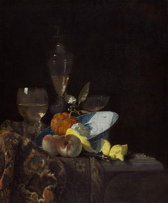
A restrained arrangement of sumptuous objects nestled in a luxurious and exotic Oriental carpet is brought to life by the delicate play of light across their surfaces. With deft touches of his paintbrush Kalf invokes the soft texture of wool, the vitreous gleam of Chinese porcelain, the dense rind of lemon, and the transparent sheen of an elegantly wrought Venetian-style goblet. Viewed individually the objects have no logical relationship to one another, yet orchestrated as they are through Kalf’s unerring sense of composition, these and the other items he has depicted come together as a harmonious whole.
As is evident from examining the full extent of his oeuvre, Kalf’s style developed in quite distinct phases that parallel, to a certain extent, his periods of residence in Rotterdam, Paris, and Amsterdam. Within each phase a precise chronology is difficult to determine as he dated only a few of his paintings. Because Kalf favored a few compositional types and tended to use many of the same objects in various combinations, however, one can often arrive at an approximate chronology.
This painting, with its pyramidal composition set off-center, is one of the purest examples of a compositional format used by Kalf in Amsterdam in the late 1650s and early 1660s. The presence of the Chinese porcelain fruit bowl, tipped at an angle to reveal its decorated interior, is also characteristic of his Amsterdam period. This Wan-Li bowl was a favorite of Kalf’s, possibly because the blues and creamy whites of the interior played off so well against the oranges, yellows, and reds of the fruit. Conservation of the painting in 2010 revealed that a glass bird with spread wings surmounting the tall flute and extensive scalloping on the glass cup on the right, which were previously visible in the painting, were fanciful additions by an earlier restorer .
Kalf’s paintings were destined for an elite audience, one that not only took pride in the mercantile prosperity of the Dutch Republic but also had been instrumental in creating that wealth. His still lifes from the Amsterdam period do not contain Dutch cheeses, breads, hams, and pies but rather depict items that had been imported from the far reaches of the world—Venetian glass, Oriental carpets, agate-handled knives, Seville oranges, and, above all, Chinese porcelain. He then placed these exotic objects against a dark, contrasting background that allowed him to illuminate their forms with accents of light.
To judge from paintings such as this, Kalf’s primary intent must have been to create an arrangement of elegant and luxurious objects that could be enjoyed for their aesthetic appeal. As opposed to earlier Haarlem still-life painters, he seems to have had little interest in instilling moralizing messages into his works. Confirmation of his attitude can be gained from the writings of Lairesse, Gerard de, an important Amsterdam painter and theorist who knew Kalf personally and admired his work. De Lairesse writes that paintings of the type that Kalf executed, which include “expensive items, such as gold, silver, crystal and other glasses, pearls, rare stones, and pearl necklaces,” are commonly called Vanitassen, or vanitas paintings. Nevertheless, according to De Lairesse, Kalf did not include objects in his paintings to convey a specific meaning or moral. Indeed, he decided which objects to paint somewhat according to whim and without any preconceived program.Although the rarity and fragility of the objects might call to mind questions of transience associated with vanitas painting, these were merely by-products of Kalf’s work, not the driving force behind it.
Technical Summary
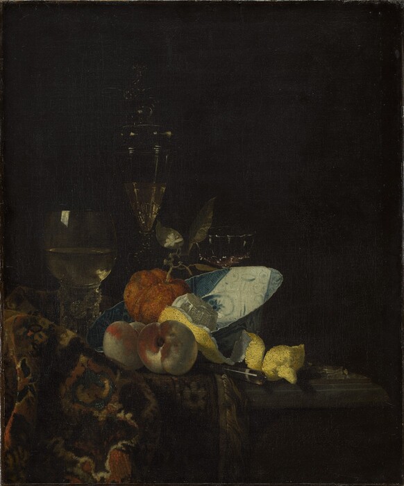
The support, a fine-weight, plain-weave fabric, has been lined with the tacking margins trimmed. The X-radiographs show broad cusping along the top edge. The double ground consists of a red lower layer and an opaque beige upper layer.[1] Both thin layers are brush applied and leave the weave pattern prominent.
Paint handling varies according to the surface texture being rendered, from thin opaque layers to richly textured pastes, with glazes confined to carpet details and the dark background. Infrared reflectography at 1.1 to 2.5 microns[2] reveals evidence of a fourth glass. Remnants of this glass became visible when overpaint was removed during a conservation treatment in 2010. It is unclear if Kalf intended for this glass to be seen or if he had painted it out and it was subsequently uncovered by a particularly aggressive restoration at some point in the painting’s history.
A large complex tear is present in the upper right quadrant and the background is heavily abraded in this area. Scattered small losses are found overall, with a larger loss in the center of the Seville orange. There is also evidence of damage to some of the glassware, namely the center glass, and the glass on the proper left side. During an earlier restoration, the white highlights in these objects were reinforced, and in some cases, such as the winged bird on top of the center glass, completely invented. The X-radiographs reveal that some of the original lead-white highlights were still present beneath these additions.[3] In 2010, the painting was treated to remove discolored varnish, inpaint, and overpaint and to bring the tear back into plane. During that treatment the restoration highlights in the glassware were painted out and the original highlights were reconstructed using the X-radiographs as a guide.
[1] The painting conservation department used cross-sections to analyze the ground when the painting was treated in 2010 (see report dated July 2010 in NGA Conservation department files).
[2] Infrared reflectography was performed using a Santa Barbara Focalplane InSb camera fitted with H, J, and K filters.
[3] The additions were analyzed by the NGA Scientific Research department using air-path X-ray fluorescence spectroscopy and confirmed to be of a later date. Some of the other pigments in the painting were also analyzed at this time (see report, dated October 19, 2010, in NGA Conservation department files). The yellow pigment in the lemon had been analyzed previously by the NGA Scientific Research department using air-path X-ray fluorescence spectroscopy and found to be lead-tin yellow (see reports dated October 12, 1983, and October 19, 2010, in NGA Conservation department files).
 National Gallery of Art, Washington, Chester Dale Collection