


The “Shirley Card” Legacy: Artists Correcting for Photography’s Racial Bias

Maybe you have some color photographs at home that are a few decades old. Or maybe you have used a filter on your phone to give your photos a charming, sun-washed appearance. Either way, you would recognize the distinct look of an aged chromogenic photograph. The three colors of dyes that make up the image (cyan, yellow, and magenta) fade, and white areas turn yellow. But what were these color photographs originally “supposed to” look like?
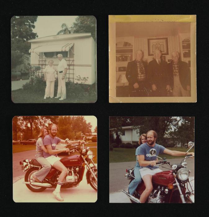
Common fading in chromogenic prints. The lower right image shows a minimally changed photograph. From the personal collection of Sarah Wagner, head of photograph conservation at the National Gallery
Using the Shirley Card to Calibrate Images
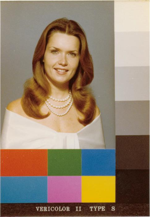
Example of a Kodak Shirley card (1978) courtesy of Hermann Zschiegner
In the second half of the 20th century, chromogenic prints became the most popular commercial color photographs. But the process required to make them became more complex and expensive, so managing their production became the work of professionals rather than amateurs—an important change from earlier in the 20th and 19th centuries. These prints were mass produced at commercial labs, drugstores, and printing businesses. And each day, trained technicians would prepare the printing machines.
Manufacturers like Kodak mailed carefully calibrated (balanced) standards known as “Shirley cards” to each printing business. The card’s name is said to come from the woman pictured in the first version: a Kodak employee named Shirley.
Technicians would print the same card on their machine and compare it to the calibrated version. If the colors looked different, they would adjust filters to “correct” the appearance. Once the technician felt their machine was calibrated, they would begin printing customers’ images.
But this process did not account for differences in the negatives. The resulting prints could be different from one another and sometimes look “wrong.” They weren’t being adjusted for the amount or quality of light in a scene—or for the subjects photographed.
Printing machines were only being calibrated to the appearance of Shirley and other white women. Pictures of people with darker skin were often poorly rendered, particularly if people with different skin tones were photographed together. Calibrating the machines to prefer lighter skin tones could even make people with darker skin unrecognizable. These poorly printed images have hidden the faces of Black subjects, including from their loved ones and future generations.
Artist Visions of the World in Color
Artists also picked up chromogenic photography, tapping into its popularity. But given how complex the printing process is, artists rarely made their own color prints. British photographer Martin Parr, for example, was one of several to work with Bristol printing studio Photographers over the Rainbow.
This studio did not use Shirley cards. Instead, printer Peter Fraser, an artist himself, tuned the color specifically to each image. This gave him greater control, and the prints more directly reflected artists’ visions of the world in color.
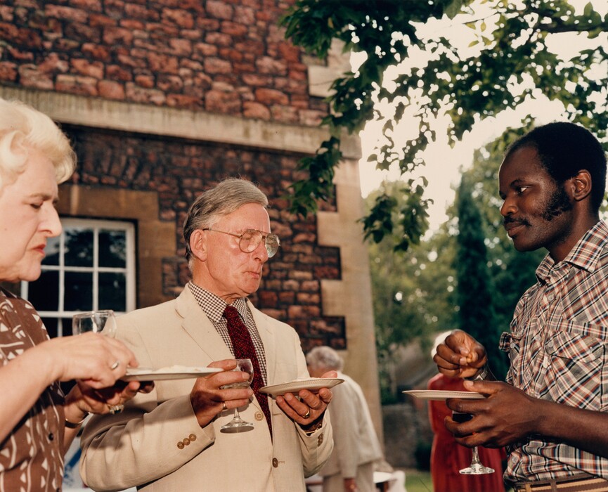
When he took the photograph Royal Commonwealth Society “Function for a Summer Evening”, Bristol, Parr boosted the natural daylight and saturated the color by using a flash. The extra light allows us to see more detail in the faces of all the people in this scene. Parr’s use of the flash and Fraser’s careful tuning of the printer resulted in a more balanced rendition of colors and skin tones. On a commercial printer, this image could have looked significantly different. But the artist and the printer were still limited by a system that prefers whiteness.
John Akomfrah’s Use of the Shirley Card
Black artists have known for decades the challenges of depicting Black subjects using the chromogenic process. But the dawn of digital technology allowed artists much more control over the rendition of color.
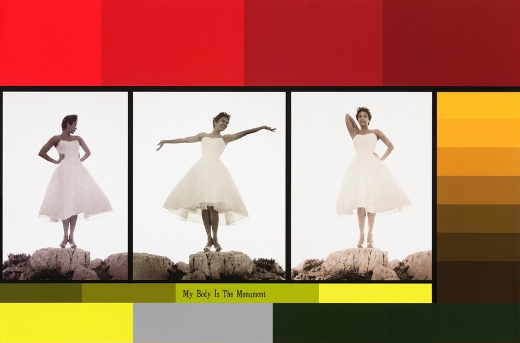
Black British artist John Akomfrah was an early adopter of digital photography, which, he argues, holds the promise of a uniquely Black image. In his 2021 work My Body Is The Monument, he lines up three photographs of Black film star Dorothy Dandridge. The color of her skin varies among the images, and they are displayed next to a color scale that directly references the Shirley card. But rather than cyan, yellow, and magenta, the colors in this scale recall skin tones.
Akomfrah printed My Body Is The Monument using the inkjet process, now the most popular way to print from digital files. While this technology offers much more control over color rendition than chromogenic printing, racial bias persists. Some algorithms written for digital cameras still preference light skin, as do applications like facial recognition software . By contrasting the Shirley card with a modern printing technology, Akomfrah points to this continued and widespread racial bias. At the same time, he is centering the creativity of Black artists and Black aesthetics.
Understanding what a historic color photograph is supposed to look like is deeply complex—and tied to a preference for whiteness. To predict the safety of exhibiting a chromogenic photograph in a museum, conservators analyze whether typical gallery light will cause it to fade quickly. Fading and color shifts are irreversible, so the photographs are not displayed for too long. And when not on view, they remain in cold, dark storage rooms to slow down deterioration.
But ultimately, exhibiting chromogenic prints is a balance between sharing the images as widely as possible, preserving them, and recognizing that their “correct” appearance is determined by a culture that continues to favor whiteness.
You may also like

Article: Photographing American Mining and Energy
Photographers have been documenting mining and energy extraction for nearly 200 years, revealing industrial activities often hidden from view.

Article: Seven Artists Inspired by Jazz
Learn how some of your favorite artists found inspiration from jazz music and listen to tunes behind their works.