Skip to Main Content

Members' Research Report Archive

A New Aesthetics for Print: The Emergence of the Visuality of the Printed Page from Gutenberg to Ratdolt

Renzo Baldasso, Arizona State University
Paul Mellon Visiting Senior Fellow, September 1–October 31, 2016

baldasso-a-2016-2017

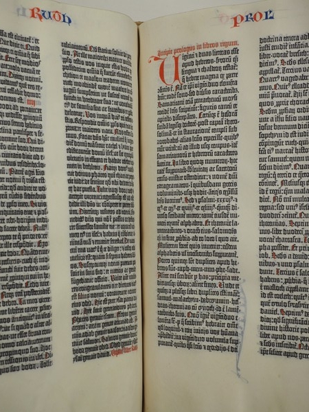
Biblia Latina (Mainz: Printer of the 42-Line Bible [Johann Gutenberg] and Johannes Fust), c. 1455, detail of 128v–129r, end of Ruth (left column, 42 lines) and beginning of 1 Kings (right column, 40 lines). Library of Congress, Otto Vollbehr Collection

Johann Gutenberg (c. 1398–1468) began printing the Bible, initially in forty-line columns, in about 1454–1455. After printing nine pages, starting both at the Preface of Saint Jerome and 1 Kings—probably two weeks of work—at the end of the first page of Genesis he decided to alter the page design, increasing the number of lines per column from forty to forty-one. After printing one page in this manner, he added one more line, and the B-42, or forty-two-line Bible, was born. During my tenure at CASVA I examined this revision process, first with the book itself at the Library of Congress and subsequently with the aid of digital images. The graphic dimensions of Gutenberg’s revisions serve as a fitting overture to my monograph, which details the development of the aesthetic of the printed page by the pioneers of the “black art.”

The height of the columns underscores that the transformation
40-41-42 was complex: by measurement, the forty-one- and forty-two line columns are not the original forty plus one line and forty-one plus one line. In fact, the forty-two-line columns are shorter than the forty-line ones. Moreover, as confirmed by considering lines 5 through 8 of the recto of page 1 of the first quire, at the opening of the Preface of Saint Jerome ([-] cula perferens, detulit / . . . veteris amicitiae nova:), Gutenberg never inserted leading between lines of type. To solve this typographic puzzle, scholars have postulated that he filed the types. While plausible, this hypothesis implicitly counters the claim that the 40-41-42 transformation was implemented to reduce costs by saving about 5 percent of the paper or vellum: each “reduction” implies the precise filing of thousands of pieces of type for the potential savings of 2.5 percent of materials, at considerable labor cost and the expense of countless damaged pieces of type. Likely such a complex change reflects more than cost-cutting intentions.
baldasso-b-2016-2017

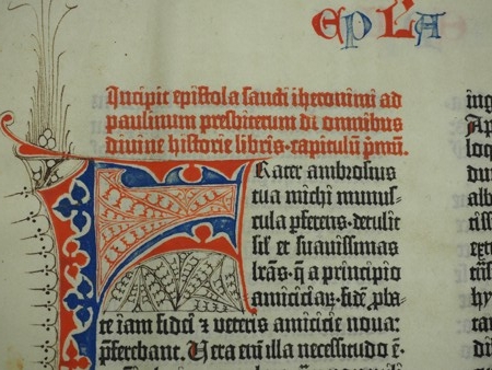
Biblia Latina (Mainz: Printer of the 42-Line Bible [Johann Gutenberg] and Johannes Fust), c. 1455, detail of 1r, title and opening lines of the Preface of Saint Jerome. Library of Congress, Otto Vollbehr Collection

Leafing through the Vollbehr Collection B-42 copy at the Library of
Congress readily highlights graphic aspects of these two transitions not captured by bibliographic descriptions. Facing pages presenting forty-one- and forty-two-line columns (the second and third pages of Genesis) and forty-two- and forty-line columns (at Ruth–1 Kings) look notably different. The forty-two-line columns appear considerably denser—and their enhanced blackness may reflect more than reduced interlinear spacing. When juxtaposed, the forty-line “prototypes” set off the compactness of the forty-two-line “production models” together with their stout and phalanx-like body. A glance at the types’ ascenders and descenders in the B-42 suggests that Gutenberg could not have fitted a forty-third line into that column height.

Other graphic aspects that catch the eye concern the titles printed in red ink on the forty-line pages. Printed at a second pass under the press, their remarkably accurate registration testifies to the fastidious precision of the presswork: reviewing copies online shows that there are no egregious registration errors and that hairline ink overlap at challenging passages occurred in only about twenty percent of cases. As the title and opening lines of Saint Jerome’s preface confirm, they were printed in the compact typesetting form (the three lines of the heading are almost two millimeters shorter than the first three lines of text), suggesting that the preface title is Gutenberg’s first trial of the B-42 graphics. It is received opinion that the title of Genesis is the last one printed because printing red rubrics was too time-consuming. Surely thereafter the rubricators’ titles afforded comparison between the printed and handwritten word while eliminating occasions for imperfect registration to challenge the mechanical purity of the printed letters, which never intrude on one another. Notably, this purity/contamination principle shaped the Mainz publications that followed the B-42: the Psalter (1457 and 1459), the Canon Missae (1458), and Rationale divinorum officiorum (1459) all present rubrics and versals printed in red ink, together with red-and blue decorative initials. These immediate heirs to the Gutenberg Bible celebrate the printer as sole master of the page.

Gutenberg’s graphic and typographic changes exemplify the early printers’ attention to and investment in the visuality of their pages beyond the text. Implicitly, they also demonstrate the process of typesetting and typographic revision, a design step that distinguishes the printer’s page from the scribe’s leaf. Finally, the 40-41-42-line changes were the first occasion for Renaissance readers to form and practice a graphic eye.