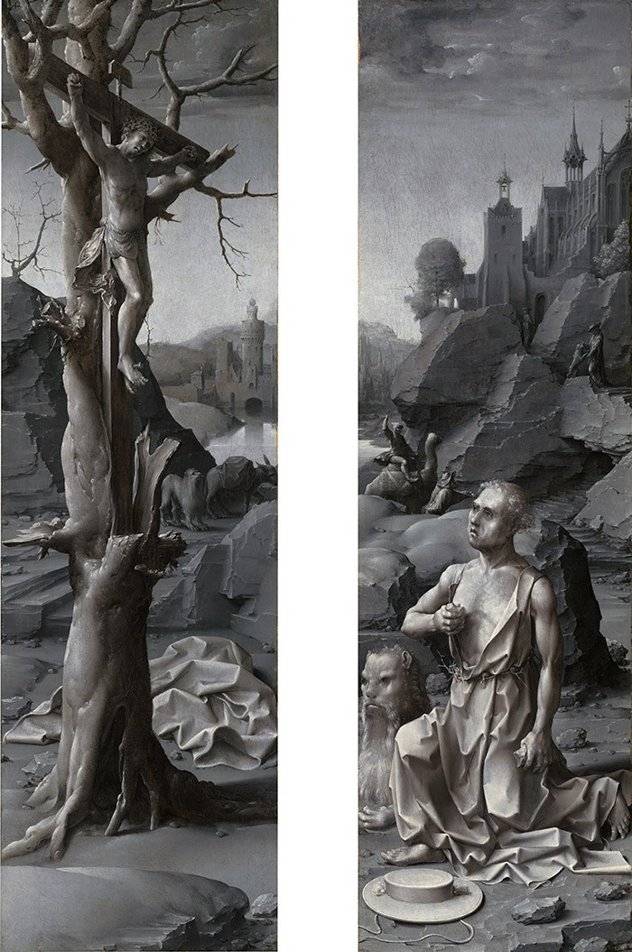
A pair of tall panels in the National Gallery of Art entitled Saint Jerome Penitent (1509 /1512), painted by the young Jan Gossaert (c. 1472–1532), follows a convention for Southern Netherlandish altarpieces that originated in the previous century. The two panels originally formed left and right wings that closed over a full-color painting of the Agony in the Garden (now Staatliche Museen zu Berlin, Gemäldegalerie). They show Jerome in anguished introspection before a crucifix, kneeling within a rocky landscape in three-quarter view to underscore his spiritual imitation of the kneeling figure of Christ inside. Interior and exterior scenes are in contrasting palettes, however, as the gray monochrome wings would open to reveal Gossaert’s full-color moonlit scene of Gethsemane. The practice of equipping altarpieces with wings painted in shades of gray (given the term grisaille only in the seventeenth century) seems to have begun in the first third of the fifteenth century, not with gray landscapes such as Gossaert’s but with fictive niches set with the figures of saints. These early, illusionistic “sculptured” grisaille wings suggested to scholars that painters were engaged in rivalry with their brethren in the sculptors’ guild, even though contemporaneous sculpture was routinely polychromed—and later examples such as the National Gallery of Art Saint Jerome indicate, in my view, that imitating sculpture was not the artists’ goal. My project during the months I was in residence at CASVA begins with altarpieces but goes on to examine the larger idea of imagining full-color reality in gray monochrome—a difficult, highly artificial undertaking for a painter but one that flourished both on the exterior wings of altarpieces and on the pages of contemporary illuminated manuscripts in the Southern Netherlands under Philip the Good, duke of Burgundy (d. 1467).
Painting the altarpiece wings in gray monochrome, in contrast to the glorious full-color sculpted or painted scenes that they shuttered for most of the liturgical year, testified to the artist’s skill; it certainly enhanced the dramatic effect when the wings were finally opened, and it would be foolish to discount the charm of trompe l’oeil. But more profoundly, the gray panels accord with restrictions on church ornament during Lent (a connection first argued by Molly Teasdale in 1957). I am skeptical of the idea that painters limited their palettes merely to imitate sculpture. What if these images are not a monochromatic gray because artists wanted to imitate the appearance of stone? What if the conceit of illusory stone was chosen instead because the wings needed to be gray? Although Netherlandish artists were celebrated for their ability to convince us that we are looking at something other than a painted surface, we may be assuming that duplicating another medium was the only goal of grisaille painting, while the most satisfying solutions to the puzzle of grisaille should accommodate both painterly skill and religious observance. My study broadens the field of vision to include instructive examples of grisaille from illuminated manuscripts, dress, heraldry, and literature. It posits that, like everything else in the semiotic universe, colors realize their meaning in opposition to other colors.
The body of grisaille manuscript painting includes clear examples of artists using gray in opposition to full color to distinguish one scene from another. In Duke Philip’s luxurious copy of Mirror of Human Salvation (Speculum humanae salvationis; Newberry Library, Chicago, MS 40), for example, the miniaturist uses gray monochrome typologically. In each opening of the manuscript, three episodes from antiquity and the Old Testament, traditionally faulted as incomplete or veiled, are depicted in gray while a single New Testament episode is set off in full color. Both manuscripts and altarpieces include trompe-l’oeil elements, but understanding the way color works in the larger visual culture of the period requires that we consider what I believe are strategic practices across several media.
Having a chance to present my material, formally and informally, to generous colleagues with a range of scholarly approaches, working on broadly differing subjects, has been extremely useful in laying out the framing chapters of my book and helping me identify misleading assumptions. Transcribing the full-color world into shades of gray is actually very challenging work for an artist. Our facility at reading black-and-white photography both explains the appeal of grisaille to modern eyes and hampers our understanding of its place in medieval visual culture. Photography supplies us instantly with an alternative monochrome version of reality to which we are so habituated that we no longer notice or appreciate the camera’s alchemy; it thus diminishes the achievement of rendering reality in antinaturalistic color. My project attempts to restore both what the absence of color would have indicated to a late-medieval viewer and what it would have demanded of a late-medieval artist.
