To judge from the elegant worlds pictured by Johannes Vermeer and his contemporaries, music and music making were a mainstay of upper-class Dutch life. Theorboes, lutes, clavichords, and bass violas permeate scenes of courtship, love, and leisure, filling these scenes of so-called everyday life with a soundtrack all their own. In Jan Steen’s Young Woman Playing a Harpsichord to a Young Man, for example, a woman’s fingers rest gently on a harpsichord’s keys as she gazes at the music before her, its notes registered for the bass and treble clef [fig. 1]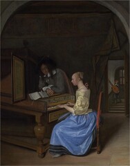 [fig. 1] Jan Steen, Young Woman Playing a Harpischord to a Young Man, c. 1659, oil on panel, The National Gallery, London. Bought, 1871. © The National Gallery, London. Her parted lips suggest she might be singing while the well-dressed gentleman leaning nonchalantly on her instrument gazes down at her. In the background, a page brings a theorbo-lute so that the gentleman can join her in a duet. Across the upper panel of the harpsichord, the inscribed words Acta Virum Probant (actions prove the man) underscore that the harmony the woman and man create comes as much from love as their playing.
The ability of painting to convey music and sound was not limited, however, to the subjects they represented. Line, shape, and color, too, were central to a composition’s sense of harmony. When, in 1604, the Dutch theorist Karel van Mander published his Het Schilder-boek (The painting book), a manual for artists, he likened musical composition to the need for balance in a painted work: “Just as in music the multifarious sounds of the singers and the players harmonize, so here too [in painting] do the many different figures.” Harmony, his dictum suggests, is found in the mechanics—or color and shape—of the composition, not just in the image itself.
For many in the 17th century, the question of balance was not only visual, it was also aural. Indeed, during that time there was an awareness of and interest in a concept later named synesthesia, from the Greek syn (union) and aísthesis (sensation), meaning the union of the senses. Since the 4th century BC, theorists and philosophers, including Aristotle, have explored the link between color and sound, investigating the relationship between chromatic and musical tones.

Fig. 2 - Athanasius Kircher, Color chart, 1646,
adapted by the author
These concepts were recognized and refined over the centuries by numerous scholars, including the 17th-century German Jesuit priest Athanasius Kircher, who, among other topics, wrote extensively on music theory. One of Kircher’s most important theories was his work on the correspondence of musical notes to specific colors, which he coded into a chart and published in 1646 (for an adaptation of this chart, see [fig. 2]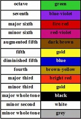 [fig. 2] Athanasius Kircher, Color chart, 1646. adapted by the author at right). According to Kircher, deep, dark sounds of minor notes are associated with cool, deep colors, while the warmer, brighter sounds of major notes are warmer, lighter colors. As a Jesuit priest, Kircher believed that the coexistence of sensory functions had profound implications in worship and that the immersion of sight and sound had the capacity, as one scholar wrote, to “move the passions, to produce strong emotional effects that, under properly controlled conditions, [could] ravish the soul and lead the faithful closer to the divine.”
Kircher’s articulation of the multisensory relationship between color and music resonates with Van Mander’s advice for artists and suggests that the experience of looking at painting may engage viewers on a variety of sensory levels. For synesthetes, the integration of certain colors and shapes on an artist’s panel or canvas may stimulate a musical experience, which would allow them to “hear” the painting.
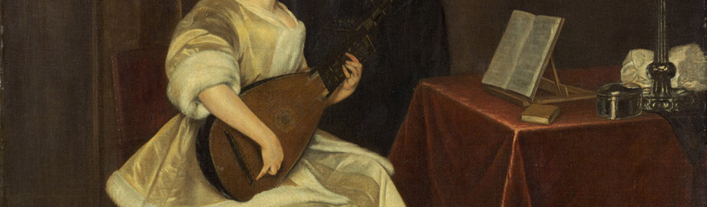
For most viewers, a painting’s composition reinforces the subject matter. In Vermeer’s Woman with a Lute, for example, which is largely a cool, dark painting, accents of warm light on the upper left of the wall (promoted by whites and creams) direct our attention to the woman’s face [fig. 3]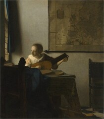 [fig. 3] Johannes Vermeer, A Woman with a Lute, c. 1663–1664, oil on canvas, The Metropolitan Museum of Art, New York, Bequest of Collis P. Huntington, 1900, 25.110.24. © 2017 The Metropolitan Museum of Art/Art Resource/Scala, Florence. Viewers are drawn in by the painting’s composition and color, while the lady tuning the lute provides the aural suggestion of harmony and balance.
A synesthete, however, might engage with this painting in a different way. The cool, dark tones present in the foreground could elicit a deep pitch, while the brighter colors on the back wall and in the face of the subject might produce warmer, major chords. Shapes also create aural associations: the diagonals of the tablecloth’s edge and the curtain’s shadow paired with the gently curving circles and ovals of the lute and the woman’s face might create similar aural associations, perhaps sharp notes accompanied by a gentle major resolve (the movement from a dissonant sound to a consonant sound). Most synesthetes scan the progression of a painting like a musical score: from top to bottom, left to right. Here the work might open with a major chord in the far upper left, with the yellow from the daylight. Then, as the eye moves down through the diffused light of the wall to the darker registers, minor chords sound. The cool white of the elegant ermine trim on the woman’s jacket could be a diminished chord, with the major resolve seen in the cream-and-gray marbled tile in the lower right.
Paintings need not depict music to convey musicality, as evident in even the quietest of scenes, such as Vermeer’s Woman Holding a Balance [fig. 4]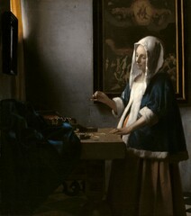 [fig. 4] . While the subject matter and palette of this sublime painting imbue a sense of silence, a synesthete might hear major chords in the warm tones of the uppermost left, minor chords repeated in the rhythmic folds of dark blue cloth, an end refrain in the diagonal of the lady’s arm, and a major resolve in the narrow, vertical strip of the warm, creamy wall.
The visual harmony created by these Dutch artists transcends their subjects and creates a transformative experience that entwines the senses as one looks and listens to a work.